Showing posts with label patches. Show all posts

Friday, February 18, 2011

It's always a great night when a player is remembered for how important he was to a franchise, especially when he made large contributions in bringing greatness to that franchise. Rod Brind'Amour had carved out a pretty good career in the NHL before he got to Carolina, but then led the Hurricanes to new heights as he helped to guide the young squad to a Stanley Cup championship. Tonight, the Carolina Hurricanes paid respect to a respected veteran hockey player, and the Flyers also showed their support of the former Philadelphia Flyer centerman.

Let's go way back to September 22, 1991. A promising young centerman by the name Rod Brind'Amour is traded by the St. Louis Blues, along with Dan Quinn, to the Philadelphia Flyers for defenceman Murray Baron and forward Ron Sutter. It was here that Brind'Amour really blossomed as a player, becoming a high-scoring, defensively-reliable centerman on Philadelphia's second line. Finding himself playing behind Eric Lindros for most of his time in Philadelphia, Brind'Amour became Philly's second scoring option. Known for the great shape he kept himself in, Brind'Amour soon developed the nickname "Rod the bod" around the Philadelphia locker room.

As a result of his playing behind Lindros, Brind'Amour saw a lot of ice-time. In 633 games with the Flyers over nine seasons, Brind'Amour scored 235 goals, added 366 assists, and spent 544 minutes in the penalty box. His leadership was vital, especially in the Flyers' run to the Stanley Cup final in 1997. In 19 playoff games that season, Brind'Amour recorded 13 goals and eight assists. However, his time in Philadelphia would come to an end through another trade.

January 23, 2000 saw the Flyers deal Brind'Amour, goaltender Jean-Marc Pelletier, and a second-round pick in the 2000 entry draft to the Carolina Hurricanes for Keith Primeau and a fifth-round pick in the 2000 entry draft. After playing 12 games with the Flyers in the 1999-2000 season, he was heading south down the coast to Raleigh, North Carolina. It was here that the veteran Brind'Amour really helped pave the way for some of Carolina's current stars such as Eric Staal and Cam Ward.

In 693 games with the Carolina Hurricanes, Brind'Amour continued scoring at a solid pace, but became a much stronger force on the defensive side of the puck as the younger Hurricane players contributed on the scoresheet. He still scored 174 goals, added 299 assists, and spent 398 minutes in the penalty box over his ten seasons with Carolina. In their run to the Stanley Cup, Brind'Amour scored 12 goals and added six assists in 25 games in helping Carolina to their first Stanley Cup championship.

Clearly, Brind'Amour has had some significant impact on two teams during his NHL career. Tonight, the Hurricanes paid respect by having each player wear Brind'Amour's famous #17 on their shoulders. They also wore his name and number on their chests just as they have done for other honoured players such as Glen Wesley. In a classy move, the club also donned Brind'Amour jerseys for the warm-up. While it may have looked like a Brind'Amour family reunion hockey game, the Hurricanes changed into their properly-named jerseys for the game.

The visitors this evening were the Philadelphia Flyers, and they also took to the ice in warm-ups with Brind'Amour jerseys on. While Brind'Amour never actually wore the jerseys seen in these images, it's still a classy move by a franchise that played a large part in Brind'Amour's career. Kudos for the Flyers for actively participating in tonight's honouring of Rod Brind'Amour.

I'm not saying that Brind'Amour is a sure-fire hall-of-famer or anything, but the man could play hockey. He won a Stanley Cup, he has 1000+ career points, and he has hardware behind his name in the Selke Trophy. I think that he's done well enough to be mentioned as a possible name on the nomination list, but is he a HoF player at this time?

Regardless, Brind'Amour will always be remembered by this writer as a great player, a great teammate, and an all-around great person. There may not be a Hall of Fame for athletes who make everyone around them and the teams they play on better, but Rod Brind'Amour could certainly be an inaugural inductee if there was a Hall of Fame like that.

Until next time, keep your sticks on the ice!

Monday, January 31, 2011

Rarely are NHL fans treated to a new look midway through the NHL season. Rarely are we treated to a shift in the values, vision, and direction of a franchise so thoroughly with half the season still to be played. And it is the rarest of cases that a franchise will debut new uniforms midway through a season while still wearing their old uniforms. However, the Tampa Bay Lightning have decided to break the trend of waiting until the off-season to debut their new uniforms by unveiling them today. Of course, I have my take on these new threads, so we'll take a look at the good, bad, and indifferent about these new uniforms, and we'll have an overall grade of the new look debuted by the Tampa Bay Lightning.

We've seen a monumental shift in how the Lightning does business since Steve Yzerman took the reins as general manager of the Floridian franchise. The Lightning have definitely changed from an outside point-of-view, extolling the virtues of honour, tradition, respect, and doing things the "right way" as values of their franchise. So it comes as no surprise that the Tampa Bay Lightning published a new set of core values on which the team will build.

If you read that vision statement correctly, the Lightning represent three major keys: the Tampa Bay community, a championship team, and hallmark events. These are the cornerstones of the Lightning franchise in that they will represent and be part of the Tampa Bay community as both corporate citizens and icons within the community; they will be a championship-calibre team so that the metropolitan area of Tampa and St. Petersburg can be proud of their hockey franchise, and proudly stand behind and support their NHL club; and, the Lightning will host hallmark events in which the people of the Tampa Bay area can take part and of which they can be proud. Essentially, the Tampa Bay Lightning are redefining themselves in the market they play in, and I think this is an excellent idea.

Not only are the Lightning pledging to be more visual and more active in the community, but they are committing themselves to the community of Tampa Bay as partners and citizens. But it's not like this vision just suddenly appeared as some apparition to the men who run the Lightning. Instead, this is the basis that the vast majority of northern NHL markets run their businesses. Franchises like Toronto, Montreal, Boston, Minnesota, and Detroit send their players out into the community to interact with fans all the time at various community events. It's no secret that Steve Yzerman, a long-time Detroit Red Wing, is putting this vision forward as a way for the Lightning to become more visible in their own yard. This, readers, is how you generate buzz about your team. For a team that's deep in the sunbelt, this is nothing but a good idea. GOOD.

While the vision statement is something brand-new for this franchise that now puts an onus on the club in being a good corporate citizen, I have to admit that I'm shocked that the Lightning took a step back in their branding of themselves. The new logos, while fairly clear, are also still regressing backwards from their previous iterations. While we saw this work in the case of the Vancouver Canucks as they moved to new uniforms, the Lightning, to me, should be a little more bold. After all, lightning is a pretty awesome force in nature. So while the overall aesthetic of the Lightning hasn't been lost, it does seem a little underwhelming just being one colour. PUSH.

The new uniforms are different, and normally I believe that different is good if it leads to something better. The Lightning have essentially turned a once-bold look into a very subdued look. While I'm not totally against the idea of simplifying anyone's look, we go back to the Lightning being a name that exudes energy and boldness. Had the Minnesota Wild come up with a logo like this, the brand simply doesn't fit the identity. I feel that the home jersey's brand doesn't have the same effect without the black and silver that it once does, and the Lightning are worse off for it. STUPID.

However, I do like the blue colour that the Lightning have decided on for the home jerseys. I was always a fan of the alternate jersey that the Lightning wore in the late-1990s, and the "electric blue" that they wear on their current alternate jerseys stands out. While the Lightning certainly could use some black and silver highlights, the home jersey would essentially look a lot like their current alternate jerseys... making them Dallas East. Kudos for the Lightning in opting for the blue background for their home jerseys, and for not selecting navy blue as their primary colour. GOOD.

The new white road jersey is even more sterile than their current road jersey. Again, the jersey could certainly use some black and/or silver highlights to make the jersey "pop" a little more. After all, we're talking about "the Lightning". And I'm not a fan of the "Tampa Bay" written across this jersey. As you know, I seriously think that NHL teams need to live and die by their logos and branding and not the city name. While the city name is vitally important to the identity of the team, when you read "Chicago hockey", the Blackhawks logo probably comes to mind. Lose the name, grab some jersey accents for this road jersey. STUPID.

The new shoulder patch being sported by the Lightning is magnificent. Honestly, I love the retro look of this new patch, and I think that this design has a lot of opportunity to be a very good logo for branding. First, circular logos are automatically pleasing to the eye in their nature. Don't believe me? Think about these logos - Target, Apple, Disney, Mercedes-Benz, the Olympic Rings, AT&T, Shell Petroleum. What do they all have in common? They are round or have large portions of their logos in a round shape. And I guarantee that most of you can picture each of those logos in your head.

Secondly, the patch is very simplistic in its design. Less is definitely more in this case, and I think the Lightning should be very happy with this design. I, for one, think it could almost be their primary logo. GOOD.

I apologize for the size of the picture, but the Lightning have gone to single-colour names and numbers on the back of the jerseys. I'm certainly not complaining because you can read the names and numbers quite easily in that small picture, and it is much better than some of their previous font choices. The font is clean and simple, and that's perfect. GOOD.

Overall, the look of these new jerseys leaves me wanting more from the Lightning. It's not to say that they're bad or that I won't get used to them, but in comparison to today's look and yesterday's look, the Lightning just seem less aggressive in their new duds. Having the legends show up and wear the new uniforms, including Phil Esposito who never played for the Lightning, was a little much in terms of presentation.

The Lightning also announced that their recently-introduced alternate jerseys would move forward with the new uniforms to remain as the alternate jersey. So while the "Victory Stripes" may be gone from the home and road jerseys, fans of the Lightning will still get to see them when the Lightning play games in their alternate uniforms. As much as I like to make fun of the armpit stripes, they are unique to the Lightning, so I'm glad to see the stripes remain. However, I'm still not sold on "Bolts". PUSH.

So there are the new-look Tampa Bay Lightning in all of their uniform glory. Personally, I think the look will grow on me, so I'm going to give these jerseys a thumbs-up as they went 4-2-2 in the GOOD-STUPID-PUSH record. Time will tell how the Lightning fare in their traditional design, but at least Steve Yzerman didn't resort to bringing Manon Rhéaume in to back up Dwayne Roloson.

Until next time, keep your sticks on the ice!

Saturday, January 8, 2011

Hockey is an interesting game whereby one has to earn respect. Respect isn't just given based upon name recognition or legacy. Otherwise, we'd be sitting here debating the merits of Brent Gretzky's game or how Brett Lindros changed the way the game is played. Teams normally show one another respect after a long playoff series by shaking hands as a way to end the battle with honour and respect. It's an age-old tradition in hockey, and one that the players take very seriously. However, the AHL's Hershey Bears played two games in the month of October while showing some serious disrespect to two other AHL teams.

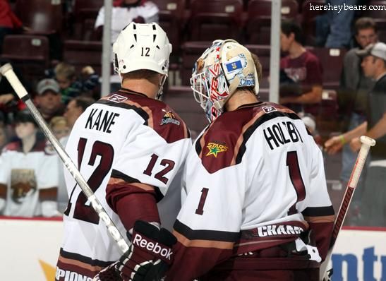
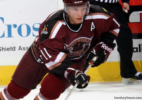
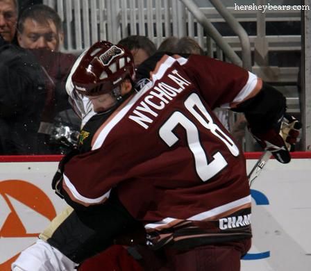
I had heard rumblings about this before the Manitoba Moose's recent series against the Hershey Bears, but it was laid out across the Sports page of the Winnipeg Free Press for all to see on Friday. It seems as though the Hershey Bears added a couple of logos to their "Championship" jersey that they wore in October to commemorate their 11th Calder Cap they had won in the previous season.

While I have no issue with teams who want to display their achievements on their jerseys, it seems a little bush league for a professional hockey team, especially one as storied as the Hershey Bears, to be creating new jerseys with their resumés on them. If you're an AHL fan or a Bears fan, you know that the Hershey Bears have won the Calder Cup eleven times, including the last two consecutively. Having the bear in the logo holding two Calder Cups is not what you'd expect from a professional hockey team.

With that, enter Gary Lawless, reporter for the Winnipeg Free Press, who discovered more about these championship jerseys. Lawless writes,
"Wilt the Stilt was as famous for announcing to the world he'd been 'friendly' with more than 20,000 women in his life as he was for his hall of fame basketball career.

"The Bears can now be known for similar 'notch on the bedpost' bragging.

"Back-to-back Calder Cup champions, Hershey put together a jersey with a Moose logo on one shoulder and a Texas Stars patch on the other.

"The Stars and Moose are the teams the Bears defeated in the last two Calder Cup finals.

"'We're the champs and here are the chumps we left in our wake,' is the message the Bears want to convey."
Again, I had heard about this earlier in the season, but I never really followed up on it simply because I thought it was a one-off game where the champs wore their jerseys and then auctioned them off to fans. However, upon reading Mr. Lawless' article, I decided to dig a little deeper.

It appears as though the Bears used their championship jerseys for two games during the month of October as they worked their way through the schedule - once in Hershey, and the other in Wilkes-Barre/Scranton. Of course, that means both a home and road version of the uniform, and that's exactly what the Bears had done: created a home and road set of championship uniforms.

Going back to what Mr. Lawless wrote, the home white set did indeed have both the Manitoba Moose logo and the Texas Stars logo on the shoulder! Normally, the Bears have the Washington Capitals logo - their NHL affiliate - and their secondary logo on the shoulders, but this is a first that I've seen in any professional hockey. And it's not like they just did this at home for their fans. No, they took their act on the road where the Moose logo was displayed on the right shoulder and the Stars logo was displayed on the left shoulder.

I'm shocked. In fact, I agree 100% with Gary Lawless when he writes,
"Designing, manufacturing and wearing these jerseys is a mistake, an error in judgement and ego run amok. It's not what the Bears have stood for in a glorious history dating back to 1938 with over 5,000 games played in the AHL and a record 11 Calder Cups. There's absolutely no question the Hershey Bears are the flagship franchise of the AHL and such a display is beneath their standard."
Wearing it once for your own fans? I can stomach that. Wearing these jerseys on the road for other teams' fans to see? Wow. It's a little sickening to see the Bears, so steeped in nostalgia and memories, stooping to this kind of bravado and self-indulgence at the expense of other AHL teams.

There's a friendly handshake between teams in the two conferences where they pledge to visit one another's rinks to help sell tickets. The Bears are always a good selling ticket in Winnipeg when they visit, and I hope that this little indiscretion towards the Moose by the Bears won't hurt their chances of visiting next season as the Moose and Bears continue this friendly setup. I like the Bears as a franchise, and I really hope this won't keep them from visiting MTS Centre in the future.

But if they don't face Manitoba next season, the Bears have no one to blame but themselves. And that's too bad because these teams are beginning to develop quite the rivalry.

I respect and support the Bears for raising money for charity, but not at the expense of other teams in the AHL. Continue to do good for the community, Bears, but please leave the minor-league shenanigans to non-cornerstone franchises.

Until next time, keep your sticks on the ice!

Tuesday, December 14, 2010

The foot to the left has five toes on it, but today's article brings you only this TOE: Tuesday's Odd and Ends. These are more images and stories that have been sitting on my desktop that need their stories told, and we'll do that today. It's an eclectic mix of things from several leagues, so we'll work through these as orderly and quickly as possible. Some of the images are interesting while some are strange, but they are all entertaining in their own right. Needless to say, this little piggy had better get to market and write this article before Christmas gets here! Here are some random things from the world of hockey. Enjoy!
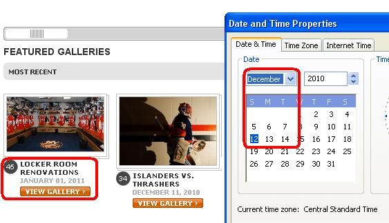
  • I was looking through the New York Islanders' website on Sunday evening for some information on the fans from Quebec City who had made the pilgrimage to Nassau Memorial Coliseum. I didn't find very much information, but I did find that the Islanders' photo gallery page is actually a time-travel portal! Yes, that gallery is dated for January 1, 2011. And just like the product they roll out onto the ice, the quality control people still have that date on the website at the time of writing this article!
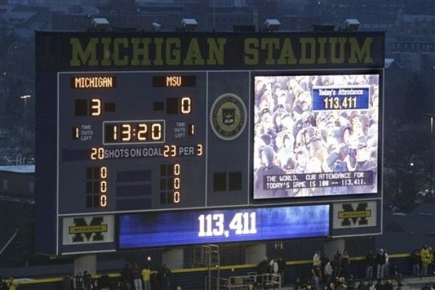
  • Huge kudos go out to everyone who attended The Big Chill at The Big House on Saturday! A Guinness record-setting 113,411 people were at the game, and they got to see the Michigan Wolverines knock off the Michigan State Spartans by a score of 5-0. John Merrill was named as the game's first star as he scored two of Michigan's goals. I am definitely impressed with the fans in Michigan who showed up for this game, and you certainly deserve a spot on Guinness' lists with that effort! Well done, fans!
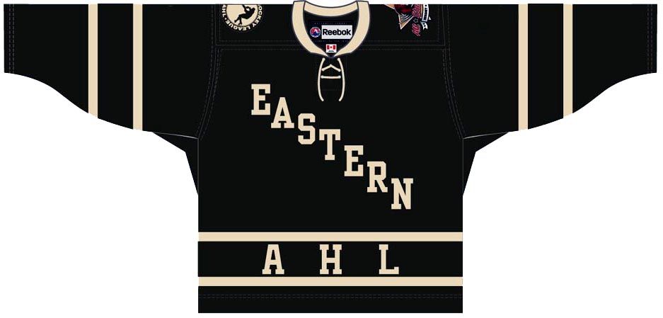
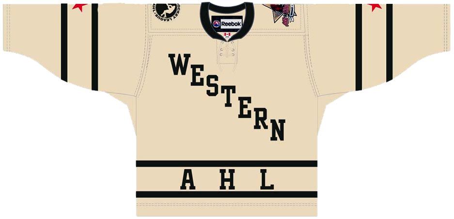
  • The AHL decided to roll out their newest All-Star Game uniforms in conjunction with the Hershey Bears. The Bears, as you may know, are hosting the game this season, and I expected something quite traditional with the AHL celebrating its 75th anniversary. Well, we got traditional as the AHL unveiled their home Eastern Conference uniforms and road Western Conference uniforms for this year's game. I do like the look of them, but I immediately thought of these past NHL All-Star Game uniforms. They seem pretty similar, no? Does anyone in hockey have any creativity left?
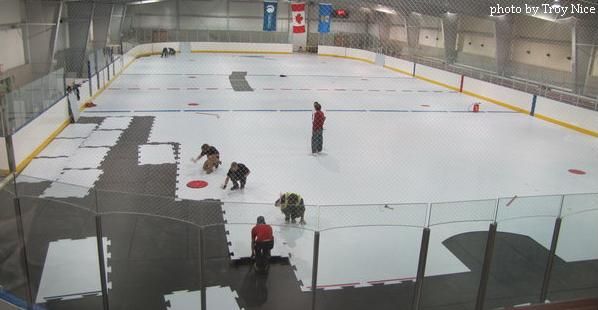
  • Great article from Brett Zarda of The New York Times about a small Canadian town that has solved the issue of springtime ice in their arena without a refrigeration system. Fort Chipewyan, a tiny outpost on Lake Athabasca in northeastern Alberta, has invested $559,000 into synthetic ice for their arena over the summer. The cost of a refrigeration system in the arena would have been into the $2 million range plus annual maintenance costs. The synthetic ice is no different than regular ice: players still use their regular skates on the synthetic ice, only there is far less maintenance involved with the synthetic ice. If you're interested in reading more about this, click the linked article above or click here to visit the Global Synthetic Ice website. It's a very cool product!
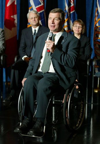
  • I had never seen this before, but a friend sent me a picture of a patch that the Vancouver Canucks wore in 1986-87. The "Rick Hansen - Man In Motion World Tour" was started in 1985 from the Oakridge Mall in Vancouver, and eventually saw Mr. Hansen travel more than 40,000kms on his trip while confined to his wheelchair before finishing on May 22, 1987 at BC Place. While support was slow at the start, Hansen eventually raised over $26 million for for spinal cord research and quality of life initiatives. The Vancouver Canucks supported Mr. Hansen in his efforts, and wore a patch to help bring his work to light. A very cool patch for a great cause!
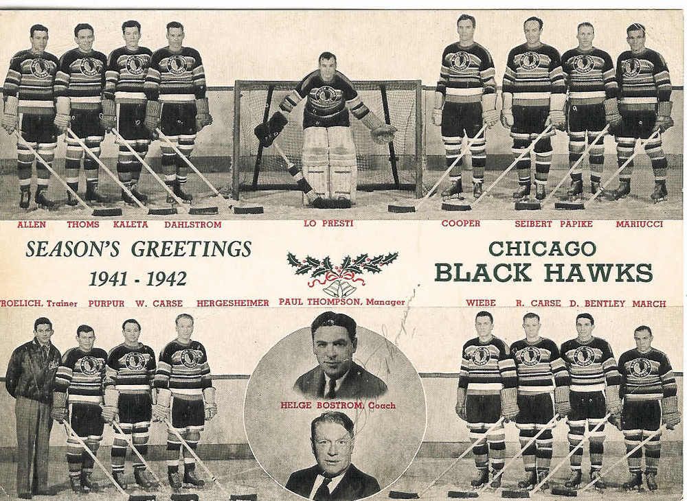
  • Last, but certainly not least, is a friendly holiday greeting from the 1941-42 Chicago Blackhawks! I'm not sure how many teams would actually send a team photo to fans in this day and age, but I was tickled pink when I saw this holiday message from the Blackhawks! Bill Thoms, second from the right at the top of the card, would lead the team in scoring that season with 45 points (15G, 30A) in 47 games. Two brothers, Robert and William Carse, can be seen on the bottom row while Doug Bentley stands beside Robert Carse. Earl Siebert can be seen at the top-left as well. Missing from that team photo are Max Bentley and Billy Mosienko - two very important players in Blackhawks history!
There are a few of the odds and ends that I've had kicking around my desktop the past few weeks. I'll begin collecting some new ones as time progresses, and I'm sure we'll have another edition of TOE. Or maybe WOE if it happens on a Wednesday. Or Foe if it's a Friday. In any case, I'll see what else I can find for another episode of Odds and Ends!

Until next time, keep your sticks on the ice!

Friday, November 26, 2010

Black Friday was appropriately celebrated by the Anaheim Ducks as they unveiled their newest look with their new alternate uniform. I say it's appropriate for Black Friday because Anaheim just can't seem to stay away from a black alternate uniform. In 2003, the then-Mighty Ducks introduced a brand-new alternate uniform that went away from their eggplant colour. They, of course, chose black. These Mighty Ducks alternate uniforms weren't the best sellers, but they weren't the best looking uniforms either. Today, though, the Ducks went a little more radical, although we're not seeing anything like this once-worn alternate jersey.

Here is your 2010-11 Anaheim Ducks alternate uniform. Much like the Blue Jackets yesterday, there are points about this uniform that I like, and some that I would rather see gone like the Wild Wing jerseys. We'll go through these individually as we always do, and I'll give the old thumbs-up or thumbs-down.

First off, I like the new logo. It's not necessarily "new" in the full sense of the word as the Ducks wear it on their normal home and road jerseys, but removing the word mark now makes this a true logo. All NHL teams need a logo to give them a recognizable image, so keeping the webbed "D" foot makes complete sense as a logo since most people already know that it's part of the Ducks' image. Thumbs-up for this idea.

The rear font on the new alternate jersey is the same as their normal font they use on their other jerseys. Again, continuity is important for a franchise with a unique font as it really does become a selling point for retailers. There are no added costs for a different font or different number of layers, so fans know exactly how much the name and number on the back will cost. Thumbs-up for keeping the unique font and making it easy on fans.

The Ducks have also brought back a little history as the shoulder patch shows the old Mighty Ducks mask logo. There's nothing wrong with a little nostalgia on a patch as I'm sure that a lot of Ducks fans have those old uniforms, so this brings the new jerseys and old jerseys together. I like the patch, and it gets a thumbs-up from me as well.

The image of Selanne showing the patch is also fraught with problems. What is going on down the side panel of that jersey? Stripes that go nowhere and do nothing are, in a word, useless. You can see that they don't continue down the pants, so why add them? While I appreciate Anaheim's black, orange, and champagne colour scheme, there are so many reasons why the orange and champagne should only be used as accent colours. They just don't blend well together when used in large blocks against a black background, and stick out vividly like a sore thumb. Speaking of thumbs, thumbs-down for the side panels.

We just went over why the accent colours don't work well, yet there are the Ducks wearing those two colours as the main colours on their new socks. Those socks look horrid, especially when the pants slide up a bit. I don't know if the designers watched a lot of children's shows before getting into the design process, but the Anaheim Ducks' socks look fairly similar to Big Bird's legs - mostly orange with a contrasting colour for definition. In fact, if you strapped a pair of skates onto Big Bird's feet, his legs would look a lot like the Ducks' socks. Big thumbs-down for the socks.

I get that the Ducks use black as their main home jersey, so I'm not sure why they couldn't add some colour to their scheme. They re-introduced the Mighty Ducks logo on the shoulder patch, so why couldn't they wear the Mighty Ducks uniform like they once did? Does anyone think this is a step back if they swapped out the "Duck mask" logo for the webbed "D" logo? It honestly doesn't look that bad at all, and I clearly have little to no graphic designer ability. Thumbs-down for another black uniform in the Ducks' closet.

Overall, it's a 3-3 tie, but the aesthetic of the jerseys just bring it down another notch. I've gone on record a few times that hockey is a sport where colours are important, and black is simply choking the life out of a once-vibrantly colourful sport. Anaheim could have done a lot with these alternate jerseys, but they chose to remain inside the box that is their uniform scheme. And that's unfortunate.

I don't think I'll ever have one of these uniforms in my closet unless I can get one on the thrift. Orange and champagne aren't really my colours, and I don't need or want any black clothing. Sorry, Anaheim, but these just aren't your best effort, similar to what we saw in the game against the Chicago Blackhawks today.

Until next time, keep your sticks on the ice!

Thursday, November 25, 2010

The image to the left is that of the brand-new Columbus Blue Jackets' alternate uniform to be worn during the 2010-11 season and beyond. Columbus has worn an alternate jersey in the past that had the black shoulder-to-wrist yoke, and that look eventually became their everyday uniforms in 2007 with a few minor changes. In continuing with Columbus' "new uniform" trend, a brand new logo can be seen on their new alternate jersey, and they have introduced a new colour not seen as an accent colour on their uniforms before. But the big question always remains: how does this uniform rate? There are a few things that I like on this uniform, but we'll see if they make the grade below.

The new alternate uniforms are very clean, very simple, and very easy on the eyes in terms of their look. There are no flashy designs or crazy graphics or sensational striping, and the jerseys have a very "retro" feel to them despite the team being just ten years old. I'm not against this retro feel that the NHL seems to have reverted to, but maybe this should send designers a clear message that new is not always better. The overall exterior look of the new Blue Jackets' uniform gets a thumbs-up.

The rear font used on the alternate jerseys for the players' names is still the same as before. Keeping the font the same makes it easy for fans who have grown accustomed to the Blue Jackets' font over the last few years, so that's good. Thumbs-up for that decision.

The number font, however, has taken a turn for the "blockish". The Blue Jackets wore a very unique font on their regular uniforms compared to most of the other block-lettered teams of the NHL. That, however, has fallen to the wayside with the new alternate uniforms, and I, for one, don't think this was a necessary move. Block letters are nice for companies that cut and stitch numbers onto uniforms, but the NHL is a multi-billion dollar retail business based on the each team's unique features. It's the uniqueness of each team that separates them from all the rest. This move to block letters makes the Blue Jackets' alternate uniform less unique compared to the rest of the NHL, and that's a thumbs-down from me.

Speaking of a lack of uniqueness, what's with this colour scheme? Light blue, white/cream, and navy blue? That would be a unique colour scheme if it weren't for Nashville, St. Louis, Florida, and Pittsburgh. In fact, when looking at the last few alternate jerseys, all of Nashville, St. Louis, Florida, and, to some extent, Minnesota have been designed in the same fashion: hem stripes, sleeve stripes at the elbow, lace-up collars, and a shoulder yoke. Granted, not every one of these teams has all of these features, but the majority of them are present on each team's alternate uniform. Is Reebok simply not trying, or do the teams just not have any creativity? Thumbs-down to the overall design for the Blue Jackets because they look like everyone else.

I do like the new logo on the alternate jersey, but, like the rest of the jersey, it seems to be copying something else from someone else. The Blues, Panthers, Penguins (twice), Sabres, and Wild all opted for a change back to a circular, retro-style logo in the last few years. The cannon? A great addition and could be a great logo on its own. The circular logo like everyone else? I can do without. I'll give this a push because the cannon logo is a great idea, but the circular logo has been done.

You may have noticed that the collar of the new Blue Jackets' alternate jersey has a special insignia on it. Blown up, you can clearly read the letters of JHM on the collar as the insignia. Why is that there? Let's go to the press release.
"To honor Blue Jackets founder John H. McConnell during the team’s 10th season, the initials JHM adorn the back of the neckline.The JHM edition of the jersey will only be worn by the team during the 2010-11 season. For jerseys sold at retail, the JHM will appear only on the initial production run, making it a true collectors’ edition."
Ok, so there's something to commemorate the team's founder, but I'm thinking this really isn't necessary. Yes, it will make game-worn jerseys fairly unique and recognizable through this special mark, but fans aren't really interested in a collectors' edition unless they are interested in buying every single uniform the team has worn. Making that person a "collector"! Thumbs-down.

The writing on the outside of the collar isn't the only place to find something as the Blue Jackets added stuff to the inside of the collar too! Let's go back to the press release for the reasons this was done.
"The phrase 'We Fight. We March!,' which appears on the interior of the jersey’s collar, was first introduced during the 2008-09 season to describe the Blue Jackets’ first-ever march to the Stanley Cup Playoffs. The expression continues to represent the team’s intention each year to fight and march throughout the regular season and into the playoffs. Below 'We Fight. We March!,' 10 stars commemorate the introduction of the jersey in the club’s 10th season."
Here's a news flash to all designers: if you can't see it, it doesn't exist. If this stuff was really that important, why not add ten stars to the bottom hem to commemorate this jersey's addition to the Blue Jackets' wardrobe where it can actually, y'know, be seen? Adding the motto on the inside is simply adding for adding's sake. These two "features" serve zero purpose overall, and have already been done by two teams: the Pittsburgh Penguins and New York Rangers. Pittburgh gets a pass simply because it will be worn on the Winter Classic uniforms, and it commemorates that event. The Rangers, however, fail miserably because no one cares about the year the franchise was established. If you're a fan, you already know that! Therefore, the Blue Jackets fall into the latter category of "fail miserably", leaving them with a thumbs-down for this idea which seems dumber and dumber every time a team does it.

Ok, so where do we stand? Well, I count 2-4-1. These jerseys just seem too cookie-cutter to me in terms of how they look. I expected more, and some of the kids in Columbus did as well. That first image by Brittany Curry? Not bad at all! I think that, for all the hype and secrecy on this unveiling, the results leave me feeling a little underwhelmed. That's never a good thing for your fanbase, especially those who don't live in the metro area of Columbus, Ohio, because they probably won't want to be part of the "We Fight, We March!" squad. I expected some creativity after they came up with a gorgeous home and road set, but all I see are ideas stolen from other teams. And that's not very professional.

Sorry, but I expected more, Jackets. You gave us a fairly standard uniform in terms of how it looks with very little original design. What's that? You did provide something more? I'm sorry, but a new cannon mascot named "Boomer" who will only appear when the new uniforms are worn is far too kitschy, and seems very much like a marketing ploy. He's not Batman who appears when the Bat Signal comes out. And you certainly don't need a second mascot when Stinger is already wearing the new threads! What's the point of that?

Because of this, I now fear the unveiling of the new Anaheim Ducks' alternate jersey coming up.

Until next time, keep your sticks on the ice!

Tuesday, November 23, 2010

Occasionally, I need to clean my desktop off when it has a number of images, stories, and emails sitting on it that have yet to be addressed. Today is one of those days as I find myself with a lot of images, stories, and emails that should be posted, but have yet to be posted. So I'll post them. I'll clean out the old file cabinet of stuff and miscellaneous items, and we'll take a look at my thoughts on each of them. There are a couple of historical pictures, there are definitely several jersey pictures, there's an "oops" picture, and there's my commentary. The pictures will certainly be more entertaining that my comments, but I'll also throw in a few emails that I've received just for good measure so that you're not overwhelmed by my sardonic outlook today. You've probably had enough babbling from me already, so let's get started.
  • I never noticed it before, but I was looking through the Classic Auctions website once again and I came across an auction for a Neal Broten jersey from the Minnesota North Stars. What caught my attention was how the number is cut. Notice the top right corner is angled downward to the right? I had never noticed that about the North Stars' font before.
  • Also from the Classic Auctions website, there's a good look at the Babe Pratt patch worn by the Vancouver Canucks in the 1988-89 season. Pratt was the goodwill ambassador for the Vancouver Canucks before succumbing to a heart attack on December 16, 1988. As a tribute, the Canucks honoured him with a patch for the remainder of that season. Very classy move by the Canucks.
  • Speaking of classy, the New Jersey Devils took to the ice last night wearing a new patch on their jerseys. With the passing of Pat Burns, there were a couple of teams who honoured the fallen coach, and I'm glad to see a man like Pat Burns getting this kind of reaction. I completely support the Devils in their honouring Pat Burns, and they look good doing it.
  • The other team that took the ice with a memorial for Pat Burns was the Toronto Maple Leafs. However, unlike the Devils, the Leafs wore their tribute on their helmets. Check out the back of Colton Orr's helmet for the "PB" sticker as he punches out Krys Barch. Another classy tribute by a hockey team, and I fully support it.
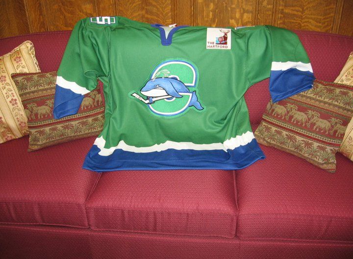
  • There was a grand unveiling on Facebook today as the AHL's Connecticut Whale showed off their new green uniforms. I still think the logo is far too cartoonish and minor-league to be a professional team's logo, but that's clearly in the past and will not be changed now. Apparently, Reebok couldn't come up with jerseys in time, so they contracted SP Apparel, to make the Whale's uniforms. The Whale will wear the green uniforms both at home and on the road until mid-December when the new white and blue uniforms arrive. So just like their name, the Whale's uniforms are becoming a major debacle.
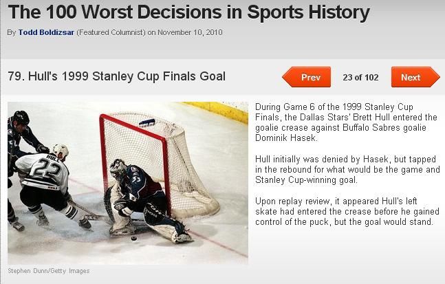
  • I was going through Bleacher Report's slideshow of "The 100 Worst Decisions in Sports History", and I was entertained by some of their choices. It's a pretty good slideshow with lots of info in it, but I was bothered by one picture in particular. On slide 79, they highlight Brett Hull's 1999 Stanley Cup-winning goal where he had his foot in Dominik Hasek's crease. As you remember, the NHL rule said absolutely no player could be in the crease as a goal was scored, yet Hull's goal was allowed to stand as the series winner. However, slide 79 shows Hull's foot in Patrick Roy's crease as the Stars played the Colorado Avalanche! Every other slide in the series has the correct photo with it except this one. Oops!
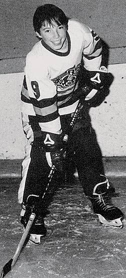
  • Sports Illustrated had a great shot of a very young Steve Nash in British Columbia dressed in hockey gear! Nash was an accomplished soccer player, is one heckuva basketball player, and now he has hockey on his resumé as well! How cool is that?
  • I received a pretty interesting email from Benny who works on behalf of the Canadian Women's Hockey League. The press release states that the CWHL and Bauer Hockey have partnered to bring the women in the CWHL elite hockey equipment from Bauer! This is a great announcement as all the women will now have top-of-the-line gear to play in, and this gives the CWHL a very credible hockey partner. "Bauer Hockey is committed to growing the sport and as a company, we have always supported women’s hockey," said Kevin Davis, chief executive officer and president of Bauer Hockey. "We’re excited to partner with the CWHL and do our part to help move the women’s game forward." I, for one, think this is an excellent announcement. Congratulations to both the CWHL and to Bauer for their commitment to the women's game!
There's the hodgepodge for Tuesday. Antler Banter returns tomorrow, and I'll have a full run-down of the Columbus Blue Jackets' new alternate uniform on Thursday as they unveil their newest design tomorrow evening. Lots of stuff coming up, so stay tuned!

Until next time, keep your sticks on the ice!

Friday, November 19, 2010

We're back today with another round of images from the Classic Auctions website. I was very impressed by what the site had to offer last time on their current round of auctions, so I went back through the archives to see if I could find some more interesting stuff. Needless to say, the archives are a treasure chest of historical items and, of course, there are a ton of NHL sweaters and jerseys that should be examined for details. With that, we have another edition of the Classic Auctions images today as we look at a number of uniforms once more.
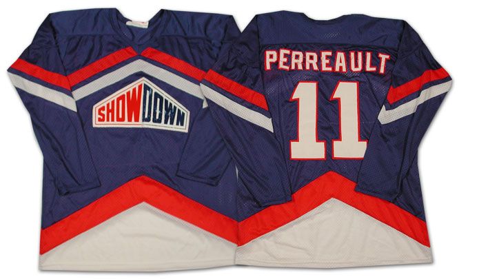
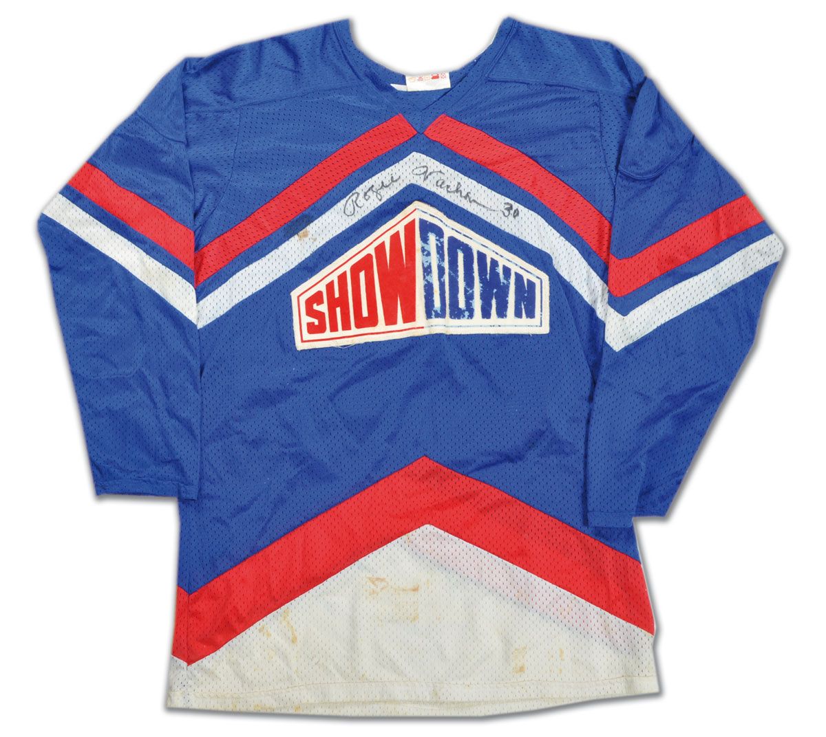
  • As we saw in the most recent set of Classic Auctions images, there was an NHL Showdown segment that used to air between periods that featured a few NHL stars that went head-to-head for cash and bragging rights. I've found more players who were a part of this now. It appears that Gilbert Perreault of the Buffalo Sabres participated for at least one season in the Showdown, and he wore a sweater similar to that of Rogie Vachon! Could they have been teammates in their respective Showdown?
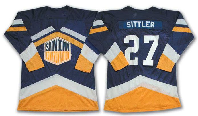
  • Another player who participated was Toronto's Darryl Sittler. However, his sweater is significantly different in terms of colours than those of Perreault and Vachon, so I'm guessing he played in the NHL Showdown in a different season.
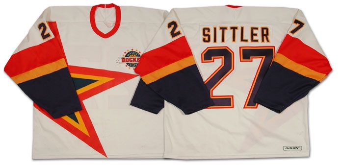
  • Another Darryl Sittler jersey that the Classic Auctions website had up for auction was a Sittler "Masters of Hockey" uniform. I've never seen or heard about this before, so I had to refer to the information on the website. "As part of an important Zellers promotion, Darryl Sittler, along with many other Oldtimers, participated in the 'Masters of Hockey' program. This white hockey [was] uniform produced by 'Hattem'". Nothing like an old promotional jersey for a department store promotion!
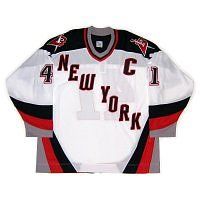
  • In the article about the New York Rangers' new alternate uniform, I had stated that there was precedence for the Rangers wearing "New York" diagonally on their uniforms thanks to their 9/11 tribute uniforms. However, there is even more precedence that shows the Rangers wearing "New York" for a much longer time on the road. Here is Bobby Carpenter's 1986-87 New York Rangers road uniform. Obviously, they wore these for at least one season, and, upon further research, they actually wore the "New York" road jerseys from 1978-1987. Lots of precedence!
  • I've rarely seen the patch worn, but there is no doubt that the Toronto Maple Leafs wore the King Clancy patch on their uniforms during the 1986-87 season. Thanks to the auction, we can now clearly see that the Leafs wore the King Clancy patch above the TV numbers on their sleeves on the road that season.
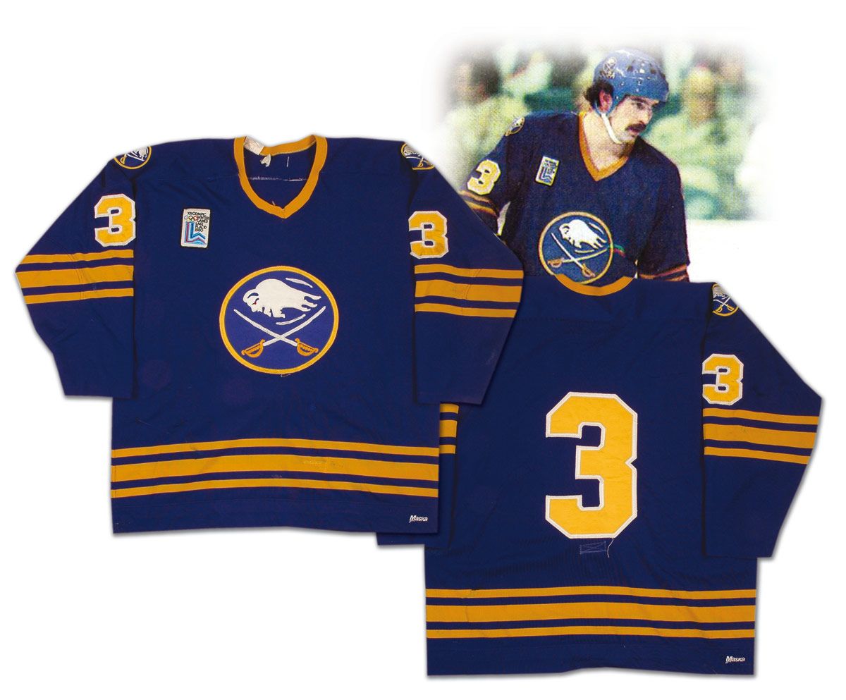
  • Some of the patches worn before photography became a major aspect of the NHL world are much more difficult to find, especially affixed to an NHL uniform. The Lake Placid patch worn by the Buffalo Sabres is one such patch, but this Richie Dunn sweater from the 1979-80 season shows it clearly affixed on the right shoulder. Notice that there are no names on the Sabres' uniforms as of 1980? I had never noticed before that either.
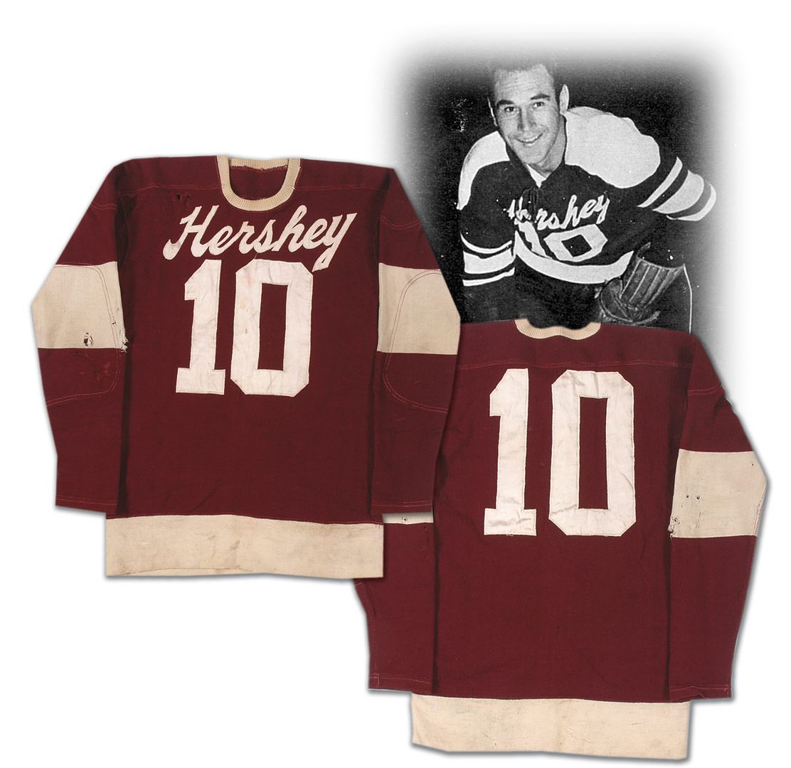
  • Heading into the AHL, we find a trend that seems to have been reproduced in the NHL with the introduction of the Rbk EDGE uniforms. I've never liked the idea of having front numbers on a hockey sweater, but the Hershey B'ars decided that front numbers were fine for a hockey sweater as far back as the 1940s! Here is a sweater that was worn by Mark Marquess as a member of the Hershey B'ars that has the city name over top of the front number. More precedence for a current trend, perhaps?
  • The Detroit Red Wings have a gorgeous jersey due to the colours and the logo. I cannot deny this. However, history shows that the logo routinely was off-centered on the Red Wings sweaters. One such example comes from the 1937 Jimmy Orlando sweater. As you can see, the center of the wheel was used as the focal point for the logo, and that caused the wing to be significantly off-center.
  • In Part One of this series, I discovered a startling trend in the 1980s that showed floating portions of names on a number of teams. Today, there appears to be some sort of discrepancy in terms of how names are displayed on at least one team. I had made mention of Brad McCrimmon's floating "C" in 1988, but I discovered an Al MacInnis uniform from the 1980s that has no floating letters! What gives? Why the change? MacInnis' first game in a Flames uniform came in 1981-82, so we at least have a start date as to when the floating letters may have started, and it had to be after the '81-82 season.
  • Because I miss the uniform and the team, here is Wendel Clark's Quebec Nordiques uniform from the 1994-95 season. Man, I miss that uniform. It's gorgeous!
  • In other lost uniform news, here is Gerry Ehman's 1967-68 Oakland Seals uniform. Does anyone miss the colour green in hockey? I sure do. Why can't more teams go with a bold green instead of these near-black colours?
  • Next, we have the second wave of California's Seal teams as we get a chance to see Joey Johnston's uniform from the 1970 California Golden Seals. I'm not all that fond of this colour scheme, but the yellow uniform is definitely bold. Much like their name, the Golden Seals certainly were living it up in goldenrod.
  • We have a 1979-80 Atlanta Flames uniform worn by Gary Unger. That's still a great uniform, and I'm glad that the Calgary Flames have gone back to those great colours. Yellow-on-red is a very striking uniform... and the lack of black is entirely refreshing!
  • Take a good look at this 1976-77 Colorado Rockies uniform worn by Michel Plasse. See how small the front logo is? Compare that to the 1981-82 uniform worn by Tapio Levo. There's a significant difference in the sizes between the two uniforms. It's almost as if the Rockies were telling everyone in 1976 that they weren't all that relevant.
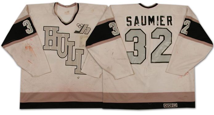
  • In the 1970s, the Hull Olympiques of the QMJHL wore some fairly vanilla uniforms. However, they changed that up in the 1980s by bringing out the black-and-silver colour scheme that became famous thanks to Wayne Gretzky's trade to Los Angeles. As you may have heard, Luc Robitaille played for the Olympiques and Gretzky owned part of the Olympiques, so Bruce McNall made the change to the new colour scheme due to Robitaille's suggestion to make Los Angeles more attractive for Gretzky. Now you have some visual proof of how this change came about thanks to Marc Saumier's uniform.
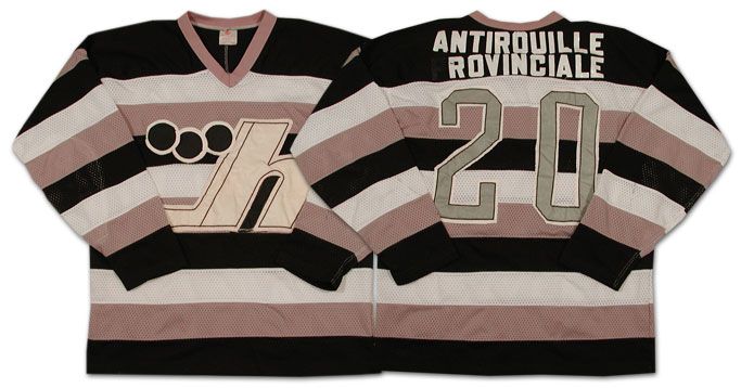
  • In 1985, the Hull Olympiques decided to roll out a different road uniform by wearing some awesome stripes! I love the stripes on this jersey, even if it looks like a black-and-white television's test pattern.
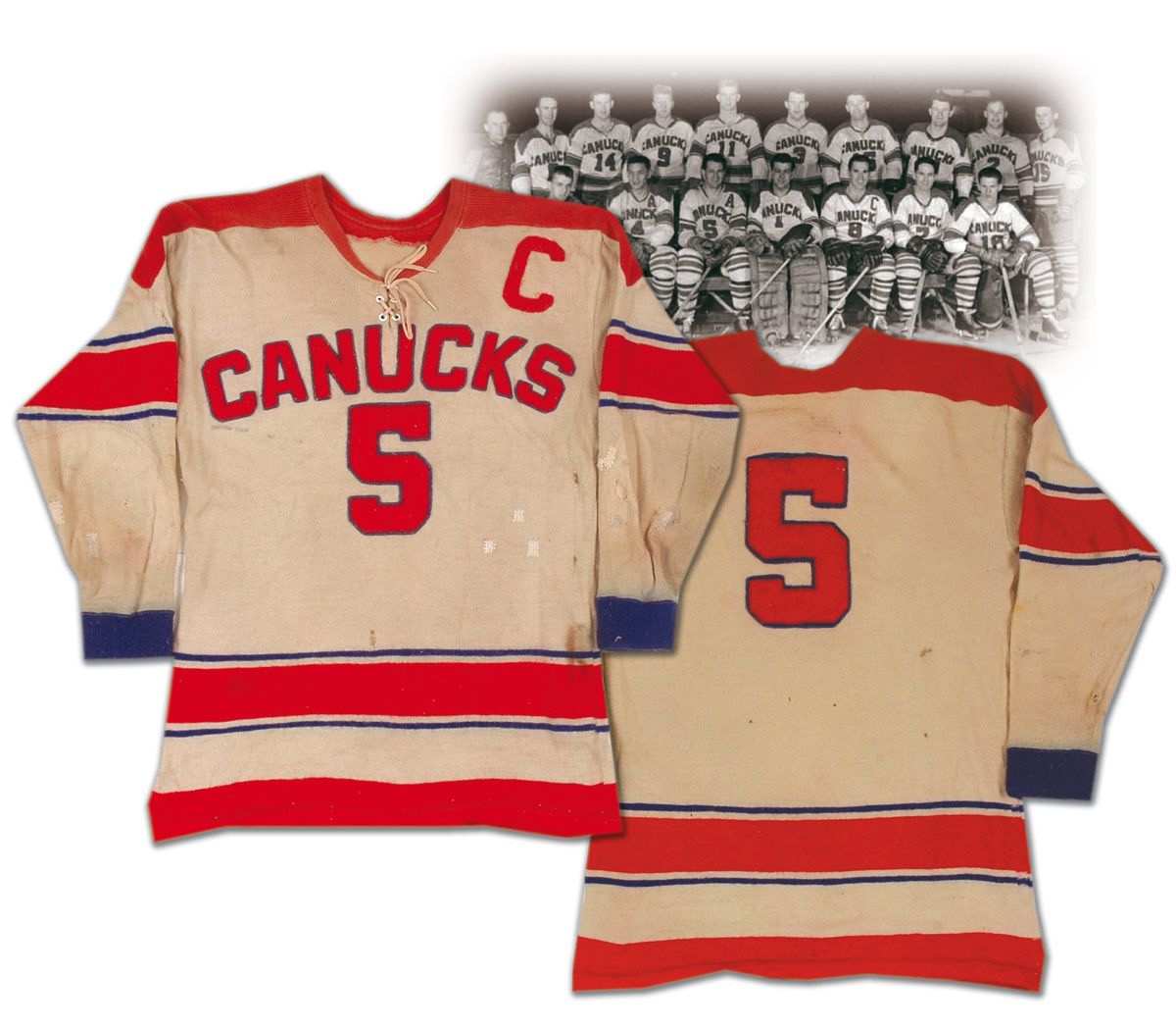
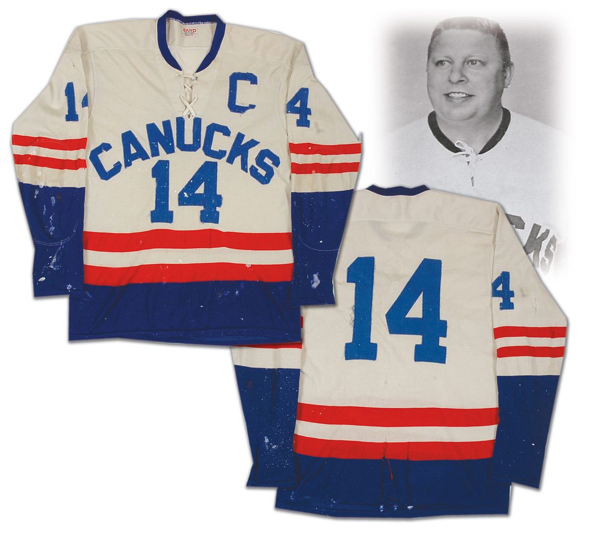
  • The WHL gets a mention on this one as we get to see the Vancouver Canucks in their original form. The WHL Canucks wore this uniform in the 1950s, and they went with a colour change in the 1960s. Of course, Vancouver received an NHL franchise in 1970 so these jerseys weren't needed any longer, but there is some precedence to the Canucks wearing a name on the front of their uniforms. It seems that the trend of front numbers was more of a minor-league thing through the 1940s, 1950s, and 1960s, though. Take note, NHL. MINOR-league.
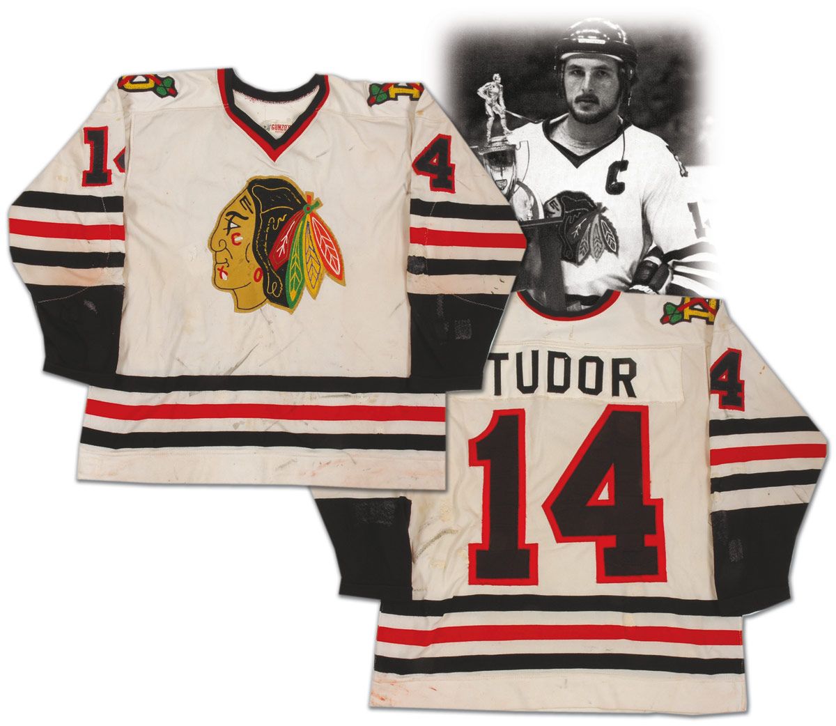
  • It has been well-documented that NHL teams often name their minor-league affiliates after their own NHL franchise name. The Sherbrooke Canadiens, the St. John's Maple Leafs, and the Albany Devils are some well-known examples. Here is Rob Tudor's jersey from the 1978-79 season. If you inspect that jersey closely, you'll see two tomahawks crossed over a "D" on the shoulder. This is a Dallas Blackhawks uniform from the Central Hockey League!
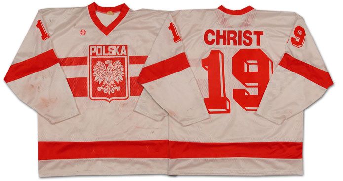
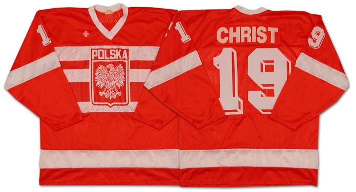
  • International jerseys are always interesting. The 1988 Winter Olympics saw Poland compete in Calgary as a part of the ice hockey competition. One member of that team was a player by the name of Jerzy Christ. Yes, that is his real last name. He was born in Katowice, Poland, and played center for his home country. The highlight of his international career was when he scored both Polish goals in a 2-1 victory over reigning World Champion Czechoslovakia at the 1986 World Championships in Moscow, Russia!
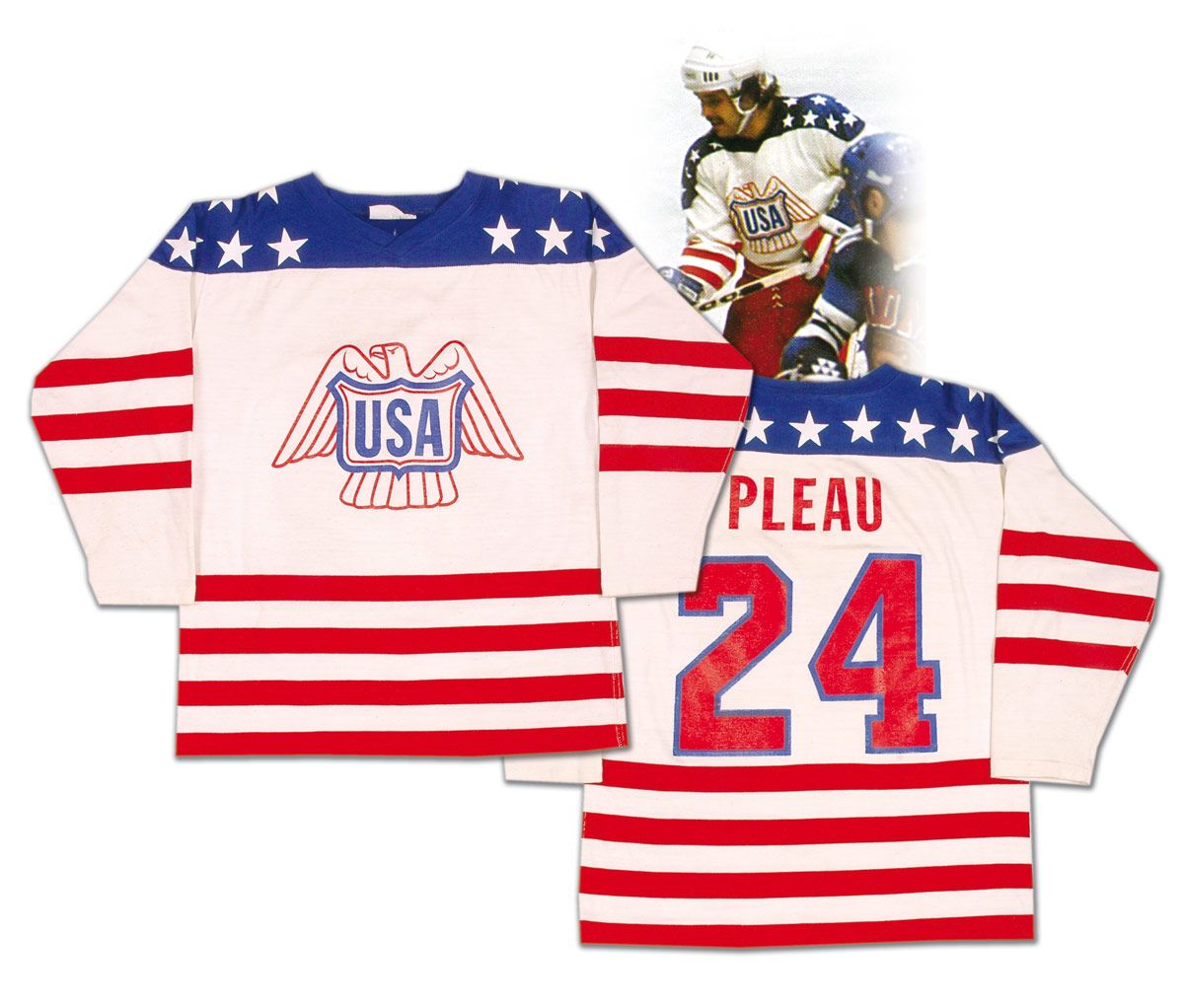
  • Love this 1976 Team USA sweater. Larry Pleau wore this uniform at the 1976 Canada Cup where Team USA finished 1-3-1 and in fifth-place. Regardless of their standing, they wore a gorgeous sweater, and it really feels like a patriotic American uniform.
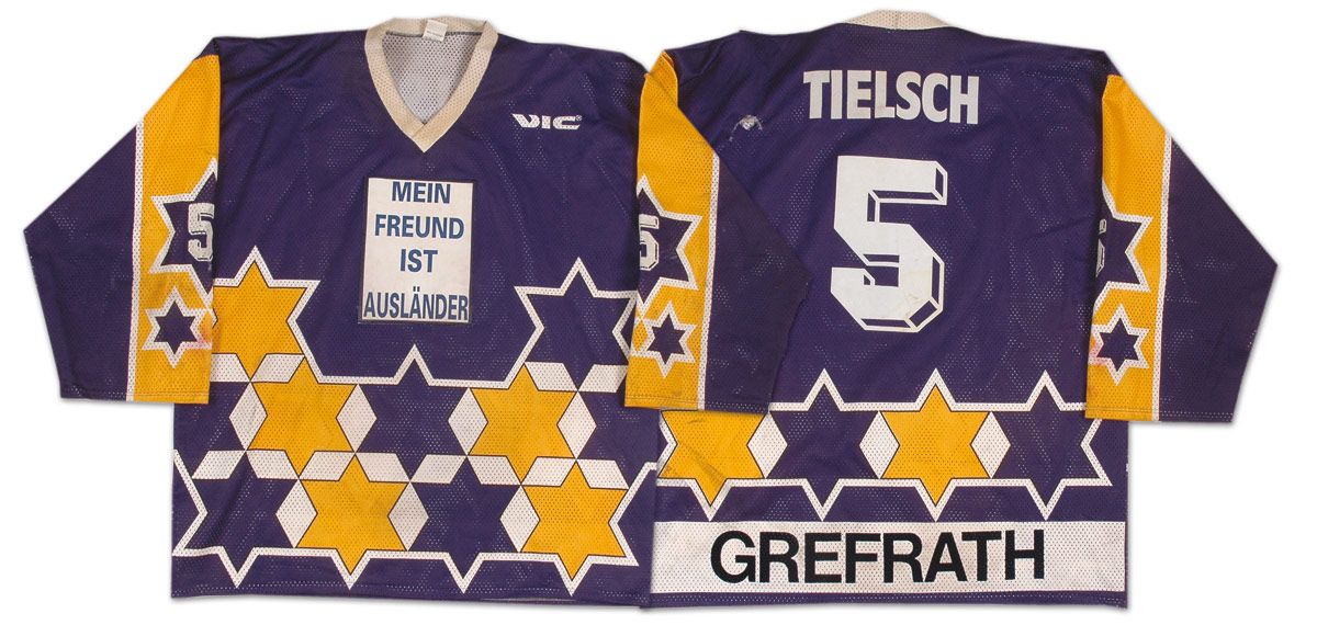
  • We'll close this look at interesting jerseys with a glimpse into German hockey. Grefrath, a German city, played in the second-division of the German Eishockey League in the early-1990s, and wore these uniforms while on the ice. As you can see, there's no logo, but a message where the logo should be. Using a handy translator, the message states, "My friend is a foreigner" or "My friend is an alien". Is this the first time any team has ever used their uniform to convey a written message to its fans? Weird idea.
So there you have it, kids. Lots of good looks at uniforms, and there was some weird and wacky stuff seen. The Classic Auctions website is a great place to find some incredible hockey history, and I encourage you to poke around their website if you're interested in some cool hockey memorabilia.

Until next time, keep your sticks on the ice!

Friday, November 12, 2010

The New York Rangers worst-kept secret finally hit the stores and streets today as the Sean Avery-previewed Rangers alternate jersey made its debut in downtown New York City. However, there are some things that make this jersey slightly different than your average alternate jersey, and I'll try to spell them out here. In any case, you'll see lots of photos of the new look being worn by the New York Rangers.

As seen in the Sean Avery picture above, the Rangers have gone with a darker blue and the words "New York" diagonally from left shoulder to right hip, similar to their regular jerseys. The jersey colour remind me of the Lady Liberty jerseys in how dark they are, so it remains to be seen how dark they actually are when on the ice as compared to their normal blue uniforms. However, the colour scheme gets a pass thus far.

Of course, the last time the Rangers wore "New York" diagonally down their jerseys was during their 9/11 tribute game on October 7, 2001. The Buffalo Sabres also did the same, but there has been at least one other time the Rangers have worn "New York". These jerseys obviously have nothing to do with that event, but the "New York" is a nice touch. While I would have loved to see Lady Liberty make a triumphant return, the use of "New York" gets a pass.

On the right shoulder, the Rangers will sport their 85th anniversary patch. The patch itself spells out exactly what it is for, and it has all the relevant details on it. There is one thing about the patch that makes it a little more important on this alternate jersey - it's the only place on the new uniform that actually has the Rangers' logo on it. While I get that the Rangers' iconic look is their diagonal lettering, they could still put their logo on the shoulder in place of the patch in the future. Instead, there is nothing on the left shoulder, and the Rangers' shield logo possibly will remain AWOL in future years. I'm going to give this a push until we see how the Rangers handle this in future years.

The font that the Rangers use on the back is different from their normal font on their everyday jerseys. The block lettering is fairly standard in the hockey world, so there's nothing major to report here - just a standard red-on-white block font for the number, and standard white for the name. The captaincy designations are a little different as they normalize the regular letters from their italicized state on the regular uniforms. They look slightly different due to the lack of shadowing on the letters, but the serifs and sizes are nearly identical. This gets a push as well as the shadowing was distinct as a New York Rangers feature. Now, they just look like everyone else.

I've never understood why teams insist on putting "features" inside jerseys. It's not like they can be seen on the ice, and chances are that no one cares about that feature if it's being hidden. The Rangers are guilty of two of these features: the inside of the collar, and the retired jersey number bottom hemline.

With the collar, I get that it's important to remind everyone that the team was established in 1926, but isn't that why the patch has been affixed to the shoulder? The patch clearly states "Est. 1926", so why do you need the collar to read the same? This is nothing more than designers adding additional flair for their own sake. This feature serves absolutely no purpose as far as I can see.

The hemline is even more puzzling. The Rangers are including all of their retired numbers on the inside of the hemline for fans that purchase the new uniform at the NHL Store or at Madison Square Garden. Why is this being offered? As you can see, Rod Gilbert had a heckuva time showing off his retired number tonight, yet the Rangers think this is a good idea. If I want a retired player's number, I'll put it on the back of a jersey. I don't need it on the inside of the bottom hem. And if I want to show my friends this "cool feature", they had better be printed upside down on the inside so they are easily readable when flipped up. This "feature" is the definition of stupid.

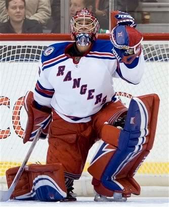
Overall, I like the look of the exterior of the jersey. It remains to be seen how dark the blue actually is once the Rangers take the ice, but idea of keeping the jersey simple is a great idea. I'm ok with the lace-up collar that the Rangers are using due to their history with it, so their overall look isn't diminished by their choice in collars. Lundqvist was even all "GQ Man of the Year" during his segment on XM Radio yesterday, and I have to say that the jersey does nothing to detract from his look.

My finals thoughts are these: great alternate uniform for the players, but ridiculous additions for the fans. The Rangers certainly get a pass for the look, but they need to tone down the flair a little. Otherwise, these are great alternate uniforms for the Broadway Blueshirts.

Until next time, keep your sticks on the ice!

Tuesday, November 9, 2010

I have some photos and some emails that I want to get through today, so I figured a Tuesday was better than never to post some of the collected stuff that has been rattling around my inbox and on my desktop. Some of the photos are quite interesting, and a couple emails really stand out in terms of the information they contain. One is all about a contest, so I'll lead with that information, but one email contains a video that a reader put together. Honestly, it's quite good! So without further adieu, let's clean up some of this stuff so I can begin hoarding other images and emails.
  • I received an email from Scotiabank about a contest they are running. Kids today should be taught "financial literacy" - ways to save money - for the future. Thankfully, Scotiabank has a handy page where kids aged 7-16 can get tips on how to save in "The Big Save" contest. What Scotiabank is looking for from those kids are their own hockey saving tips, an early hockey memory, or just their favourite part of the season! In exchange, the Scotiabank Hockey Club will award one lucky family the chance to go to Whitehorse for this year's Scotiabank Hockey Day in Canada! The Big Save contest ends November 30, so be sure to have your kids and their friends enter! For all rules and regulations - yes, you must be Canadian to enter - please click here for details!
  • With the month of November upon us, I'm not sure how many of you are aware that it is Prostate Cancer Awareness month. As a result, the month has been renamed to "Movember" for those who are participating in growing moustaches as part of the awareness campaign. One such man who has a lovely 'stache? Colton Orr of the Toronto Maple Leafs. Look at that 'stache! It's a beauty!
  • Of course, Colton Orr has a long way to go before knocking off some other rather famous hockey 'staches. George Parros' 'stache was always a favorite, and he actually shaved his off this month to grow a new one in honour of "Movember". May the Parros-stache return!
  • Great find by a Uni Watch blog reader as Jake Doyle presents the original St. Louis Blues prototype jersey! I actually like how the logo stands out against the word marks. It's very unique in that the music note looks bigger because of the illusion.
  • Another solid find by Uni Watch blog reader Bill Hoppe as he shows off Gerard Gallant's unique facemask. If you look carefully, you can see the Red Wings' 60th anniversary patch on the shoulder. Also to be noted is the captaincy designation on Danny Gare's uniform. It's on the right shoulder! This photo was taken in 1986-87, so the Red Wings have a long history with the captaincy designations being on the right!
  • I'm not sure where the next photograph came from, but there is a great shot of Jacques Plante being interviewed by a masked man who apparently is mocking the legendary Canadiens goaltender's facial protection. Plante, as you know, was the first man to wear facial protection in a hockey game after having his face cut open by an Andy Bathgate backhanded shot. This "poking fun" at Plante is endearing, but Plante's reasons for wearing the mask are absolutely sound.
To end this clean-up today, I want to present a video that reader Greg W. sent me. According to his email, Greg is "a professional video editor from Toronto, a huge Leafs fan, and an avid reader of your blog" (thanks, Greg!). Being a huge Leafs fan, he has finished a video project on Doug Gilmour, a man who all Leafs fans still love and respect. Here it is in its entirety, and thank you Greg for allowing me to post this!
Great work, Greg! Excellent musical choice!

That's all for today, kids. Antler Banter returns tomorrow as we check out how the Moose finished up their seven-game road trip. Jeff Tambellini joins the Moose, but can he make a difference in their line-up?

Until then, keep your sticks on the ice!

Sunday, November 7, 2010

The Hockey Hall of Fame Game went this weekend in Toronto, and didn't look anything like the game to the left. Instead the Toronto Maple Leafs hosted the Buffalo Sabres in the annual game as the five inductees to the Hockey Hall of Fame were honoured on Saturday night. It should be noted that the first two women to be inducted into the Hall of Fame - Angela James and Cammi Granato - were part of this class. But that's not why I'm writing today. Today is all about why numbers on the front of the jersey are a fail.

The way that the patches on hockey jerseys are supposed to be worn are shown by Mike Komisarek and the Toronto Maple Leafs. Komisarek wears the alternate captaincy designation on the left side of his jersey, and the patch fits nicely in the open space on the front right shoulder. The Toronto Maple Leafs were not the problem on this night.

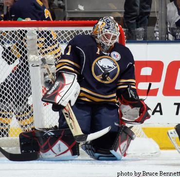
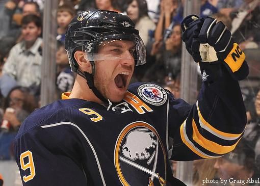
The Buffalo Sabres, however, wear their jersey numbers on their front right shoulder. As you can see on Jhonas Enroth, the HHOF patch fits nicely on the front left shoulder if the Sabres were opting not to have captains or alternate captains on Saturday night. But, as you may be aware, players must be designated either captain or alternate captain in order to speak to the referees on the ice. This is where the "fail" develops.

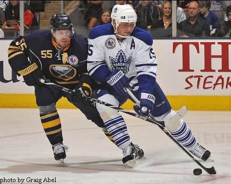
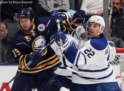
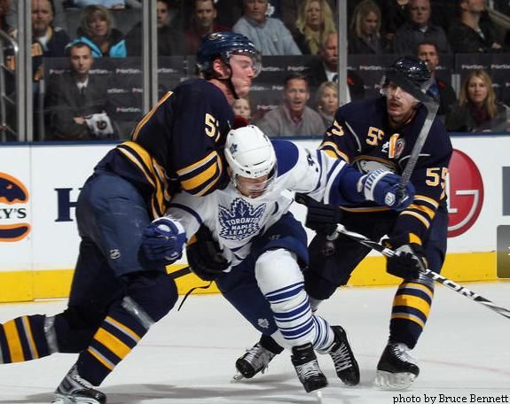
When looking at both Tomas Kaberle of Toronto and Jochen Hecht of Buffalo, it's clear to see why numbers on the front of the shoulder are a complete debacle. The captaincy designations are squished against the lace-up collar for the Sabres while Toronto's uniform looks clean and balanced. The eyesore created by the HHOF patch can be solved with one move: lose the numbers.

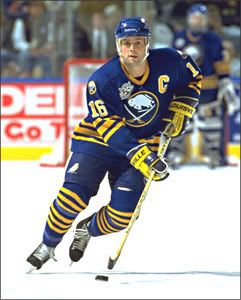
Clearly, in the Pat Lafontaine image, the front of the jersey looks clean and balanced in the same way that Toronto's jerseys did on Saturday night. Losing the numbers wouldn't be very difficult or problematic for any NHL team, and it just makes good sense with all of the patches being worn by teams for various reasons. While San Jose and the New York Islanders have yet to participate in one of these special games requiring a patch, but the numbers are still obtrusive and dumb.

The only way that Buffalo could have avoided this patch debacle was to have placed the patch on their shoulders like the New York Rangers did in 1999 and 2007. As you can see on Tim Connelly, there is nothing on the sleeves of the jersey to prevent the patch from being placed there, and there is precedence with the Rangers have done it in the past.

I'm sorry, Buffalo, but this look is an epic fail. And it bothered me every time I saw Craig Rivet, Derek Roy, and Jochen Hecht on the ice. Lose the front numbers when playing in an important game with a patch, or start using the sleeves of your jerseys.

Otherwise, don't participate at all.

Until next time, keep your sticks on the ice!

Thursday, September 2, 2010

Today is a lazy Thursday thanks to my preparations for a long drive tomorrow. As you may know, I will be heading down to the city of Houston, Texas! Yes, the same Houston that is home to the AHL Aeros, and was once home to Gordie Howe and the WHA's Houston Aeros! While neither edition of the Aeros will be playing hockey while I'm in the great state of Texas, I will be posting hockey information about each of my stops. It starts tomorrow, so here are a few links and pictures to keep you busy while I hit the open road!
  • Uni Watch Blog reader and long-time uniform expert Terry Procter has penned a very comprehensive uniform history of the AHL's Rochester Americans going back to 1956! Honestly, there should be a list like this for every single pro hockey team out there. It is this attention to detail that the serious fans and collectors appreciate, especially when lookng for a game-worn jersey or creating their own from a blank jersey. Well done, Mr. Procter!
  • Longest name in the NHL ever? It could be Rangers prospect Mats Zuccarello Aasen if he cracks the Broadway roster. The young man from Norway played with Modo, and can be seen in the second commercial here about the restaurant Mammamia. He was voted as the MVP for the Elitserien (Swedish Elite League) in 2009-10!
  • I might be late to the party on this one, but the Penguins will be wearing a patch to commemorate the opening of the Consol Energy Center this season. It's nice, but it had better not show up some place that makes it stick out. A quiet addition to a shoulder would be nice in this case.
  • I am loving the Detroit-octopus tie-in on Jimmy Howard's new mask paint! As I'm sure you're aware, Doctor Octopus was Spiderman's arch-enemy in comic books. The legend of the octopus in the Stanley Cup Playoffs has become a Detroit tradition now, so combining these two images together makes perfect sense! Now ony if we could get Stephen Valiquette onto another NHL team for this season, preferably a Central Division team....
  • Cool image seen in the next link as a team of professionals apply paint to the ice to create the Chicago Blackhawks center ice logo. I know for a fact that most NHL teams do this. However, the AHL's Manitoba Moose reportedly use plastic as it lasts longer than the paint does. I wonder how much painting the ice actually costs, and how often the teams are required to apply a fresh coat?
  • Check out this picture of the Quebec Nordiques battling the New England Whalers in the WHA! How can anyone say that the sweater the Nordiques are wearing is not gorgeous? I love the fleur-de-lis on the goalie's mask as well!
  • More old-time paint jobs include a reprint of the Calgary Cowboys' logo on the mask of their goaltender. Doesn't have the same effect as the fleur-de-lis did above, but it does the job, I suppose.
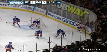
  • Can we end this ads-on-the-glass thing? Highly annoying and very distracting. I know traditionalists aren't thrilled with the ads on the boards, so now we add ads to the glass? Less is more, people.
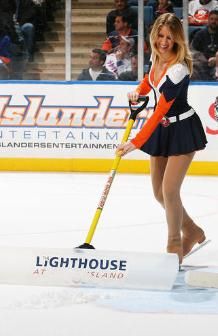
  • You know everything is for sale when the Islanders' Ice Girls are selling ad space on the shovels they use to clean the ice. I suppose if it's a white space, it's a place for some sort of advertisement. I'm just not too pleased about it.

There's a few pictures and links to keep you busy for the day. I'm out as I have many preparations to go through! See you tomorrow in Wahpeton, North Dakota!

Until next time, keep your sticks on the ice!

Wednesday, August 4, 2010

There was some breaking news yesterday as Gary Bettman, Commissioner of the National Hockey League, was actually spotted in a Canadian city! Ok, that's not all that impressive, but he was in Calgary, Alberta for the announcement of the 2011 Heritage Classic Game taking place in that city. This is the second time an NHL outdoor game will be held in Canada, and both have been hosted by the province of Alberta as Edmonton battled Montreal in the bitter cold in 2003. Montreal prevailed in that game, but the NHL was the real winner as the demand for outdoor games grew into the Winter Classic on New Year's Day annually. With 40,000 people watching Montreal and Calgary battle at McMahon Stadium, this game should be great as well.

Of course, we cannot forget about all the marketing being done by the NHL and the Calgary Flames to bring people in, and we'll look at that today. From logos to Heritage Classic uniforms, there was a pile of stuff to be seen and heard from yesterday.

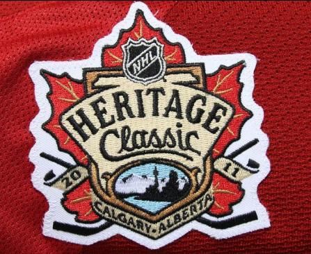
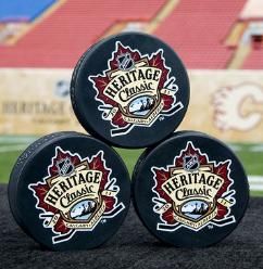
We'll start with the Heritage Classic logo as seen above. I like that it is not adorned with any corporate logos or shenanigans. The maple leaf marks the Canadian event with something truly Canadian, and Calgary skyline represents the host city's inclusion on the logo. Thumbs-up with the Heritage Classic logo, and prepare yourself as you'll probably be seeing this logo everywhere once the season starts.

Montreal decided to roll-out their Heritage Classic jerseys by... um, doing nothing. The Canadiens will wear their everyday road jerseys in Calgary on February 20, 2011 with one slight modification: the Heritage Classic patch. I get that Montreal wore a ton of jerseys over the last two seasons, and they might be a little "jerseyed" out, but this is the Heritage Classic. It's not like it happens everyday. Thumbs-down to the NHL's most-storied franchise.

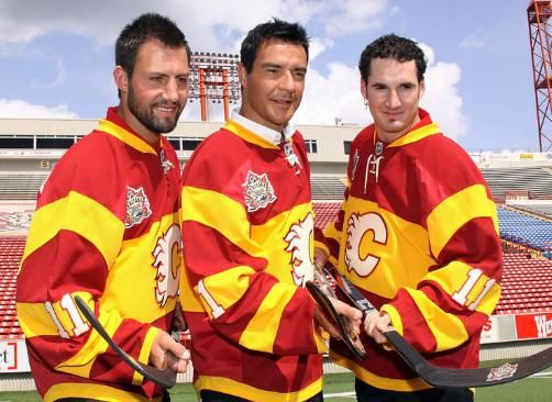
The Flames, on the other hand, will have a new uniform for the Heritage Classic, and it is modeled after the Calgary Tigers' uniform worn in 1924 NHL season. The Tigers won both the Prairie Hockey League and Western Canadian Hockey Championships that season, and were the first Calgary-based team to play for the Stanley Cup. Who did they meet in the final? The Montreal Canadiens. Montreal's Howie Morenz scored a hat trick in a 6-1 hammering of Calgary in Montreal, and Montreal's Georges Vezina stole the show in a 3-0 shutout win over Calgary in Ottawa to sweep the three-game series.

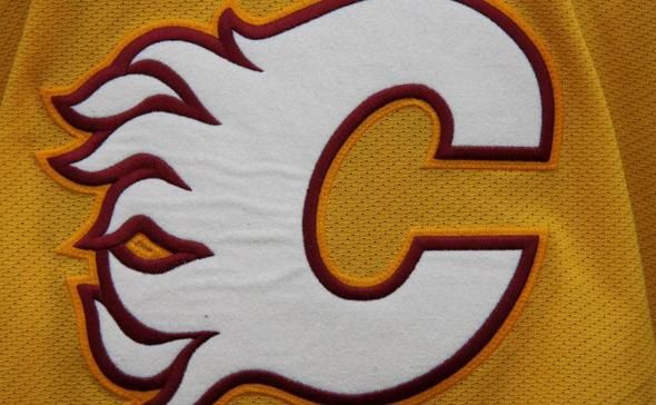
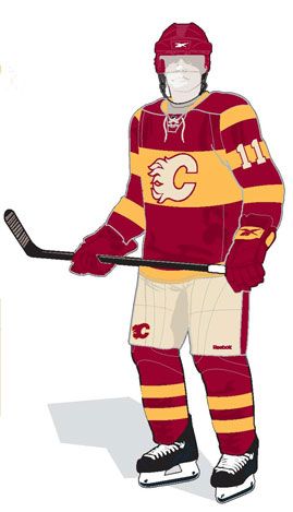
The Flames, going back in the city's hockey history, decided to honour the Tigers, but modernize their look. The yellow-and-black of the Tigers' sweater is gone, replaced by a dark-red-and-yellow look. The Calgary Flames' logo will appear on the chest of the players in white, and they will wear tan pants to fit the timeframe of the uniform.

Would I have liked to have seen the Flames bring back the Tigers' look? Undoubtedly. I like hockey history. But the two teams - the Flames and Tigers - are not linked aside from calling Calgary home. Designing the new uniforms in Calgary Flames-esque colours makes sense for the Flames as they can sell their newest creation to their rabid fanbase. The people of Calgary support their hockey team as well as any other city in the NHL, and this includes buying up jerseys with their favorite player on the back. This is a great sales opportunity, and I think the Flames are doing the right thing despite the historical inaccuracy.

There are a number of people on various websites who have said that this uniform is a "fail", but I disagree. As stated above, it's an excellent way to push jersey sales, and their look for the Heritage Classic is unique. The tan pants that everyone seems to be complaining about is no big deal, in my opinion, and there have been similar opportunities when concerning a heritage game. While the striping on the arms and socks does have a bit of a "Ronald McDonald" look to it, the uniforms are distinct and unique - something the NHL can use more of in spades. Overall, thumbs-up from this writer on the new Flames' duds.

It appears that this game will look pretty good with the contracts in uniforms between the two teams. All Calgary needs is some stable weather for this game, and this could be another very memorable outdoor game produced by the NHL. I'm looking forward to it already!

Until next time, keep your sticks on the ice!

***Photos taken by Brad Watson and Dylan Lynch!***