Showing posts with label mascot. Show all posts

Friday, March 4, 2011

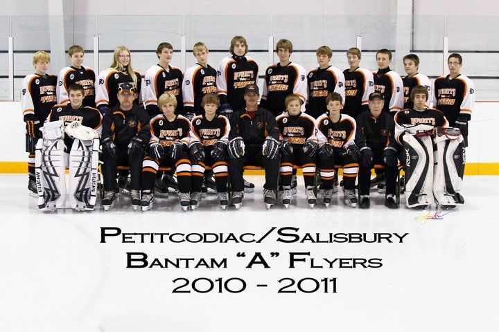
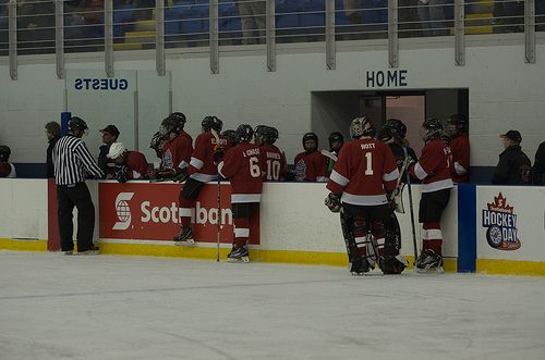
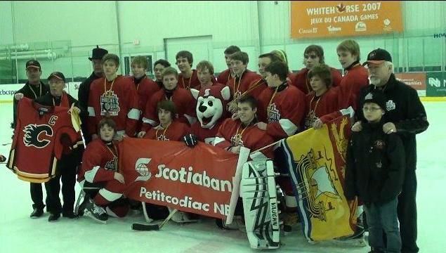
I was contacted a few weeks back by a lady who had been on the trip of a lifetime with a hockey team that worked their butts off to make it happen. I'm talking about the Petitcodiac/Salisbury Bantam "A" Flyers from New Brunswick who were featured on Hockey Day In Canada on CBC! Miss Michelle Nott wrote me with her story of the trip to Whitehorse that the Flyers experienced, and she also detailed all the cool stuff they did while in Whitehorse! Let me just say that I am jealous of the fun they had! Here is Michelle with the recap of everything that happened on Hockey Day In Canada!

4:30am. Thursday February 10th 2011. It’s finally here. The day I’ve been waiting for since December 7th when I was told I had won the Scotiabank "Big Save Contest". As I walk into the airport, I am greeted by 49 people who are also making the big trip to Whitehorse, Yukon. There are 19 players, 4 coaches, and 27 parents. The energy in the airport is amazing! Everyone is so excited.

It had been 2 months since we first found out that we had won the Scotiabank "Big Save Contest". None other than Ron MacLean had sent us a DVD that was played in our arena, announcing to the boys (and 1 girl) that they would be taking a trip all the way up to northern Canada to celebrate Hockey's birthday in Whitehorse, Yukon. We had been preparing for this day ever since.

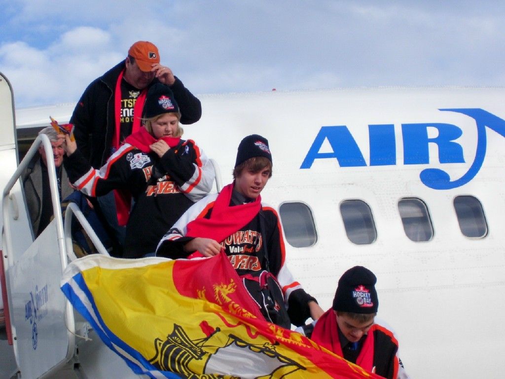
Our flight left Moncton at 6am, and we traveled to Toronto, then on to Edmonton. Finally, we landed in Vancouver for the night. It was a ten-hour day, and we still had to travel another four hours on Friday to get to Whitehorse, Yukon.

Friday February 11th, 2011. We left the hotel in Vancouver at 7am to go to the airport. There was a lounge set up for us by Scotiabank for breakfast. Shortly after we finished breakfast, the Vancouver Giants (a WHL team) arrived in the lounge to join us. It was so amazing for the kids to be in the same room as pro hockey players who were not too much older then they were. While we were having that awe-inspiring moment, in walked Pat Quinn (former Toronto Maple Leafs head coach). When the kids noticed him, their jaws dropped. They were so excited and overjoyed and couldn't wait get near him. Mr. Quinn was very generous and gracious, posing so the parents could take pictures of him with each one of our kids. Out of the corner of my eye, I see a smile that has just lit up the room. It is OUR head coach Randy, who is beaming from ear to ear.

The whole time leading up to this trip, all I could think about was what an unparalleled experience this was going to be for our kids. It never dawned on me how incredible this was going to be for our coaches as well. Most of the hockey legends that we were going to be meeting over the weekend, were stars in the days that our coaches were teenagers. This just made me even more excited, realizing that this trip was going to mean at least as much to the coaches as the kids, if not more.

We boarded our Air North charter flight with the Vancouver Giants and Pat Quinn. We made a stop in Kamloops to pick up the Kamloops Blazers (another WHL team) who would be playing on Saturday evening against the Giants. So there we were, onboard a flight with 2 WHL teams and Pat Quinn! How cool is that??

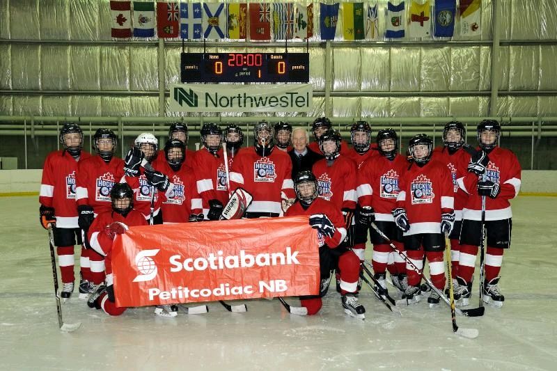
We landed in Whitehorse around 12:30pm and were immediately whisked off to a private reception with both WHL teams, the mayor of Whitehorse, other dignitaries, media, and the Whitehorse Bantam B Mustangs(the team we would be playing on Hockey Day in Canada). From there, we were bused over to the Canada Games Center for a practice. The Flyers and the Whitehorse Mustangs would be practicing together that day.

When the kids got on the ice, they were so excited to see that they were going to be coached by none other than Wendel Clark. I’m sure that all they really wanted to do was just enjoy the absolute glory of the moment.

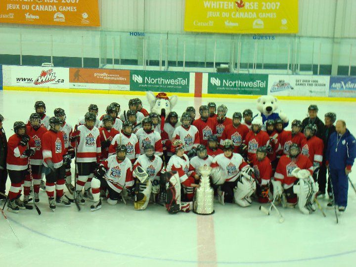
Just when you think that the practice can’t possibly get any better, Wendel Clark calls all the boys in (from both teams) to gather at center ice. A man with white gloves takes out the Stanley Cup, and proceeds to carry it onto the ice, placing it right in front of the boys. The look on their faces and amazement in their eyes at that moment was indescribable. Here is a piece of hockey history, sitting just a few feet in front of them! The cameras were flashing all around and before long, the man with the white gloves was ready to return Stanley to his safe and cushy box, but not before my two sons & I were asked to go over and have a picture taken with it. I kept nudging my oldest (who is a goalie) to touch it. He kept looking at me with this puzzled look. Not being sure if it was a good idea or not, he reluctantly touched the cup, and then a look of pride came over him. He whispers to me "that was so cool". If only he could understand how cool all of this was for me. I had won the contest, so for me, this was even more amazing. I was getting to see 19 kids’ faces, 4 coaches, 27 parents, and their reactions to how unbelievable this really all was.

After our practice, we were taken upstairs for a pizza party. The Mustangs and their parents joined us. It was a nice way for everyone to get to know the other players and parents, before the game the next day. Pat Quinn even came up to chat with everyone. He signed more autographs and had more pictures taken. What a great guy he is! Once the pizza party was done, the kids were able to go swimming in the Aquatic Center downstairs. They all had a great time just being kids and having fun. At around 8pm, we left on the bus to go to our hotel to finally check in. Since we had traveled all the way across the country in the last 2 days and were anticipating Saturday would be a very busy and full day, we all turned in rather early that evening.

Hockey Day in Canada - Saturday morning. 7am came rather quickly. We all met down in the lobby and walked over to the Catholic church for a pancake breakfast. We were greeted at the door by the mayor of Whitehorse, Honorable Douglas Phillips, and many locals who were very excited to meet us and welcome us to their beautiful city. We were just starting to eat when it was announced that His Excellency, Governor General David Johnston, was arriving to join us for breakfast. He took the time to meet all of us and talk with us before sneaking off with an apron to help flip pancakes in the kitchen.

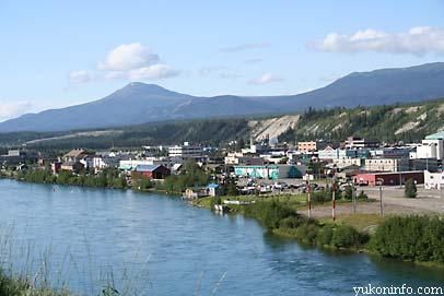
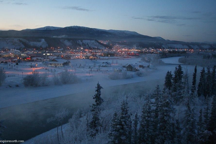
It was about 9am when we headed back to the hotel to go sightseeing. Because of our large group, we had 2 buses to transport us to wherever we needed to go. Our bus driver was extremely knowledgeable and took us to see all the great sights in Whitehorse. We stopped at Shipyards Park, roasted some marshmallows, and chatted with the locals. Then we went to see Whitehorse’s pride and joy, the SS Klondike. It is a huge sternwheeler that was used to run freight between Whitehorse and Dawson City along the Yukon river between 1921-1950. The ship is not normally open to the public, but we were given an exclusive tour inside the ship by a man who works for Parks and Recreation. Our bus driver told us some great old stories about the area, and took us to a lookout point, where we could see the gorgeous city in all its glory. We only had a little bit of free time for sightseeing, but what we saw, we loved. It was, of course, Hockey Day in Canada. It was going to be a big day for all of us.

At noon, we all headed over to the Canada Games Center to get ready for the big game: the Petitcodiac/Salisbury Flyers vs. the Whitehorse Mustangs. While they were in the dressing room, they received a few special visitors: Lanny MacDonald and Mark Napier, 2 NHL alumni. I was later told by Mark Napier himself that he was very impressed by our boys (and girl). He said they were very polite, friendly, and intelligent kids. He stayed to watch the whole game.

Puck drop was at 1pm. As the kids took to the ice, the carpet was rolled out for a very special someone to come on the ice to drop the puck. It was none other than Governor General David Johnston. Once the ceremonial puck drop was complete, he took a seat up in the stands and watched the entire 2hr game, cheering the kids on, and getting to know the parents of those kids. Our team had our coaches on the bench, and they were told that Wendel Clark would be helping coach the game. The Mustangs were going to be coached by Trevor Linden. Later on, it dawned on me that for the coaches, it would have been a true honor to have such accomplished professional hockey players helping them coach the kids. It must have been a very surreal experience for them, a dream come true. Not just anyone can say they’ve coached a hockey game WITH Wendel Clark or Trevor Linden!

Although Ron MacLean reported on TV that day that we were losing the game at one point by 3-1, we were in fact winning the game and won it 5-1. The class, the composure, the dignity and the sportsmanship that our Flyers displayed during that game filled us all up with such pride! They played a true good hockey game, and would have made every New Brunswicker extremely proud. When I saw our coach, Randy, I was busting at the seams. I asked him, "Are you as proud of the kids as I am? Weren’t they amazing?" Answering me with a huge lump in his throat (from pride), he said: "They were great. They were all so great." The kids had classroom sessions for about 7 weeks, where our coach (Norm) taught and stressed to them that they were all ambassadors for New Brunswick, Petitcodiac and Salisbury, and they needed to represent themselves with class, dignity, and distinction. This was a friendship game. Thank you Norm, you taught them well. They were excellent ambassadors, and each and every one of us could not have been more proud.

Ron MacLean was just outside the Canada Games Center broadcasting live all afternoon. Although the boys had hoped he might pop in and catch some of their game, he did not. This was a huge disappointment for our kids, seeing as they all thought they would get to meet him. Especially since it was Ron MacLean himself who had announced to them in the first place that they were going to be coming to Whitehorse.

Once the kids were finished the game, they made a mad dash to get dressed and we all went over to the Tikhini arena to watch the WHL matchup between the Vancouver Giants and the Kamloops Blazers. When we arrived, we noticed our seats were already cornered off for us to sit and enjoy. A huge carpet was rolled out on the ice and both the Blazers and the Giants were all lined up. It was obvious someone pretty special was going to be coming in on that ice. Moments later, Don Cherry himself entered the rink, and went on the ice for the puck drop. Don Cherry and Ron MacLean then walked off the ice to head to their booth where they would be broadcasting Coaches Corner that evening.

A few minutes into the game, the first fight of the night happened. I watched an entire section of kids (our kids) all stand up with their cell phones, each one trying to take pictures of the big fight. The mom in me was thinking, "Oh yeah, this is just great for them to see after the outstanding game they had played half an hour earlier." Just then, an overwhelming feeling came over me of "We’re Here! We’re in Whitehorse, Yukon!!!" How cool is that?!?

During the first intermission, 4 of our boys, our girl, plus 5 Mustang hockey players took to the ice for a shootout competition. That was very exciting for them. During the second intermission, the mascots took to the ice. There was Carlton the Bear, Harvey the Hound, Peter Puck, and the Scotiabank Bear and they put on the funniest show ever. They were, by far, the best entertainment you could have asked for, especially Harvey the Hound.

The game was a great game to watch. We heard that the Giants were 1st in the division, and the Blazers were last. The Blazers came out strong and hard, and it was a very close game, going from 1-1 to 2-2 with the Giants getting the very important final goal to win the game 3-2.

When the game was over, we all piled onto the buses, and headed out for a quick bite to eat. The boys (and girl) were going to head back over to the Canada Games Center for a family skate with NHL alumni for a couple of hours. They were a bit disappointed that no NHL alumni actually showed up for the skate, but they soon found their own fun by playing hockey on the outdoor pond at the arena. It was the perfect setting. It was dark. The spotlights were on the rink and the snow was lightly falling. It was chilly, and with the absolutely breathtaking scenery that is Whitehorse, it looked like the perfect way to end a perfect, amazing and unbelievable Hockey Day in Canada: playing hockey.

We left Whitehorse the next day. We flew all the way back across the country to get home.

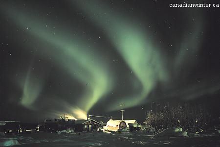
Looking back on the experience, there are no better words to describe our trip other than to say it truly was The Trip Of A Lifetime. Whitehorse is a beautiful city, filled with wonderful, warm, hospitable and generous people. You could not ask for a more beautiful city to host Hockey Day in Canada. In fact, it is so incredible there, that I personally believe Hockey Day in Canada should be held there every year. To me, Whitehorse represents the perfect setting for Hockey Day In Canada. It’s snowy and cold, yet so cozy and warm. Our trip was too short, and I most definitely hope to get back there as soon as possible so I can have the time to explore it more. We were so busy when we were there that I didn’t get to see even close to everything I had wanted to see. For me, the Yukon is one of the most beautiful, yet under-acknowledged, parts of Canada. It is a breathtaking city with a marvelous vista of lakes and mountains. It is majestic. A true hidden gem with so much to discover. Such an extraordinary place just waiting for you to have extraordinary experiences. I would suggest to anyone reading this to make a point to visit the Yukon. Especially Whitehorse. I promise it will be even more then you can imagine.

Thank you, Scotiabank, for everything. It was truly was amazing. The warmth, hospitality, and attention that was given to us by every employee that represents you was outstanding. Thank you for The Trip of a Lifetime. It was all that, and so much more.


WOW! Thank you, Michelle, for this incredible recap on all the stuff that you and the kids and the coaches and the parents did while in Whitehorse! This is simply amazing! And thank you for the pictures as well!

I admit it: I am very jealous, and I really want to visit Whitehorse now that I've read all that you did and how great the city and people sound. While the weather might be cold, I believe you accurately captured the true warmth of the people of Whitehorse and northern Canada perfectly, and this is one of the major reasons I'm planning on visiting there in the future!

Thank you to Scotiabank for running this contest as well! There wouldn't be a great story like Michelle's story had it not been for Scotiabank running their contest! Thank you, Scotiabank, for allowing this story to be written through your generous contest!

This is a fabulous story, and I, Teebz, am very jealous that these kids got to do something as cool as this. I'm quite certain that each and every member of the Petitcodiac/Salisbury Bantam "A" Flyers will never forget this experience. So allow me to say it: HOW COOL IS THAT?!?

Until next time, keep your sticks on the ice!

***All images, unless otherwise noted, as property of Michelle Nott and used with permission by HBIC. Please do not copy or use these photos without the consent of Michelle Nott. Thank you!***

Monday, December 13, 2010

An interesting story is developing out of Columbus, Ohio where it seems that the brand-new Blue Jackets' alternate jersey has found its way to the attic at Nationwide Arena. Because of the Blue Jackets' horrific record in their first four games wearing their new jerseys, the team has fallen into a superstitious fallacy that the new jerseys are either "cursed" or "hexed" in some way, and that has driven them to mothball the new uniform. Has there ever been an instance where a team has decided to "unmarket" their new jerseys because of how poorly they played while wearing them?

Things began to appear a little strange when the Blue Jackets took to the ice at home against the visiting New York Rangers in their regular blue uniforms instead of their new alternate uniforms. I thought there may have been some mistake, so I went to view the schedule of the alternate jersey dates. Lo and behold, that page no longer exists on the Blue Jackets' website!

So what gives? Why were the Blue Jackets in their regular uniforms instead of their scheduled alternate jersey night? According to The Columbus Dispatch's Tom Reed:
"'You know what,' [head coach Scott Arniel] said unable to suppress a grin. 'I just thought our red pants against their red pants would really look cool.'"
I'm sure that Stacey London and Clinton Kelly would be most shocked at this blending of identical colours, but Scott Arniel probably isn't worried about What Not To Wear as much as he's worried about winning hockey games. Thankfully, Mr. Reid was able to find the culprit in terms of who was responsible for the jersey snafu.
"Jackets players tried keeping a straight face as media members asked them who made the decision. Equipment manager Tim LeRoy deadpanned: 'It's my fault, I forgot to put (the third jerseys out.'"
Ok, so it seems that the players and staff of the Blue Jackets are having a little fun with their apparent superstition towards the new uniforms after having posted an 0-4 record in them and being outscored 18-5 in them. With Saturday night's 3-1 victory over the New York Rangers while wearing their regular uniforms, it seems the new alternate jerseys should remain tucked away in the back of the players' closets. However, a Blue Jackets spokesperson did say to Mr. Reid that they will make at least one more appearance:
"Prior to last night’s game, a team spokesman said the Jackets would sport them on Saturday against Dallas."
Personally, if they discontinue their alternate jerseys at any point before 2015, I'm chalking this experience up to an "epic failure". What makes matters worse, though, is that Boomer, the team's newest mascot, will be phased out of the Blue Jackets family. According to The Columbus Dispatch,
"Late last month, the Blue Jackets unveiled a second mascot - Boomer, a cuddly cannon - to great laughter and embarrassment because of Boomer's unmistakably phallic shape. Fans better get their digs in quickly. Sources have told The Dispatch that Boomer's role will shrink as the season moves along, and he could be retired this summer."
So they unveil a brand-new mascot who will appear only at Nationwide Arena when the team wears their new alternate jerseys, but then decide to "retire" him months later? I had said in a previous article that "a new cannon mascot named 'Boomer' who will only appear when the new uniforms are worn is far too kitschy, and seems very much like a marketing ploy". Did I foreshadow that one, or am I just clairvoyant?

Sorry, Blue Jackets, but you're making a mockery of yourselves with these alternate jersey decisions. You're a professional hockey team in one of the major sports in North America. Maybe try acting like you belong there. First, you reduce the number of games in which you'll wear your newest uniform. And then you kill off the mascot specifically designed and created to bring about increased exposure for these new uniforms. Does anyone at Nationwide Arena use their brains?

Epic failure, CBJ. Heavy emphasis on the "epic". But at least one member of the Blue Jackets is putting the onus on the right problem.
"Captain Rick Nash said outcomes are determined by the players' efforts, not what they are wearing. But he didn't doubt for a minute why the change was made. 'If you look at the stats, you can make an easy assumption.'"
And we all know what happens when ASSumptions are made, right?

Until next time, keep your sticks on the ice!

Thursday, November 25, 2010

The image to the left is that of the brand-new Columbus Blue Jackets' alternate uniform to be worn during the 2010-11 season and beyond. Columbus has worn an alternate jersey in the past that had the black shoulder-to-wrist yoke, and that look eventually became their everyday uniforms in 2007 with a few minor changes. In continuing with Columbus' "new uniform" trend, a brand new logo can be seen on their new alternate jersey, and they have introduced a new colour not seen as an accent colour on their uniforms before. But the big question always remains: how does this uniform rate? There are a few things that I like on this uniform, but we'll see if they make the grade below.

The new alternate uniforms are very clean, very simple, and very easy on the eyes in terms of their look. There are no flashy designs or crazy graphics or sensational striping, and the jerseys have a very "retro" feel to them despite the team being just ten years old. I'm not against this retro feel that the NHL seems to have reverted to, but maybe this should send designers a clear message that new is not always better. The overall exterior look of the new Blue Jackets' uniform gets a thumbs-up.

The rear font used on the alternate jerseys for the players' names is still the same as before. Keeping the font the same makes it easy for fans who have grown accustomed to the Blue Jackets' font over the last few years, so that's good. Thumbs-up for that decision.

The number font, however, has taken a turn for the "blockish". The Blue Jackets wore a very unique font on their regular uniforms compared to most of the other block-lettered teams of the NHL. That, however, has fallen to the wayside with the new alternate uniforms, and I, for one, don't think this was a necessary move. Block letters are nice for companies that cut and stitch numbers onto uniforms, but the NHL is a multi-billion dollar retail business based on the each team's unique features. It's the uniqueness of each team that separates them from all the rest. This move to block letters makes the Blue Jackets' alternate uniform less unique compared to the rest of the NHL, and that's a thumbs-down from me.

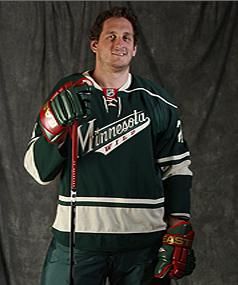
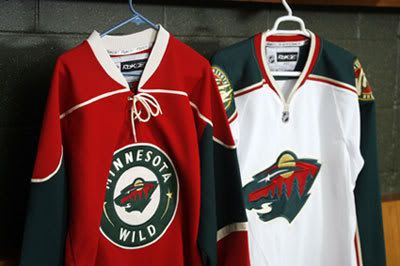
Speaking of a lack of uniqueness, what's with this colour scheme? Light blue, white/cream, and navy blue? That would be a unique colour scheme if it weren't for Nashville, St. Louis, Florida, and Pittsburgh. In fact, when looking at the last few alternate jerseys, all of Nashville, St. Louis, Florida, and, to some extent, Minnesota have been designed in the same fashion: hem stripes, sleeve stripes at the elbow, lace-up collars, and a shoulder yoke. Granted, not every one of these teams has all of these features, but the majority of them are present on each team's alternate uniform. Is Reebok simply not trying, or do the teams just not have any creativity? Thumbs-down to the overall design for the Blue Jackets because they look like everyone else.

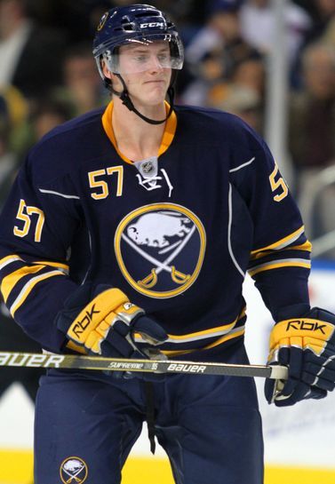
I do like the new logo on the alternate jersey, but, like the rest of the jersey, it seems to be copying something else from someone else. The Blues, Panthers, Penguins (twice), Sabres, and Wild all opted for a change back to a circular, retro-style logo in the last few years. The cannon? A great addition and could be a great logo on its own. The circular logo like everyone else? I can do without. I'll give this a push because the cannon logo is a great idea, but the circular logo has been done.

You may have noticed that the collar of the new Blue Jackets' alternate jersey has a special insignia on it. Blown up, you can clearly read the letters of JHM on the collar as the insignia. Why is that there? Let's go to the press release.
"To honor Blue Jackets founder John H. McConnell during the team’s 10th season, the initials JHM adorn the back of the neckline.The JHM edition of the jersey will only be worn by the team during the 2010-11 season. For jerseys sold at retail, the JHM will appear only on the initial production run, making it a true collectors’ edition."
Ok, so there's something to commemorate the team's founder, but I'm thinking this really isn't necessary. Yes, it will make game-worn jerseys fairly unique and recognizable through this special mark, but fans aren't really interested in a collectors' edition unless they are interested in buying every single uniform the team has worn. Making that person a "collector"! Thumbs-down.

The writing on the outside of the collar isn't the only place to find something as the Blue Jackets added stuff to the inside of the collar too! Let's go back to the press release for the reasons this was done.
"The phrase 'We Fight. We March!,' which appears on the interior of the jersey’s collar, was first introduced during the 2008-09 season to describe the Blue Jackets’ first-ever march to the Stanley Cup Playoffs. The expression continues to represent the team’s intention each year to fight and march throughout the regular season and into the playoffs. Below 'We Fight. We March!,' 10 stars commemorate the introduction of the jersey in the club’s 10th season."
Here's a news flash to all designers: if you can't see it, it doesn't exist. If this stuff was really that important, why not add ten stars to the bottom hem to commemorate this jersey's addition to the Blue Jackets' wardrobe where it can actually, y'know, be seen? Adding the motto on the inside is simply adding for adding's sake. These two "features" serve zero purpose overall, and have already been done by two teams: the Pittsburgh Penguins and New York Rangers. Pittburgh gets a pass simply because it will be worn on the Winter Classic uniforms, and it commemorates that event. The Rangers, however, fail miserably because no one cares about the year the franchise was established. If you're a fan, you already know that! Therefore, the Blue Jackets fall into the latter category of "fail miserably", leaving them with a thumbs-down for this idea which seems dumber and dumber every time a team does it.

Ok, so where do we stand? Well, I count 2-4-1. These jerseys just seem too cookie-cutter to me in terms of how they look. I expected more, and some of the kids in Columbus did as well. That first image by Brittany Curry? Not bad at all! I think that, for all the hype and secrecy on this unveiling, the results leave me feeling a little underwhelmed. That's never a good thing for your fanbase, especially those who don't live in the metro area of Columbus, Ohio, because they probably won't want to be part of the "We Fight, We March!" squad. I expected some creativity after they came up with a gorgeous home and road set, but all I see are ideas stolen from other teams. And that's not very professional.

Sorry, but I expected more, Jackets. You gave us a fairly standard uniform in terms of how it looks with very little original design. What's that? You did provide something more? I'm sorry, but a new cannon mascot named "Boomer" who will only appear when the new uniforms are worn is far too kitschy, and seems very much like a marketing ploy. He's not Batman who appears when the Bat Signal comes out. And you certainly don't need a second mascot when Stinger is already wearing the new threads! What's the point of that?

Because of this, I now fear the unveiling of the new Anaheim Ducks' alternate jersey coming up.

Until next time, keep your sticks on the ice!

Wednesday, September 29, 2010

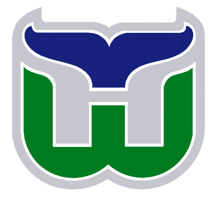
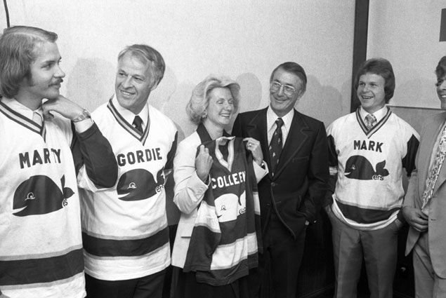
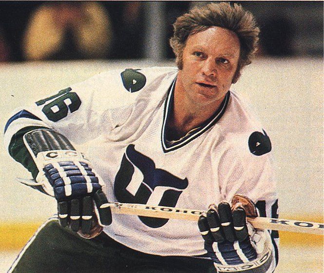
It's late on a Wednesday night, but I've been waiting for this announcement for a long time. The Whalers Sports and Entertainment group, having been successful in their purchase of the AHL's Hartford Wolf Pack, began their quest to bring the Whale back to Hartford. The image to the left is of the Whalers' center ice design before they started their final game in Hartford against the Tampa Bay Lightning, and there was hope that the iconic Whalers logo, while never being duplicated, could at least have some influence on the new logo that the soon-to-be-called Connecticut Whale will wear.

With baited breath, I waited and waited for this evening. The announcement was made that the Whalers Sports and Entertainment group would unveil the new logo before the exhibition game between the Wolf Pack and Albany Devils this evening, and I've been scouring any news source that may have the new logo available.

And we finally have it!

And with that new logo comes the inevitable letdown when comparing this gorgeous logo with this cartoonish, minor-league logo. Even the OHL's Plymouth Whalers have a much more professional logo than what the AHL's Connecticut Whalers will wear at some point in the 2010-11 season, and the Plymouth Whalers are a Canadian junior team!

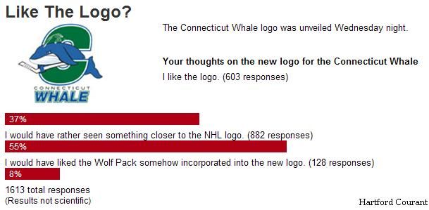
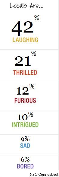
From the way a couple of surveys are going, it appears that this move to change the Wolf Pack to the Whale isn't being met with a lot of support after seeing this new logo. According to the Hartford Courant's online survey, only 603 people have liked the logo thus far out of the 1613 people that clicked on the survey. That's a mere 37% of the people surveyed, and over half of the respondants would have preferred something closer to the NHL logo. Over on the NBC Connecticut's site, their survey shows that twice as many people are laughing in regards to the new logo as there are people who are thrilled. I'm no Marketing whiz, but I'm pretty sure this isn't the kind of groundswell that a new logo and newly-named team wants.

There is some good news for Whalers fans, though. Pucky the Whale will remain as the mascot for the new Connecticut Whale, and that has to be good for fan morale. I've always liked Pucky, and thought he was highly underrated. He is, however, one of the few mascots to actually appear on an NHL jersey, and he even had his own patch!

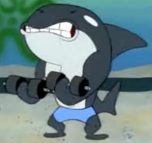
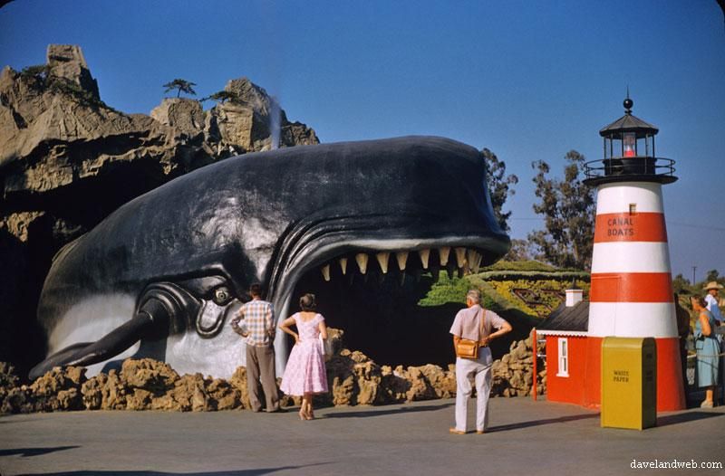
"We wanted to not only incorporate our traditional Whaler green, but focus on the whale, the official animal of the state of Connecticut," according to Howard Baldwin, chairman of the Whale franchise. No offence to Mr. Baldwin, but when Spongebob Squarepants has a better whale character than your pro hockey team, you're missing the entire point of the exercise. I mean, you don't have to hire Walt Disney to design your logo, but they did a heckuva better job in both Pinocchio and Finding Nemo than what was put forth here. But who am I to criticize? After all, I'm not a graphic designer.

Personally, I expected more from Howard Baldwin's team. He knew how much the Whalers meant to Hartford, and he came up short with this design. Very short. I'm officially going on record here: I hate this new logo. But that's just me.

What say you, readers? What is your take on the new Connecticut Whale logo? Comments are encouraged on this one!

Until next time, keep your sticks on the ice!

Wednesday, July 14, 2010

A friend of mine emailed this to me today, and I had to watch it several times to catch a pile of awesome stuff in the video. Winnipegger Joey Gregorash, a semi-famous musician from Winnipeg, put together a little tune about his favorite NHL team, the Winnipeg Jets. The video was then put to highlights of the Jets, and the result was the video below. Take a look through and note all the interesting stuff: Benny the Jets' mascot, the goalie masks, the uniforms, Ron MacLean with hair.

Now Gregorash wasn't just some random Winnipegger with some American Idol-esque talent. He was a rock musician with a Winnipeg-based band called the Mongrels, and he became the first solo act from Manitoba to win a Juno Award in 1972 for Outstanding Performance by a Male. His win knocked Gordon Lightfoot off the top rung of Canadian music as Lightfoot had won the two previous solo awards.

He's still fairly well-known today thanks to a couple of major hits in the 1970s in "Jodie" and a cover of Neil Young's "Down by the River". Personally, I much prefer Gregorash's version of "Down by the River", but to each their own, right?

In 1987, he returned to the music scene with "Together (The New Wedding Song)", a must-have song at weddings around the world. He also hosted a show for kids called S'kiddle Bits that took him around to various places in Winnipeg as well as showcasing his musical talents.

I liked this little look back at the Jets, and it brought back some good memories: Selanne scoring his record-breaking goal against the Nordiques, Selanne playing on a line with countryman Jari Kurri at the All-Star Game, Zhamnov, Tkachuk, Housley, Essensa, Carlyle, and all the great moments in Jets history. And Gregorash's contributions cannot be forgotten!

Until next time, keep your sticks on the ice!