Showing posts with label jerseys. Show all posts

Saturday, March 12, 2011

There is no quantitative limit with regards to the respect and admiration I have for hockey history. There are so many great stories and so much fascinating imagery from the game that it should be celebrated as often as possible. Thankfully, Classic Auctions is holding another one of its fabulous sports memorabilia auctions, so I think it's time we revisit some of the great history seen in the game of hockey and some of the associated stories that have come along with these small glimpses into the annals of the game. Let's take a look at some of the more interesting pieces up for auction this time.
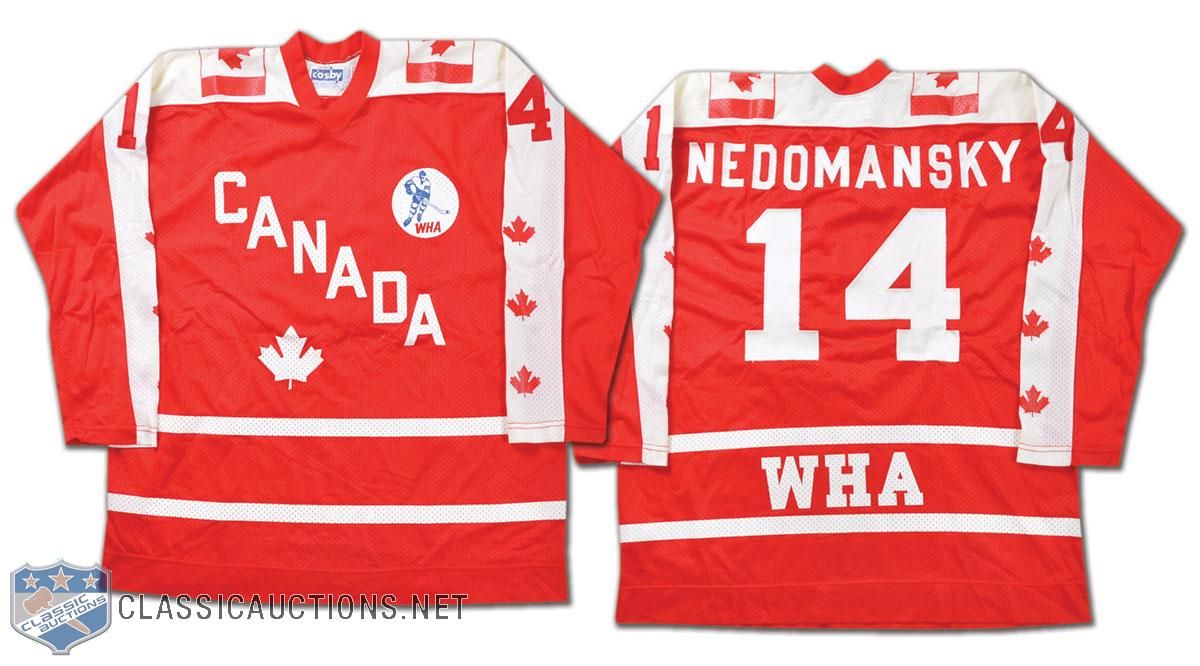
  • We'll start this look into hockey history with a glimpse back at a jersey from an all-star. Vaclav Nedomansky was chosen as a WHA All-Star in 1976, and he played on Team Canada for the game in Cleveland, Ohio despite being from Czechoslovakia! The reason for this is that the WHA chose players for their all-star teams based upon where they played rather than where they were born! The Canadian-based WHA teams sent players as part of the Canada All-Stars and the American-based WHA teams sent players as the United States All-Stars. In 1976, Toronto Toros' star Nedomansky and the Canadian WHA All-Stars beat the US WHA All-Stars by a 6-1 score on January 13 at Richfield Coliseum!
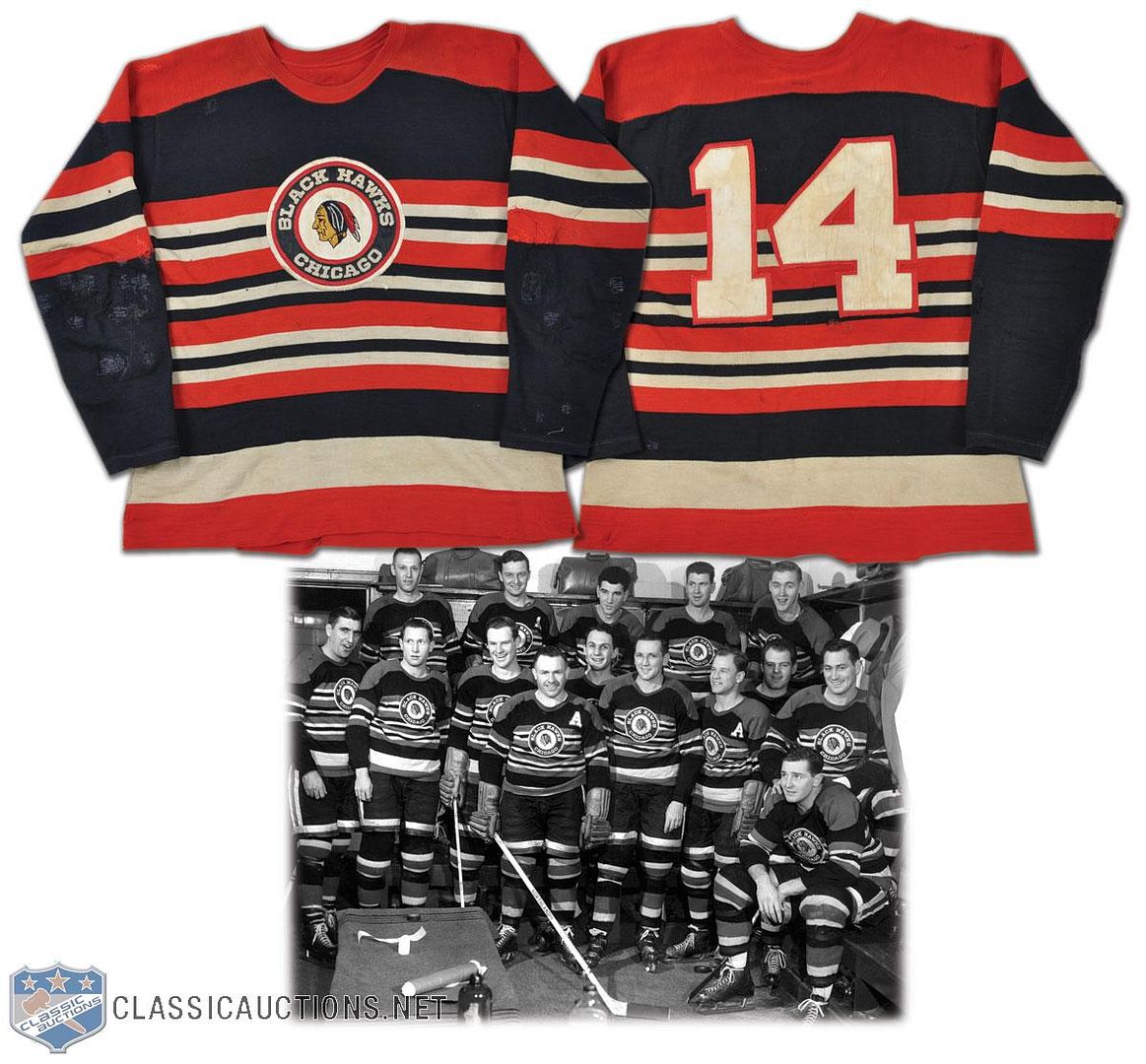
  • We move on to an Original Six team. I have to say that I am a huge fan of this Blackhawks sweater from the 1950s. The colours, the stripes, the logo, the font... it truly is a thing of beauty! If there was ever an opportunity to bring back a different alternate jersey for the Blackhawks, this one gets my vote.
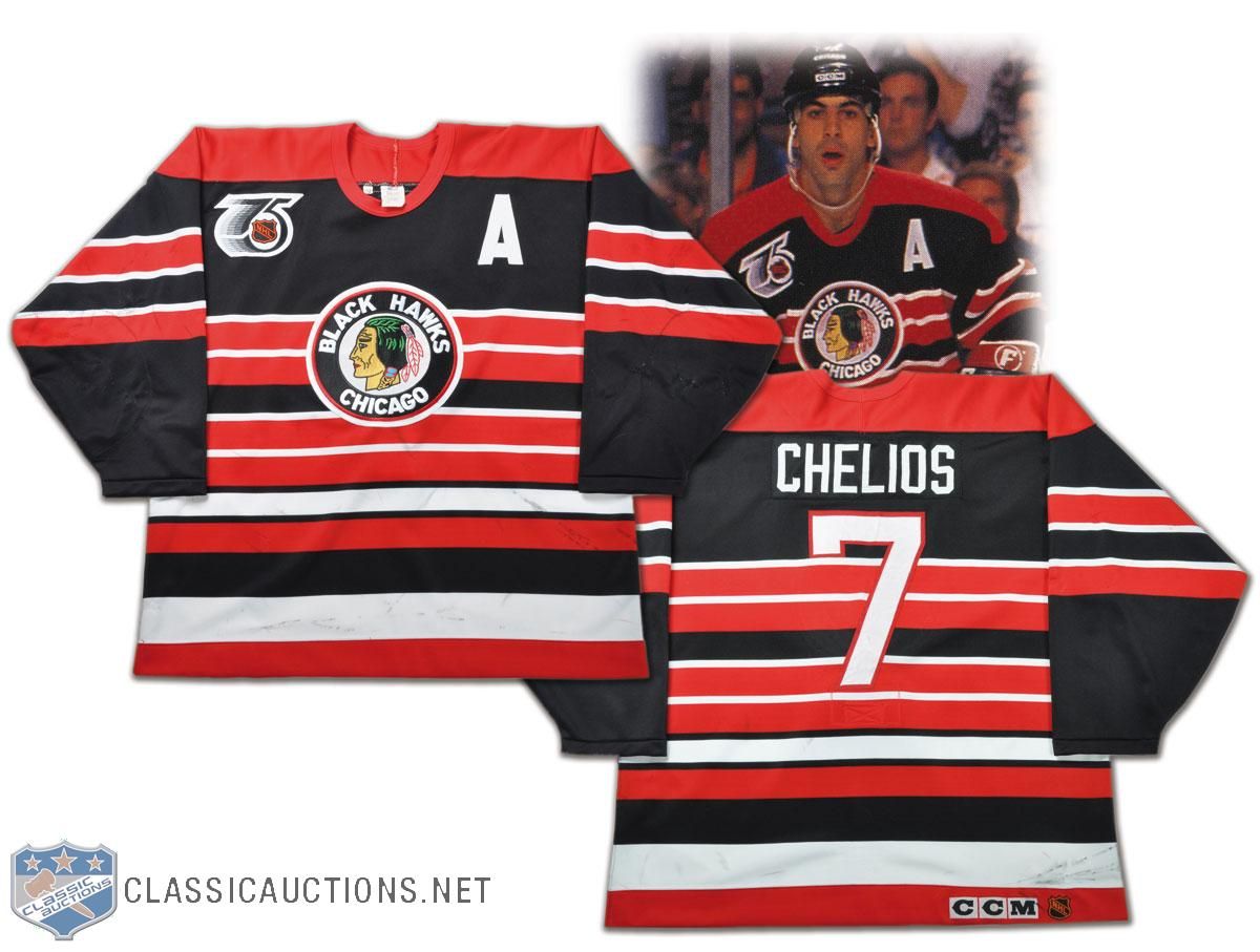
  • Strangely enough, the Blackhawks have worn this look closer to the future. In 1991-92, the NHL had the Original Six teams wear a throwback jersey, and the Blackhawks decided on a jersey that looked remarkably like their sweaters from the 1950s. Two things I don't like: the rear font they decided on, and the name on the back. The font is just too skinny, and if you're going to throwback to a previous incarnation, go all the way or don't go at all.
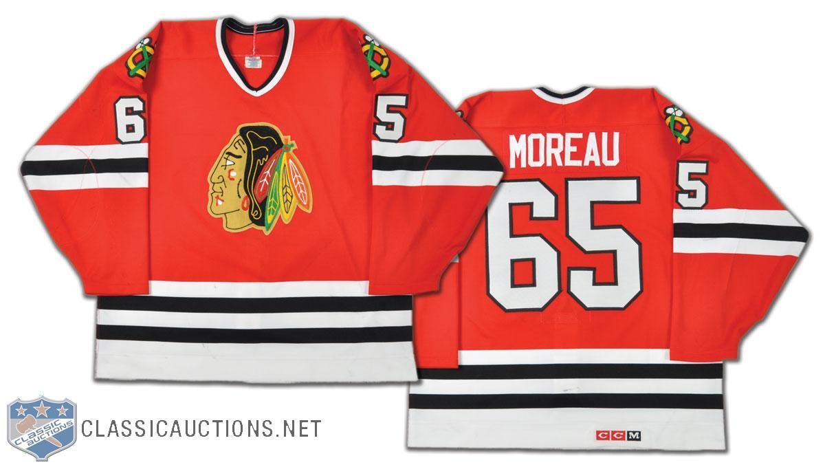
  • This is a rare find, but I'm always intrigued when I come upon a number that I've never seen a player wear. Ethan Moreau apparently wore #65 during the 1994 preseason! If you're a Moreau fan, this number is one of those rare finds - much like Joe Sakic's #88 jersey when he played with the Nordiques!
  • When you think of the Vancouver Canucks, does anyone else miss this look? I'm sorry, but as good as the current look is, there is still something about the skate logo that I truly miss about the Canucks. Maybe we'll see these beauties come back as an alternate one day? No one did yellow-orange-black like the Canucks did.
  • As much as I hated them as a Penguins fan, there is something magical about the red-white-and blue of the Capitals. But I do have one question about this Doug Jarvis jersey from the early-1980s: why are the hem stripes so huge? They literally go right to the logo which is mid-torso! That's a little crazy.
  • Just because there aren't enough Sutters in Calgary, here is more proof that the Sutter bloodline runs through the Flames. That's Shaun Sutter's jersey from the 1999-2000 season. Shaun is the son of Brian Sutter, and was drafted by the Flames when his dad coached there. Currently, Shaun serves as an assistant coach with the WHL's Regina Pats.
  • I've looked at this before, but there was something going on with the Philadelphia Flyers in the late-1970s and early-1980s. Check out the location of the captain's "C" on Bob Clarke's jersey from 1976-77. It's nearly in the middle of his chest! And it's still pretty close to his mid-line in 1980-81! What gives? Why is it so close to the middle of his chest?
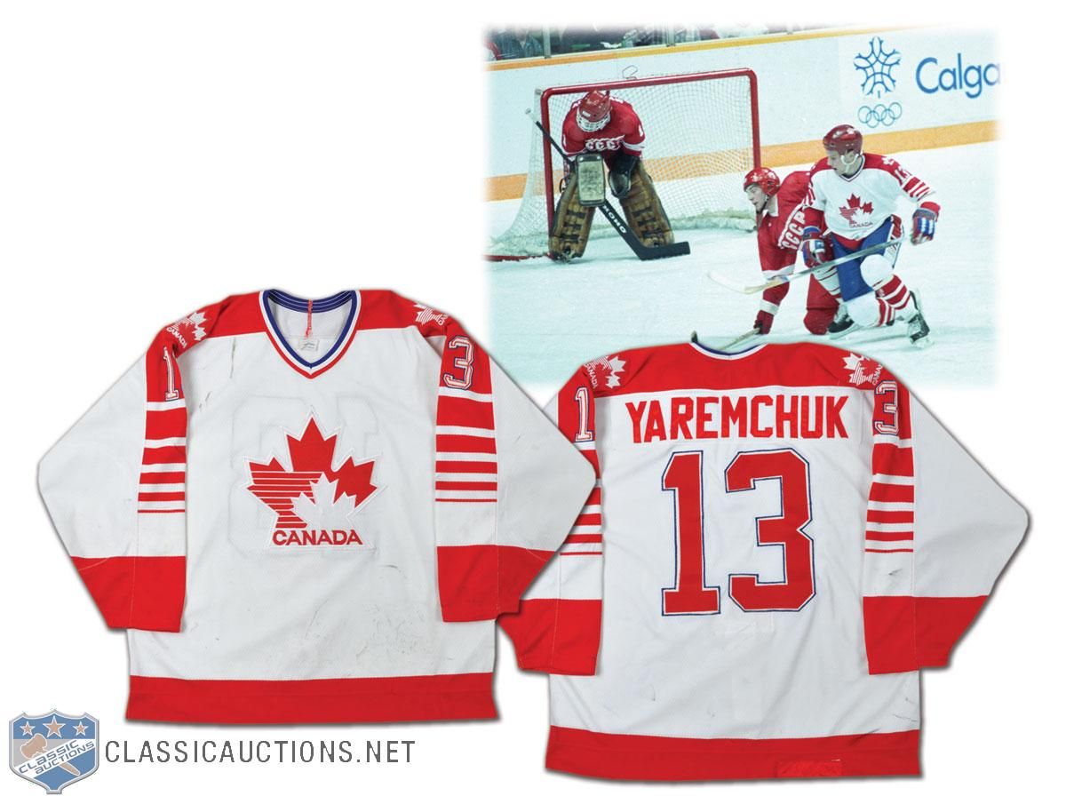
  • We move to the international scene. There's a big story surrounding the 1988 Canada Olympic jerseys that I wasn't aware of before reading the story on the Classic Auctions site. This is Ken Yaremchuk's jersey, and he played alongside NHL players like Sean Burke and Andy Moog as they prepared to represent Canada at the 1988 Winter Games in Calgary. Here's the kicker: "An embroidered CCM crest on the rear hem has been covered with a patch of red tackle twill, obviously to comply with advertising guidelines. Canada received a fine of $100,000 for refusing to wear uniforms made by Tackla at the Games". I never knew that! Corporate America already had a hold on the Olympic Games back then! How cool is that little gem of hockey history? I'm hoping your answer was "very".
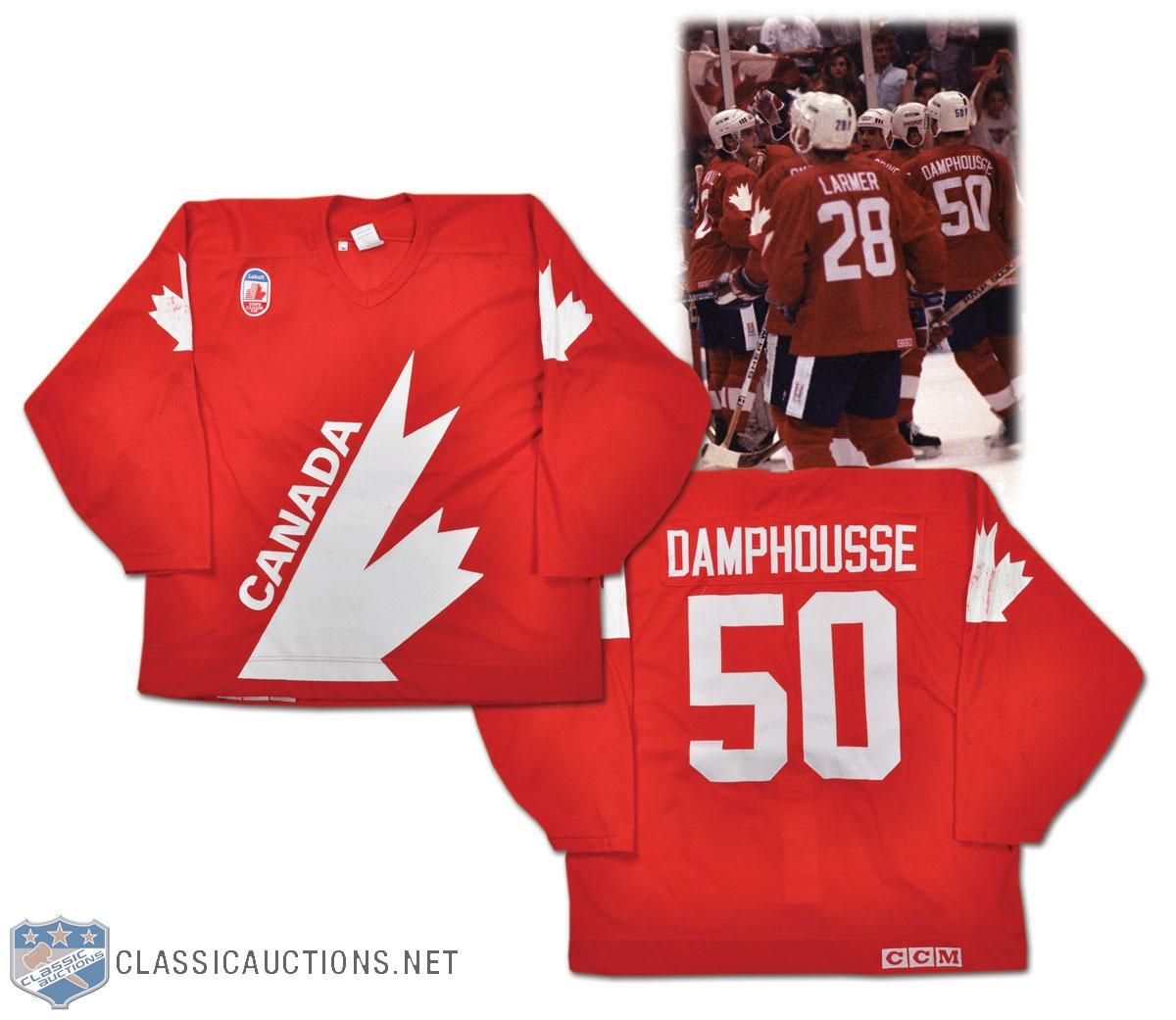
  • Here's a number that wasn't seen on the ice at the 1991 Canada Cup, but Vincent Damphousse played during the selection camp. He wore #50 through the camp as he worked to play his way onto the team, but he was cut days before the Canada Cup started. It's another one of those number cameos by a player who never wore #50 again. We'll see more of Damphousse later in this article as he has another jersey in this exposé.
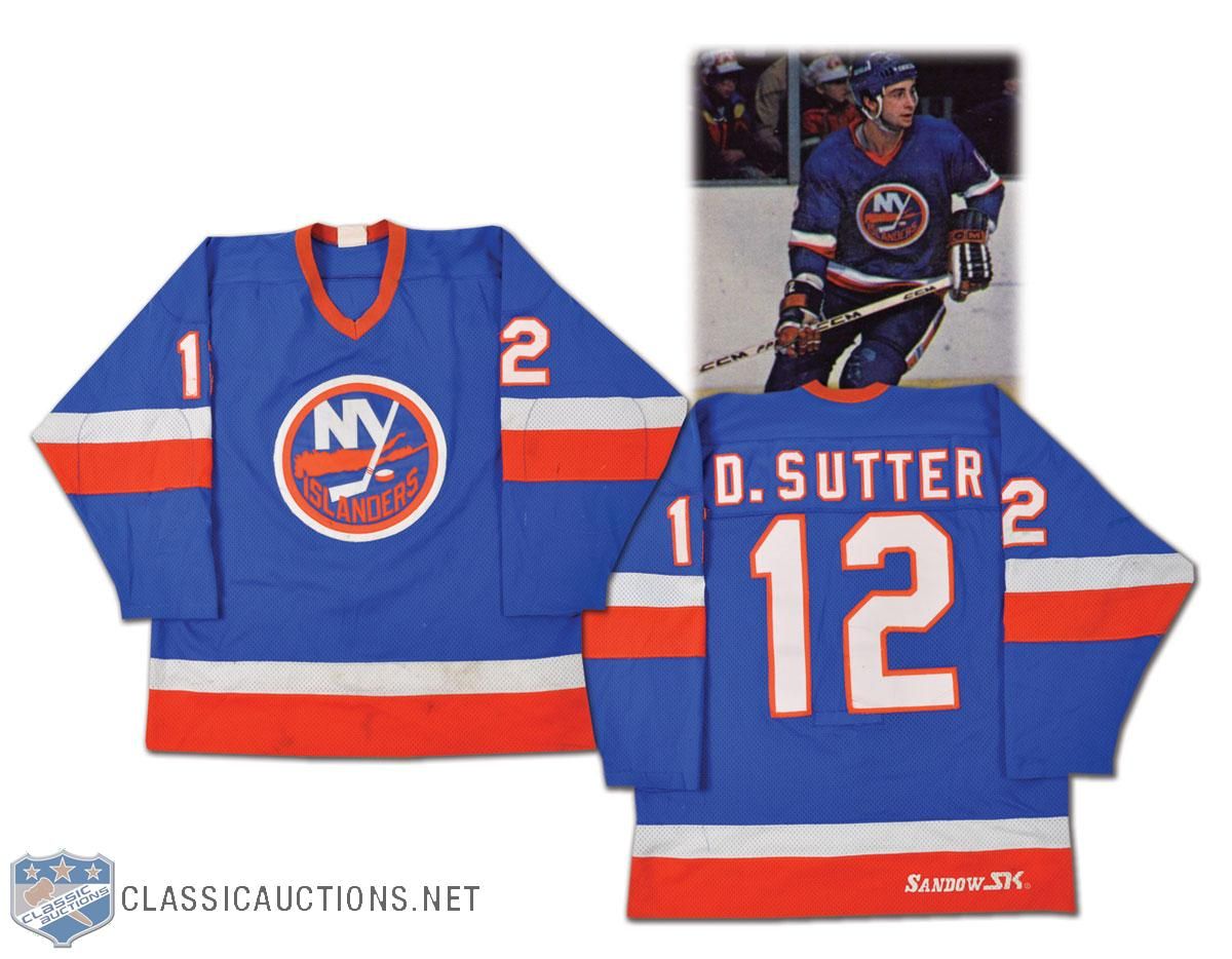
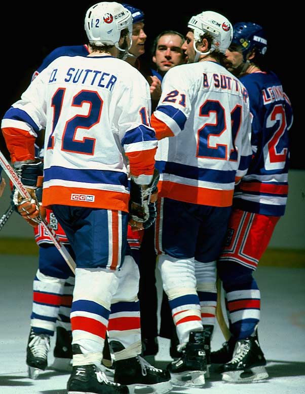
  • We mentioned a couple of Sutters already, so let's bring a couple more onboard in this article. We get a good look at Duane Sutter's jersey with the Islanders from '81-82, and I'm always a fan of the first initial on a jersey. However, as we look at this photo with both Duane and Brent Sutter in it, does anyone see a major difference in the lettering? Duane's appears as single-colour font while Brent's font is double-coloured. It appears this was corrected as of 1981-82.
  • With the Lightning changing their jerseys next season, it's always interesting to look back at some of their previous jerseys. Their inaugural jersey was interesting. Steve Kasper's jersey has that ridiculous font on it. I'm quite happy that it went the way of the dodo and was never seen again.
  • I have to say that I always loved the colours of the Minnesota North Stars. We get to see that gorgeous green colour of the North Stars jersey here on Basil McRae's uniform from the 1987-88 season. This is what Minnesota hockey looks like. Bring back the green!
  • Bob Rouse's jersey from his stint with the North Stars shows the addition of black to the colour scheme. This is how I think most people remember the North Stars. There were so many great memories of that Stanley Cup run in 1991 that ended at the hands of Mario Lemieux and the Pittsburgh Penguins in the final, but these great uniforms will stand out vividly in my mind.
  • The jerseys that the North Stars wore in 1991-92 really took leaps and bounds in the wrong directions with their "re-design". Nothing about that design even comes close to giving off that great North Star vibe, and it feels pretty bland as a hockey jersey. Little did the hockey world know that the "north" part would soon be a thing of the past.
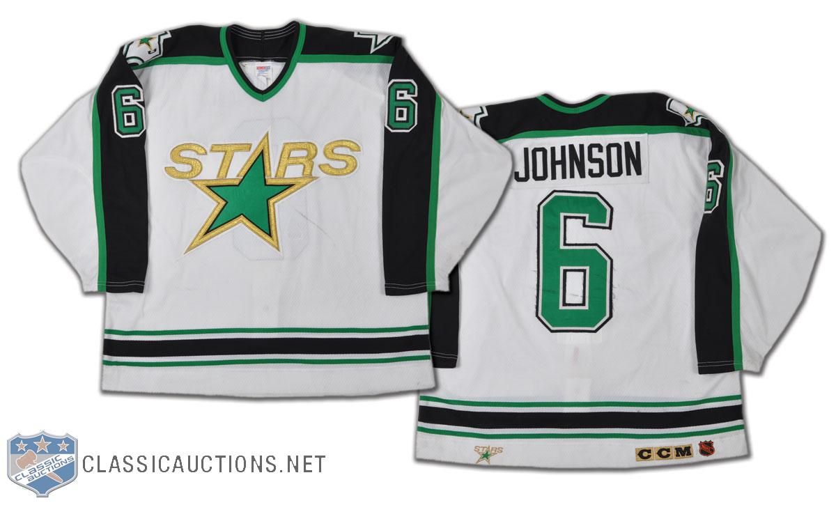
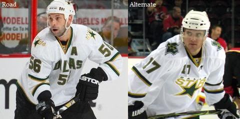
  • By 1993-94, the Stars would be playing in Dallas, and they would be wearing uniforms that seemed to have a lot in common with the earlier re-design. Note to self, fans: if your team suddenly begins to remove the parts of the uniform that make you distinctly unique like, say, part of the team name, I'd be suspicious.
  • Even the officials got in the act with some distinct designs. We've seen this image of Ron Ego calling a penalty in the WHA and discussed his red-striped officials jersey. I never scoured the internet for a picture with much intent because the referees seem to get lost in the shuffle of history. However, Wayne Mundey's referee sweater is a joy to behold!
  • The NHL officials showed that they wore the NHL colours for a long time as this official's sweater from the 1970s has orange numbering to match the NHL shield on the front! Wasn't it nice when NHL All-Star teams and NHL employees all represented the league by wearing the league's colours? The "good ol' days", I suppose.
  • The California Golden Seals seemed to miss the boat in the 1970s when they went pastel instead of staying true to their gorgeous green looks as the Oakland Seals. Bob Girard's uniform looks great, but it just doesn't have the same "pop" as the Oakland jersey does.
  • The 1975-76 Kansas City Scouts jersey is a nice blend of colours, but that logo really draws the eyes to it. That logo features chain-stitching, a favorite of Mr. Paul Lukas over on Uni Watch Blog. I'm not saying the colours should return in the same fashion, but I really think someone needs to come up with a new "Scouts" ensemble. Any takers?
  • Check out the logo on Nelson Pyatt's Colorado Rockies jersey from 1976-77. It looks a little off, doesn't it? That's because the Rockies didn't have their jerseys ready when the season started in 1976. The Kansas City Scouts had moved in the off-season before the 1976 season started to Denver, but they didn't have their jerseys ready in time for the start of the season. Thus the Rockies began the 1976-77 season with an odd-looking Rockies logo instead of their normal logos.
  • Speaking of another jersey that just doesn't seem right, here is a Penguins jersey from the late-1960s. The stripes being light blue just don't seem right after having seen them in yellow-and-black for so many years. Another of the jerseys lost in the annals of history, I suppose.
  • Don Maloney had an interesting career with the New York Rangers. While he wasn't officially the captain, he worked as acting captain whenever the Rangers saw their captain injured. Thus, he routinely is seen with the "C" on his sweater. However, Maloney is probably more well-known for his full name on the back of his sweater. I always thought that was pretty cool.
  • How many people remember Guy Lafleur's tenure with the Broadway Blueshirts? The original "Flower" laced up the skates with the Rangers for 67 games in 1988-89, netting 18 goals and adding 27 assists. I don't remember this, but Lafleur wore #44 while with the Rangers.
  • I found that the Detroit Red Wings did something as they evolved through the 1980s. In the late 1970s (and probably further back), the Red Wings used to use the wheel as the center point for their logo on their chests. The result? Greg Carroll's jersey looks seriously skewed because of the logo.
  • Another gorgeous throwback jersey from the 1991-92 season was worn by the Detroit Red Wings. Doug Crossman played with them that season, and the stripes make this jersey look amazing. This is still one of my favorite hockey jerseys of all-time.
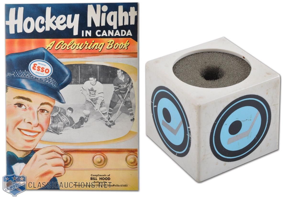
  • How cool is this Hockey Night In Canada microphone cover and book? Ok, the book isn't all that important, but how awesome would it be to have that microphone caddy? I might want one of those more than I want a fabled HNIC towel!
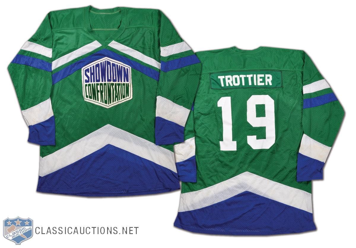
  • We've seen a number of the NHL Showcase Confrontation jerseys in the past, but there's another one in the auction this time around. Bryan Trottier's jersey is up for grabs this time, and I must admit that I really like the colours on this jersey. I may have to research these Showcase Confrontation games a little more!
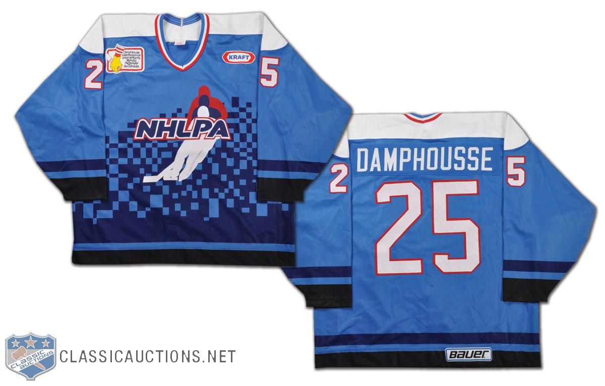
  • There are lots of people who saw the NHLPA 4-on-4 Challenge from Hamilton, Ontario in 1995, but there seems to be zero tape of these games online anywhere. During the strike, the players got together at Copps Coliseum in Hamilton to play some four-on-four hockey while representing their respective regions: Western Canada, Ontario, Quebec, and the USA. Vincent Damphousse was invited, and he played for Team Quebec at the event in this gorgeous NHLPA jersey. I want it!
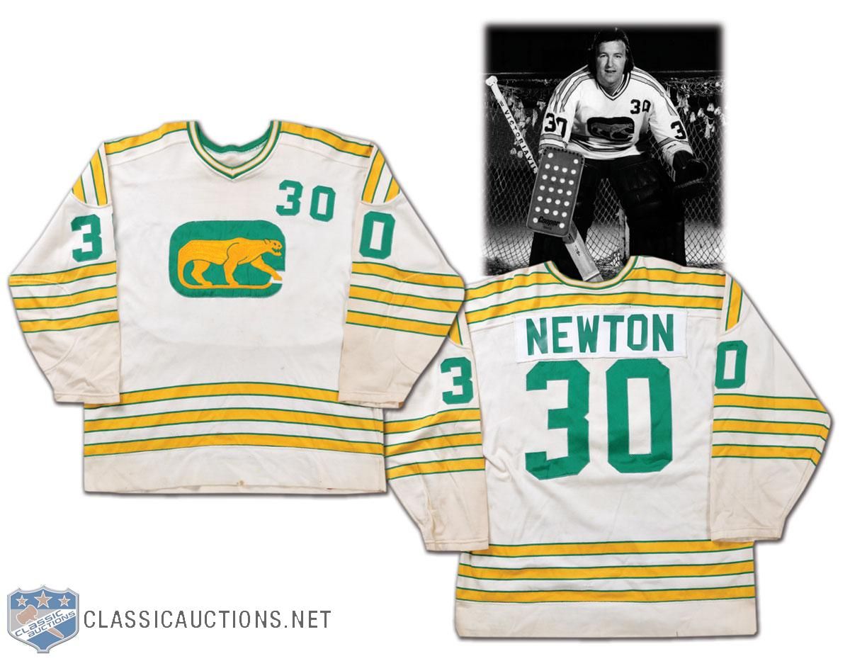
  • We started with the WHA, so let's end it with a few WHA sweaters as well. The original team with the number on the shoulder was the Chicago Cougars, and Cam Newton's jersey from 1973-74 shows the number clearly. I'm still not a very big fan of having the number on the front of the jersey in hockey, but it seems to have made a comeback with some of the NHL teams today.
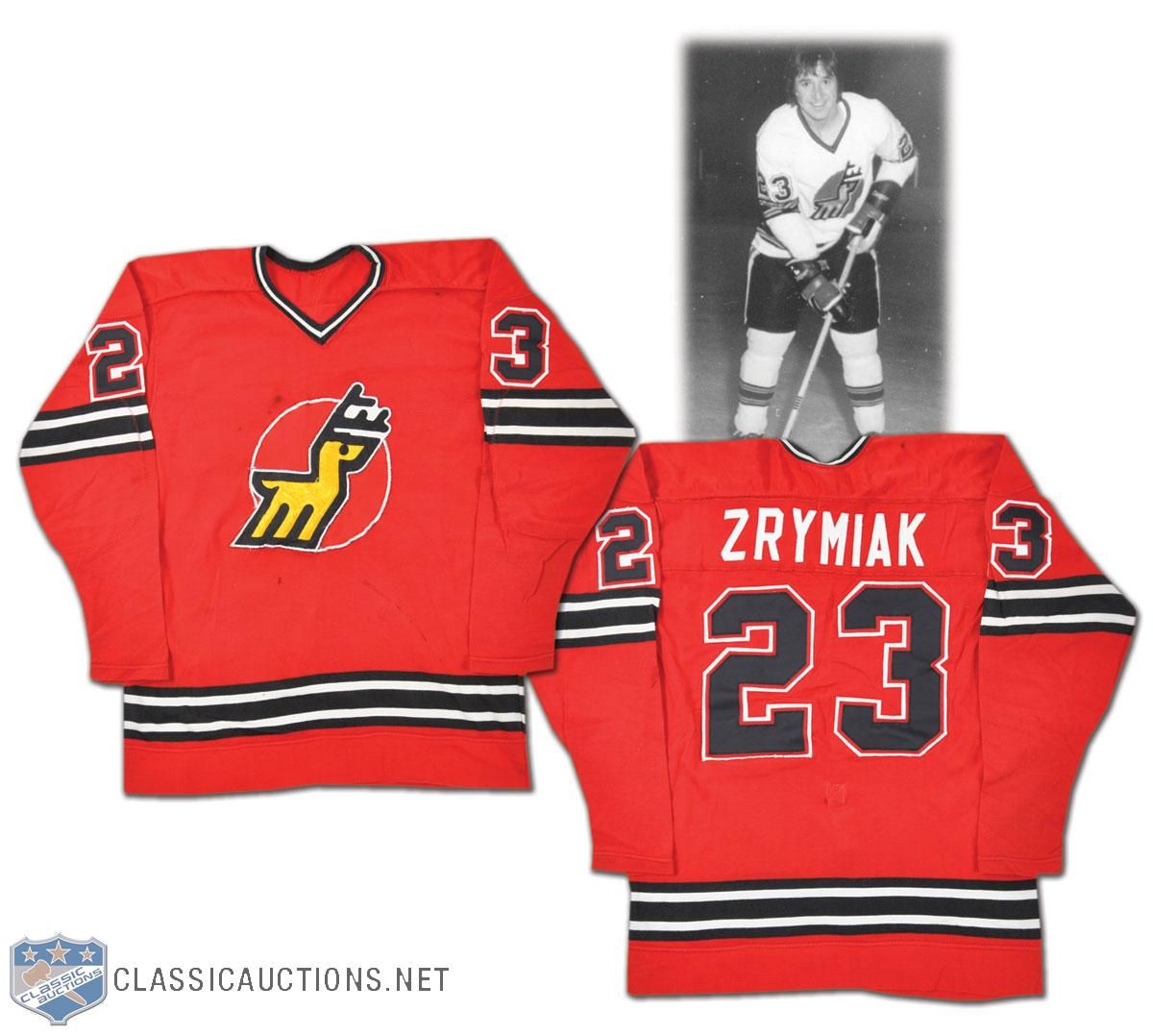
  • Journeyman defenceman Jerry Zrymiak bounced around the WHA for a while, but he played with the Michigan Stags for a while during the '74-75 season. I'm not sure about you, but the name "Michigan Stags" just sounds like a manly name. The colour is a little less manly, though. I love the Stags' logo, though.
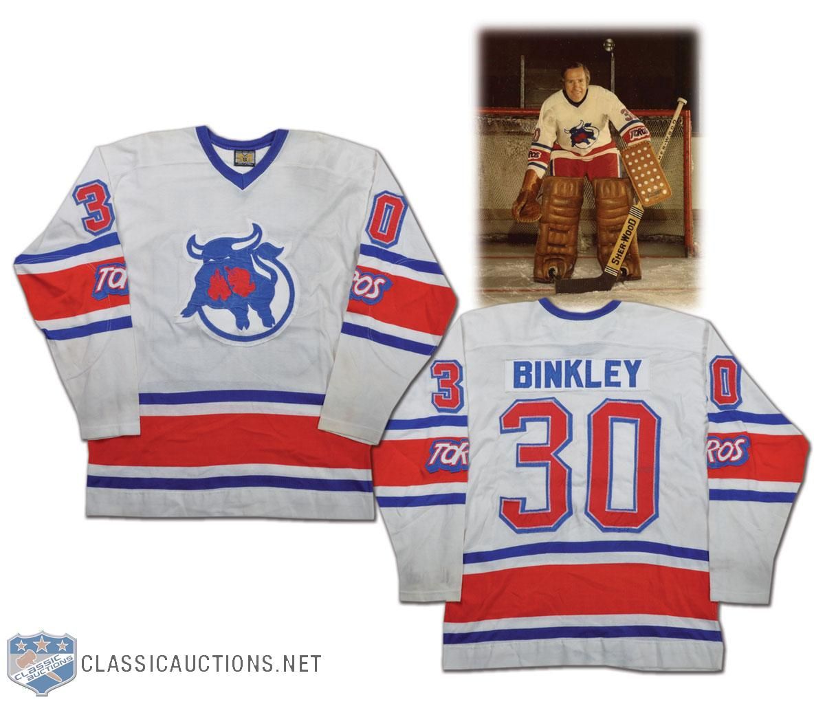
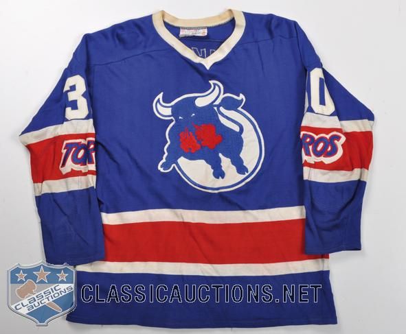
  • Les Binkley starred in net for the Toronto Toros in 1975-76. I like the colours of the Toros' jerseys, but the important part is the "Toros" mark on the sleeve stripe. That's a huge detail on these jerseys, especially when you consider that the team moved after the '75-76 season and became the Birmingham Bulls. Why is this important? Check out the similarities in the Bulls' jersey to the Toros' jersey. The only thing missing is the "Toros" wordmark from the sleeve!
There are a pile of incredible auction items available through the Classic Auctions website. I really would kill for that HNIC microphone cover or that Detroit TBTC jersey, but, being that I'm a poor college student, these luxuries will have to wait. If you're interested, get over to the Classic Auctions website ASAP!

Until next time, keep your sticks on the ice!

Friday, March 11, 2011

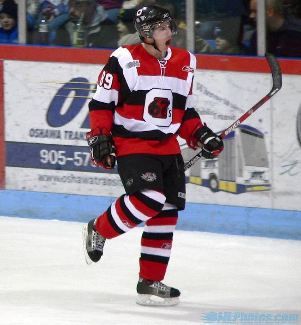
If there was one travesty that happened when Reebok began outfitting hockey teams across the world, it was the fact that they single-handedly removed the identity of the Ottawa 67's with their EDGE design. Gone were the barber pole jerseys that fans of the 67's loved and held in such high esteem thanks to the legends that had worn it. I, for one, loved the look of these jerseys, but Reebok essentially killed what made the Ottawa 67's so identifiable. While there had been rumours of Ottawa bringing these jerseys back to their uniform set, nothing had materialized. That is, nothing had materialized until Thursday!

In 2009, Jeff Hunt, owner of the OHL club, addressed Ottawa 67's fans through a statement after it was revealed that the 67's would wear black jerseys while on the road despite the popularity of the barber pole jersey thanks to Reebok's new "technology". Mr. Hunt said,
When the 67’s Reebok Edge Jersey was launched this week, longtime fans who had grown to love the traditional barber pole jerseys were upset. Rightly so. As an organization, we should have warned you in advance that in this first edition of the Edge Jersey our traditional look wasn’t possible. At least, that way, it wouldn’t have been a shock when the jersey was unveiled.

The problem is that the engineering of the new, lighter, cooler jerseys is such that only a solid colour is possible on the main front panel. We have maintained as much of the barber pole look as we could (sleeves) and we are working with the manufacturer to overcome the technical problems so that, at some point in the future, we can return to our full barber pole look.

I hope you enjoy the new season.

Jeff Hunt
Owner and Governor
Ottawa 67’s Hockey Club
Needless to say, the demand for the barber pole jerseys didn't go away. In fact, I think a lot of hockey fans in general looked at this move by Reebok as something akin to blasphemy or heresy. With the demand on the rise, I'm sure that Mr. Hunt and his team felt the pressure to bring back the identity of the Ottawa 67's.

I am happy to report that the dream is now reality as of yesterday! We go to the Ottawa 67's page where the news has broken!
"The barber pole jersey is synonymous with 67's hockey," said 67's Owner and Governor Jeff Hunt. "It’s the jersey of Denis Potvin, Doug Wilson and Bobby Smith. It's the jersey of our Memorial Cup winning teams. And it's fantastic to finally be able to return to it and give our fans the look they’ve been asking for."
For the first time, it seems that a team has finally forced Reebok's hand in developing something that they want rather than having it the other way around. I'm glad the the Ottawa 67's are going back to the way they are supposed to look because it just feels right.

Over on the Ottawa 67's Fan Blog, a great site written by Valerie, Sid, and StatsGuy, they have a full picture of the new barber pole jerseys, and I have to say that they look fantastic! I am extremely pleased with this news, and I look forward to seeing the 67's on the ice all season next year!

Finally, it seems some sense is being put back into hockey fashion. Thank you, Ottawa, for bringing back your mojo!

Until next time, keep your sticks on the ice!

Thursday, March 10, 2011

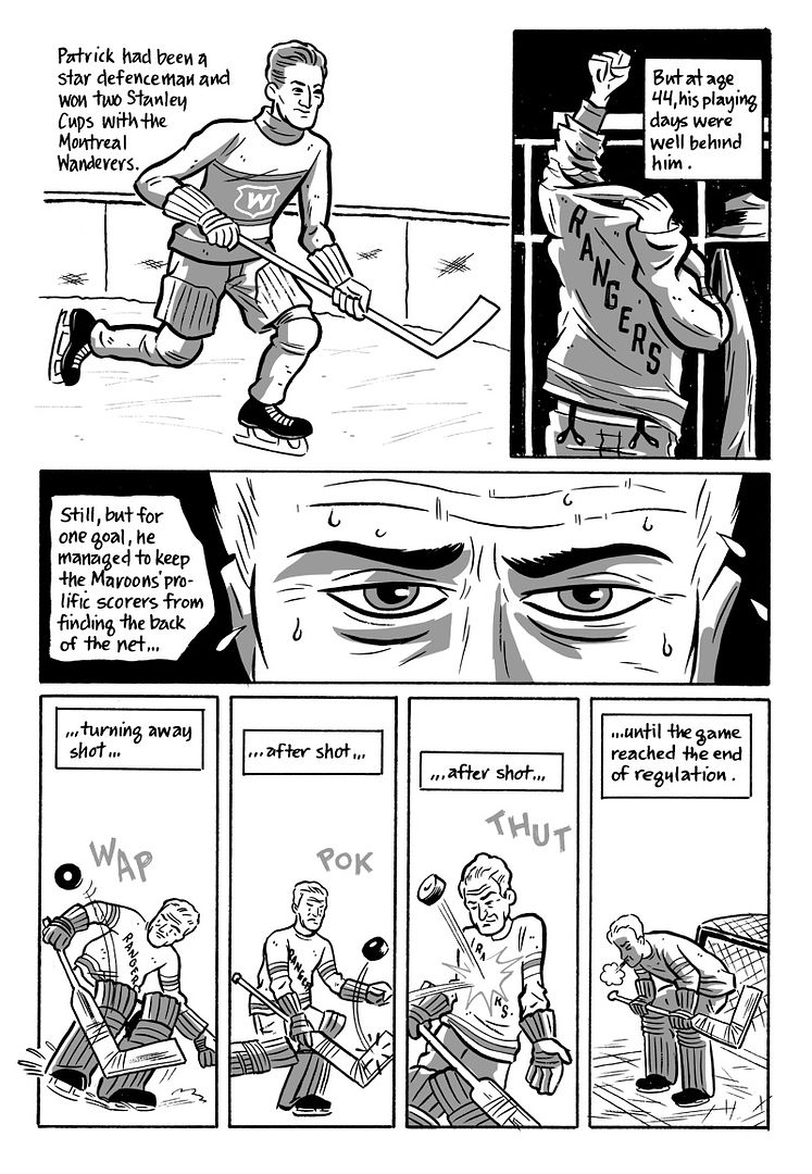
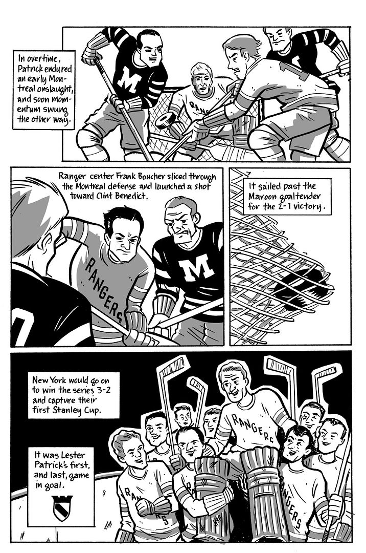
I've told the story of Lester Patrick's goaltending heroics for the New York Rangers on HBIC before, but it's still a story that deserves to be told a thousand times again simply for the amazing tale of a man who was the epitome of putting the team first. Thankfully, pictures are worth a thousand words, so I'm told, so I'm always grateful when great artists contact me with their works about hockey. Artist extraordinaire Rob Ullman sent me his newest comic strip about Lester Patrick's tale, and it is a fantastic representation of the hockey legend's tale when Patrick went from coach to goaltender for the New York Rangers. Here is Rob's latest work, The Backstop From Behind The Bench. Enjoy!

Part One of The Backstop From Behind The Bench. As always, you can click the image to blow it up larger for easier reading.

Part Two of The Backstop From Behind The Bench.

Part Three of The Backstop From Behind The Bench.

Rob outdid himself on this one as he really did a great job in capturing the story in both words and images. I can't say enough about how good Rob's work is, and you can find a ton of excellent stuff over on his site, Atom-Bomb Bikini. There is some excellent artwork over there, so make sure you stop by his store and score yourself something great!

If nothing else, check out Rob in the Ginger Classic wearing the old-school Quebec Nordiques jersey! He looks like a young Peter Stastny out there! Well done on your jersey choice, Rob! Congrats on your success in the tournament, and thanks for sending me over these great pieces of artwork!

Until next time, keep your sticks on the ice!

Saturday, February 26, 2011

Last month, it was a bit of a shock when the Tampa Bay Lightning announced that they were unveiling new uniforms for the 2011-12 NHL season. It was shocking because teams rarely announce new looks midway through their current season, especially if the changes are as dramatic as the Lightning showed. Apparently, there was a distinct method to their madness in TeeBay, though, as the Lightning came out with some revisions this past Wednesday to their new uniforms that make the Lightning look a lot more like the Lightning we've become accustomed to seeing on a nightly basis.

Back on January 31, I made the following comment in regards to the Lightning ditching the black and silver/gray in its colour scheme: "I feel that the home jersey's brand doesn't have the same effect without the black and silver that it once does, and the Lightning are worse off for it". A number of Lightning fans felt the same way, and the Lightning listened to the people paying their salaries. For once, a sports franchise actually listened to its fans in regards to its redesign!

The Lightning made two subtle changes their already-new uniforms, and these changes bring back part of the soul of that the Lightning seemed to have lost in their re-design. As you can see on the road jersey, they brought back a touch of black to help restore what was their original colour scheme. My only complaint about those numbers now are that the Lightning's numbers really look like the Maple Leafs' old numbers. This will only further the Lightning-Maple Leafs comparisons when it comes to their jerseys.

The second change is on the pants where the Lightning bolt reappears down the leg. It has been there before, and is certainly there this season, but the Lightning had opted to remove it off their new uniforms before the revision was put in place.

There two changes that seem minor are actually very good from this writer's perspective. Both changes keep the links to their history - which includes a Stanley Cup - and both keep the identity of the Lightning intact from what their brand had before the uniform changes. These two small changes get a thumbs-up from me, and I really think the Lightning have taken steps in the right direction thanks to them listening to their fans.

Until next time, keep your sticks on the ice!

Friday, February 25, 2011

I'm not going to lie, readers, when I tell you that this school stuff is taking over my life. Next week, I'm faced with five exams on five days, and that means I'll be studying my rear end off. If my nose is stuck in a book or if I'm flipping through course notes, guess what I'm not doing? That's right: I'm not blogging. As a responsible blogger (at least I think I am), this doesn't sit right with me. I want to be able to spend some quality time with hockey, but I can't because I'm having an affair with books and information. Something, I feel, has got to give.

That's where you can shine, readers. For today, I am opening the doors to HBIC for anyone who wants to drive whenever they get the urge. Officially, I am accepting all articles written about hockey by you! If you have the urge to write something, get something off your chest, or simply post a few picture about hockey, the canvas is waiting for your paint, readers.

If you have an article you'd like to send through, please attach to an email and send it through to me. Full credit will, of course, be given to you, and I'll even chime in on your work. Normally, I'm a pretty supportive guy being that I'm a man by the people, for the people, and of the people, but it will all depend on what you submit. I may take issue, but I will certainly thank you for your work and give you all the credit you deserve.

If you're a college student who is working on some sports-related article, I'd be happy to send something to your professor or instructor stating that you've contributed an article that has been published. I'm not sure how much weight that will carry for you, but if they ask if you have any published works, you can say yes.

If you have something to submit, get it sent in! Otherwise, here are a few things I've found around the Interwebs that could use a little exposure. Some of these come from the Life magazine gallery found on Google. I'll note those where necessary.
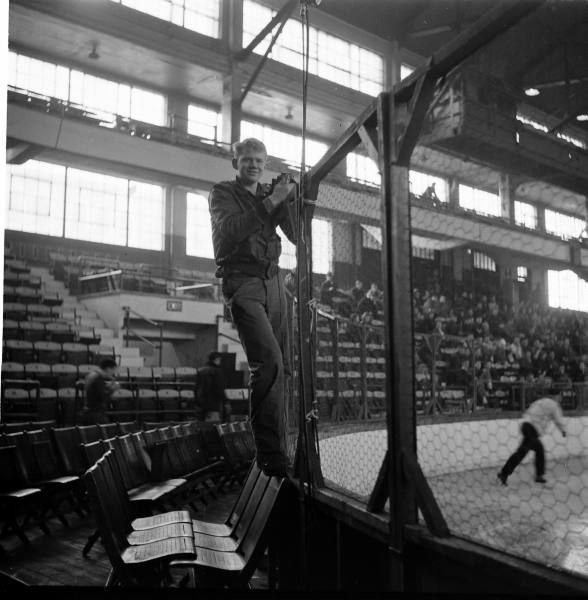
  • Love the images of the old rinks, especially when they have the chicken wire instead of glass. I'm not sure what that fellow is fixing, but he appears to have posed for this picture. If my eyes aren't deceiving me, it looks as though there is a game being played while he's working on the rink! This is a great shot from Life.
  • Speaking of those old rinks, check out how close the fans are in Madison Square Garden to the visiting Canadiens. And they barely have a separator there! I guess life back in the 1950s and 1960s really was a different time. Life brings history into reality once again.
  • Rarely do we get access to places like the team bus or train, but Life snapped this photo of Blackhawks star Bobby Hull and a teammate who appears to be Pierre Pilote sitting aboard the team train! While it's tough to say which newspaper Hull is reading, Pilote clearly is readying himself for the fairways with his edition of Golf magazine. I love this photo as it really shows a side of the players we don't get to see away from the rink!
  • A lot of people I know weren't really fans of the Bruins' yellow alternate jerseys, but I hate to see how many people would really hate the Bruins if they went all yellow. If we go back to 1958-59, though, the Bruins did actually wear mostly yellow as seen here on Fern Flaman! The thing about how the Bruins looked in '58-59 is that there is just enough black to break up the yellow and white. I actually don't mind this look, but I don't know if I'd be happy with it forever. The Bruins just look better in black with yellow highlights.
  • We all know how the Rangers have that very unique shadowing on their numbers, and they seem to be pretty consistent when it comes to using that shadow. My question to you, readers, is this: when did they start using it on their sleeve numbers? The reason I ask is that it appears they were shadowing the back numbers in 1963, but they did not do the same on the sleeve numbers as this picture shows. From what I can find, the earliest that they made the numbers on the sleeves similar to those on the back is 1978. Does anyone know if this is the earliest their numbers had similar shadowing?
  • Just because I can: Wayne Gretzky in the Burger King jersey. Nothing like a little BK on a Friday night, right? No, I'm not selling out to Burger King either.
  • I always like the old photos of international games, so this USSR-USA picture from the 1968 Winter Olympics ranks high. I love the lettering on the front of the USA jersey! The USSR squad has a very understated look for such a dominant team.
That's all for a Friday. I need to get myself ready for five exams next week. I'm pretty sure that my brain going to be mush by the end of next week. However, there is no crying or whining allowed here, so I must do what I have to do!

Until next time, keep your sticks on the ice!

Wednesday, February 23, 2011

It's been an interesting week on Antler Banter as the Moose find themselves stuck in neutral in February. All teams go on streaks, whether they be hot or cold streaks, but the Moose seem to be stuck in these extended streaks that have serious consequences on their overall standing. Going 3-4 so far in March has put a serious halt on the upward movement through the standings that the Moose saw in December and Janaury. Can they break out of this slump against the Toronto Marlies and Lake Erie Monsters? Make sure you stop by the Moose website for all your Manitoba Moose news and information. If you're interested in attending a Manitoba Moose game, please click here for seating information, ticket pricing, and availability. The Moose finish off their six-game homestand with a little Hardcore Hockey!

Scrivens Makes It Two

The Moose dropped the Tuesday night affair to the Marlies by a 2-1 score, so they were looking to bounce back against a feisty Marlies squad. They also needed to see if they could score more than one goal in a game after having only potted one marker in each of four of the last five games. Tyler Weiman got the call for the Moose as he hoped to reverse the Herd's fortunes, and he faced off against Ben Scrivens who was standing 200-feet away.

It was a "good, bad, and ugly" evening for the Moose powerplay. The good: Ryan McGinnis scored his first goal of the season with the man-advantage with less than five minutes to play. The bad: the Moose went 1-for-6 on the night, missing several excellent opportunities to put this game away early as Toronto found themselves in penalty trouble. The Moose had a 5-on-3 for a full two minutes and four minutes of total powerplay time, but could not capitalize. The ugly: Tyler Weiman whiffed on what appeared to be a routine glove save, giving up a shorthanded goal early in the second period that really seemed to deflate the squad. Overall, poor marks for the powerplay units on this night for not capitalizing on chances, and Weiman has to be better.

It looked like another night at the office for Sergei Shirokov as he picked up an assist on Guillaume Desbiens' second-period goal, but things went completely off the rails in the third period as Sergei Shirokov had had enough of Nazim Kadri's antics. After Kadri slashed the Russian sniper across the shinpads, Shirokov's soft hands lost the gloves as he and Kadri wrestled their way to the ice along the boards. I'd normally say that your best scorers shouldn't be fighting, but I fully believe that a player should be able to defend himself. Good on Shirokov for dropping the mittens and showing Kadri that he's not going to be pushed around.

It took the Moose nearly 56 minutes to wake up in this game as the Marlies built a 4-1 lead in that time. The Moose stormed back in the final four minutes to make it a 4-3 game, but Ryan Hamilton iced it with 2.2 seconds to play as the Marlies hung on for the 5-3 win. The Moose have now dropped two straight games to the Marlies after winning the first three, and see their record on the season drop to 29-19-6.

Monsters Frighten Moose

The Monsters were nipping at the heels of the Moose as they entered Friday's game, so that meant that the Moose needed to put four points on the board with two wins over a team that looked to overtake them in the standings. Eddie Lack looked to reverse the fortunes of the Moose while Jason Bacashihua got the call for the Monsters.

Kevin Connauton should feel responsible for the opening goal of the game. Connauton got muscled off the puck by Greg Mauldin, and then couldn't recover to chase down Mauldin. Mauldin circled behind the net, and Mark Flood left Ben Walter in front of the net to track down Mauldin. Connauton arrived in front of the net seconds late after Mauldin centered to Walter for the first goal of the game. I'm not sure what Connauton was doing, but he certainly seemed to give up after losing the puck in the corner to Mauldin. The effort shown by Connauton might be a reason why the Moose are on a two-game skid.

The Moose penalty killing units took a hit tonight as well as they gave up two powerplay goals to the Monsters. I'm not going to blame the penalty killing units for the result in this game, but they could use a little help from the other special teams unit. Manitoba's powerplay fired blanks again as they went 0-for-4 on the night, and find themselves ranked as the 25th best powerplay in the league. When the penalty kill has an off-night, it would be nice if the powerplay units brought their lunch pails to work and scored a couple of goals.

Overall, there wasn't much to brag about on the home side as the Moose got walloped by the Monsters in a 5-1 loss. The Moose fired 30 shots on Jason Bacashihua, but there weren't many of the high-quality variety that tested Bacashihua often. With the loss, the Moose drop to 29-20-6, and lose their spot atop the North Division standings as the Monsters leap-frog into first.

Moose Fly Past Monsters

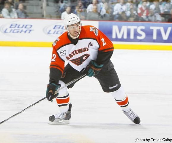
It was a big night for one minor hockey team in Winnipeg as the Gateway Flyers took to the ice for their first AHL game in history! Ok, so they weren't the real Flyers, but the Moose donned the jerseys of the Gateway Flyers for their Saturday clash with the Monsters as part of the Community Jersey Program! It was weird seeing the Moose in black-and-orange for the first time in history, but it was easy to get used to when they began playing like the Flyers - scoring and hitting. Eddie Lack would take to the pipes again for Manitoba. Jason Bacashihua started the game for the Monsters, but he would be relieved by Trevor Cann after the Moose had staked themselves to a sizable lead.

It was another big night for Manitoba's Garth Murray. The scrappy, defensive forward scored a goal, added a helper on Sergei Shirokov's goal, picked up two minutes for tripping, had two shots, and finished the game as a +2! The scorekeepers certainly used a lot of ink on his stats tonight! Murray played really well at both ends of the ice, deserving some kudos despite not earning one of the three stars on the night. He scored, he played physical, and he was responsible in his own zone. That's the kind of effort the Moose need from all 22 players.

Manitoba's best player continues to make great plays as Sergei Shirokov scored a goal, added an assist, had four shots on net, and ended the night as a +2. Shirokov's assist was a gorgeous backhanded no-look pass to Mario Bliznak that seemed to confuse Jason Bacashihua. Shirokov made a move to head behind the net casuing Bacashihua to move off the post, but Shirokov threw the puck out front on the backhand. Bacashihua, realizing he made a mistake, went back to hugging the post, but Bliznak wired it past his right shoulder into the cage before Bacashihua could find the puck again. Great plays like that show you why Sergei Shirokov was an easy choice as Manitoba's AHL all-star representative.

The Moose really played well for 57 minutes before giving up a couple of goals to the Monsters. Despite giving up a pair of goals late, the Moose hung on for the 4-2 victory to jump ahead of the Monsters in the standings once again as they have a better winning percentage. With the win, the Moose snap their three-game losing streak and improve to 30-20-6 on the season.

Gotta Grind Out Some Wins

The Moose hit the road over the next week with games starting tonight against the Rochester Americans. They'll battle the Amerks again on Friday before heading into Toronto for games against the Marlies on Saturday and Sunday. You can catch the Sunday game against the Marlies on CBC as the AHL on CBC comes to the Ricoh Coliseum for the Marlies-Moose tilt.

The Americans come into the games having gone 6-4 over their last ten games. During that stretch, the Americans have beaten the Hamilton Bulldogs twice, the Hershey Bears once, and knocked off the Worcester Sharks. They're led by Tim Kennedy and Clay Wilson offensively as both men are nearing the 40-point mark on the season. Tyler Plante is playing fairly well in net, and is even sporting a blocker with the old-style holes painted on it! Or maybe they're real holes? Either way, that looks cool! The Moose have to keep winning as the Bulldogs and Monsters are breathing down their necks, so two wins over the Americans would help immensely!

The Marlies need no introduction as the Moose re-engage in battle with them. Kadri is becoming a thorn in the side of Moose players, Scrivens and Gustavsson are playing well in net, and the Marlies are closing the gap with each win over the Moose. Again, beating divisional rivals is vital if a team wants to go far in the AHL, so the Moose need to play well against the Marlies this coming weekend after dropping the these last two games at home against Toronto!

Eight points await the Moose if they are hungry enough to get them. Working harder than their opposition is a good way to start, and the talent that the Moose bring should put them over the top in each game if they work hard. Only one thing to say as the Moose head down the stretch: DO IT!

Until next time, keep your sticks on the ice!

Friday, February 18, 2011

It's always a great night when a player is remembered for how important he was to a franchise, especially when he made large contributions in bringing greatness to that franchise. Rod Brind'Amour had carved out a pretty good career in the NHL before he got to Carolina, but then led the Hurricanes to new heights as he helped to guide the young squad to a Stanley Cup championship. Tonight, the Carolina Hurricanes paid respect to a respected veteran hockey player, and the Flyers also showed their support of the former Philadelphia Flyer centerman.

Let's go way back to September 22, 1991. A promising young centerman by the name Rod Brind'Amour is traded by the St. Louis Blues, along with Dan Quinn, to the Philadelphia Flyers for defenceman Murray Baron and forward Ron Sutter. It was here that Brind'Amour really blossomed as a player, becoming a high-scoring, defensively-reliable centerman on Philadelphia's second line. Finding himself playing behind Eric Lindros for most of his time in Philadelphia, Brind'Amour became Philly's second scoring option. Known for the great shape he kept himself in, Brind'Amour soon developed the nickname "Rod the bod" around the Philadelphia locker room.

As a result of his playing behind Lindros, Brind'Amour saw a lot of ice-time. In 633 games with the Flyers over nine seasons, Brind'Amour scored 235 goals, added 366 assists, and spent 544 minutes in the penalty box. His leadership was vital, especially in the Flyers' run to the Stanley Cup final in 1997. In 19 playoff games that season, Brind'Amour recorded 13 goals and eight assists. However, his time in Philadelphia would come to an end through another trade.

January 23, 2000 saw the Flyers deal Brind'Amour, goaltender Jean-Marc Pelletier, and a second-round pick in the 2000 entry draft to the Carolina Hurricanes for Keith Primeau and a fifth-round pick in the 2000 entry draft. After playing 12 games with the Flyers in the 1999-2000 season, he was heading south down the coast to Raleigh, North Carolina. It was here that the veteran Brind'Amour really helped pave the way for some of Carolina's current stars such as Eric Staal and Cam Ward.

In 693 games with the Carolina Hurricanes, Brind'Amour continued scoring at a solid pace, but became a much stronger force on the defensive side of the puck as the younger Hurricane players contributed on the scoresheet. He still scored 174 goals, added 299 assists, and spent 398 minutes in the penalty box over his ten seasons with Carolina. In their run to the Stanley Cup, Brind'Amour scored 12 goals and added six assists in 25 games in helping Carolina to their first Stanley Cup championship.

Clearly, Brind'Amour has had some significant impact on two teams during his NHL career. Tonight, the Hurricanes paid respect by having each player wear Brind'Amour's famous #17 on their shoulders. They also wore his name and number on their chests just as they have done for other honoured players such as Glen Wesley. In a classy move, the club also donned Brind'Amour jerseys for the warm-up. While it may have looked like a Brind'Amour family reunion hockey game, the Hurricanes changed into their properly-named jerseys for the game.

The visitors this evening were the Philadelphia Flyers, and they also took to the ice in warm-ups with Brind'Amour jerseys on. While Brind'Amour never actually wore the jerseys seen in these images, it's still a classy move by a franchise that played a large part in Brind'Amour's career. Kudos for the Flyers for actively participating in tonight's honouring of Rod Brind'Amour.

I'm not saying that Brind'Amour is a sure-fire hall-of-famer or anything, but the man could play hockey. He won a Stanley Cup, he has 1000+ career points, and he has hardware behind his name in the Selke Trophy. I think that he's done well enough to be mentioned as a possible name on the nomination list, but is he a HoF player at this time?

Regardless, Brind'Amour will always be remembered by this writer as a great player, a great teammate, and an all-around great person. There may not be a Hall of Fame for athletes who make everyone around them and the teams they play on better, but Rod Brind'Amour could certainly be an inaugural inductee if there was a Hall of Fame like that.

Until next time, keep your sticks on the ice!

Sunday, February 13, 2011

I was at school the other day, and someone asked me if I had ever heard of the Canadian Women's Hockey League. I have, in fact, heard of the league as I had done a story on the draft that took place to get the inaugural five teams up and running. It was then that I realized that I have seriously neglected the highest professional hockey league that women can compete in against other women. Because of this oversight, today is all about the Canadian Women's Hockey League, how each team is doing, what they are wearing, and where you can catch a game or two if you're interested.

I want to preface this article with this statement: if you spend the time telling me that no one cares about women's hockey through comments or email, your comments will not only be denied entry on to this article, but I'll categorically go back and delete any and all comments you have ever made. And any future comments will be denied entry as well. I'm tired of hearing "hockey fans" crap all over women's hockey like it means nothing. If that's the case, your kid's Timbits hockey or any minor hockey in general is just as meaningless. As a true hockey fan, this won't fly with me. Capisce?

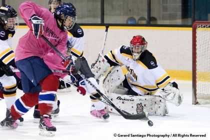
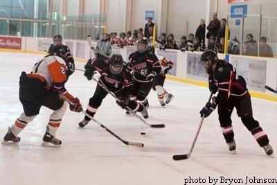
First off, there are a lot of recognizable names playing on the five teams in the CWHL. The five teams are based out of Brampton, Burlington, Toronto, Montreal, and the lone American-based team in Boston. These teams were assembled through a draft that happened in early August of 2010, and the teams have been battling since the season started.

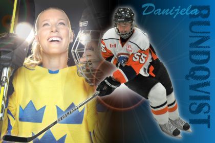
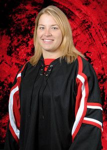
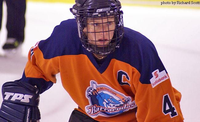
If you're a fan of Burlington Barracudas, you want to keep your eyes on Danijela Rundqvist, Becky Kellar, Ashley Riggs, and Shannon Moulson. Burlington has had a rough start in the inaugural CWHL season. They currently sit fifth out of five teams with a 4-17-1 record, including being 1-11-1 away from the friendly confines of the Appleby Ice Centre.

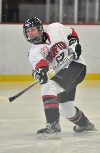
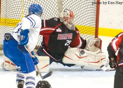
If you cheer for the Brampton Canadettes-Thunder, Jayna Hefford, Gillian Apps, Cherie Piper, and Lori Dupuis are probably household names. Brampton has been on a major tear recently having won eleven straight games, and this streak has propelled them into second-place in the CWHL with a 17-6-0 record! Brampton is pretty consistent when it comes to their play as they are 9-3-0 at the Cassie Campbell Comnmunity Centre and 8-3-0 away from home. Hefford is the CWHL's all-time leading scorer in the previous incarnation of the CWHL, so there's some history there too!

The Toronto Aeros are sitting in fourth-place in the five team CWHL, but trail third-place by only two points at the time of writing. Their 8-12-3 record sees them playing well at home where they are 5-3-0, but Toronto needs to be better on the road with their brutal 3-9-3 record. Jennifer Botterill leads the team in scoring, and she's joined by familiar faces Tessa Bonhomme and Sami Jo Small. The Toronto club is stocked with former NCAA players, so this young squad is coming along nicely as they mature through this season.

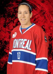
The Montreal Stars are the class of the league at this point, leading in wins and points in posting a record of 18-2-2. Caroline Ouellette is dominating the league with 58 points in just 22 games. Joining her on the Montreal squad are Emmanuelle Blais, Julie Chu, Sarah Vaillancourt, and Kim St-Pierre. Montreal is 11-2-1 on home ice at Aréna Étienne-Desarteau, but has yet to lose in regulation on the road with a 7-0-1 record.

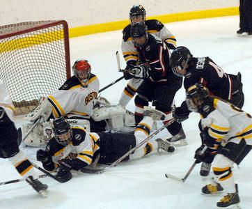
The lone American-based team is the Boston Blades, and they currently sit in third-place in the CWHL. Boston is 10-13-1 through 24 games thus far, but are significantly better on American soil. The Blades have a 7-6-1 record at the University of New Hampshire's Whittemore Center Arena, but have struggled to a 3-7-0 record while traveling through Canada. Led by Angela Ruggiero, Caitlyn Cahow, Erika Lawler, and Kacey Bellamy, the American-based team recently put an end to Montreal's undefeated season thanks in large part to a 74-save effort by by goaltender Mandy Cronin!

Just so you're aware, the Blades will play 16 of their 26 games at “home” – six apiece at Harvard and UNH, and single games at Providence College, Kennedy Memorial Rink in Hyannis and Wesleyan University in Middletown, Connecticut. Essentially, the "New England" Blades are making the tour through the NCAA circuit!

As you can see, some of the best women to ever lace up the skates are playing regularly in the CWHL. This will, of course, make the women's game much better as the women will regularly get to play at a high-level, and I commend the CWHL for its commitment to the teams, cities, and women who are putting their best game forward day in and day out.

In terms of recognizing the teams, there are some clear similarities between the CWHL and a few NHL teams. The first jerseys put forth were clearly designed from NHL templates. As you can see, the Aeros look like the Maple Leafs, the Stars look like the Canadiens, the Thunder are wearing the colours of the Ottawa Senators, and the Barracudas are shown in the colours of the Buffalo Sabres. All of them have the Dallas Stars' treatment on the front in this image.

Well, there were a few teams that stuck with those similarities, but one team decided to stick with their original colours and their original logo that they wore in a previous league. I have to say that there are very few images of CWHL players in comparison to other leagues. In saying that, here are how the teams look today.

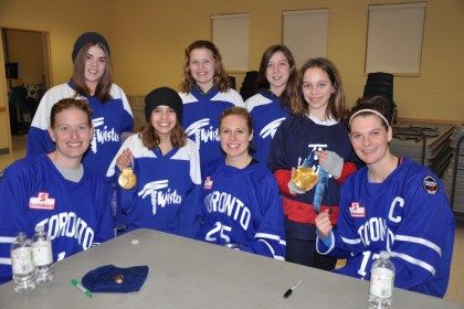
Toronto is definitely blue at home and white on the road. The roster photos shown on their roster page have the players in this mock-up, but I have not seen this uniform used in any picture where the players are playing. I also have yet to see the alternate uniform proposed above, so I'm on the hunt for some of those images still.

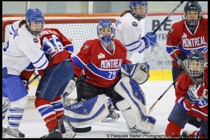
Montreal proudly wears red at home and white on the road. Again, no sign of the alternate uniform, and I'm thinking this may be a cost-saving measure. Why create a third uniform in your first year of existence? Or when your uniforms look extremely sharp already?

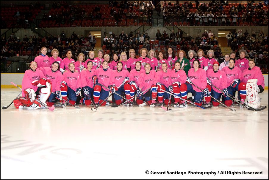
Montreal should go down in the CWHL as the first team to wear a promotional jersey as well as the team wore pink jerseys on February 1 to help promote breast cancer awareness and to raise funds for the Fondation du cancer du sein du Québec to battle the disease. After the game, the Stars and their moms took to the ice for a photo! The Stars raised over $5000 for the charity on the night! Good on the Stars for helping this charity, especially since it hits close to home for a number of women playing in the game!

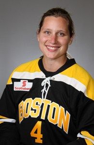
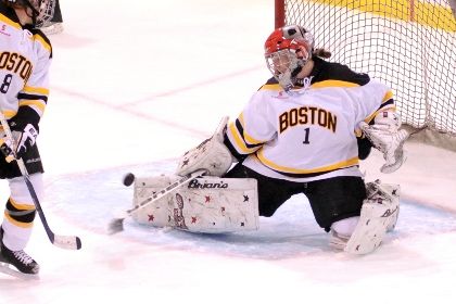
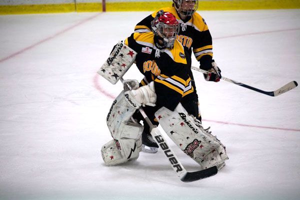
The Boston Blades look very familiar as they wear black with yellow at home and white on the road. Much like the Stars and Aeros, I have yet to see a third yellow jersey being worn by Boston, but I am still looking.

The Brampton Canadettes-Thunder have gone opposite to the norm, adopting the black third jersey as their home jersey while wearing white on the road. Instead of going red like the Senators do, the Canadettes-Thunder are wearing black. For a five-team league, you would think that Brampton could choose a different colour, but I'm not going to rain on their parade.

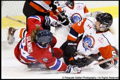
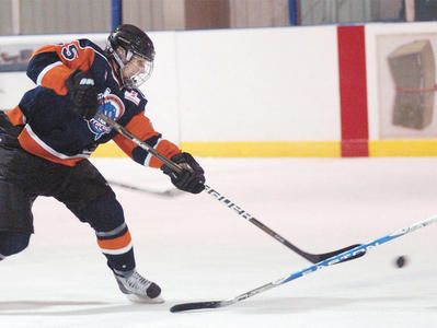
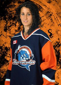
Burlington is the wild card in this five-team league as they decided to go with the template of the New York Islanders instead of the Buffalo Sabres. This may have been due to the fact that they wore orange and navy blue in their previous seasons, so this keeps their colour scheme intact. As you can see, the Barracudas wear white on the road while going navy at home. As you can see, Burlington has opted to keep their logo as they display it proudly across the front of their jerseys.

So there's your introduction to the Canadian Women's Hockey League. I'll be following these teams and players as the season progresses, and we'll have a full run-down of how well each team did at the end of the regular season along with a synopsis of how the players did in the race to win the scoring title!

I'd just like to point out that some of these amazing photographs were taken by Pasquale Stalteri and used with his permission. Please respect the copyright this amazing photographer has done, and I encourage you to check out his website or his blog where all of his amazing photography can be seen. I am truly thankful for the work Monsieur Stalteri has done with the CWHL, and for his generosity in allowing me to use some of his fantastic photography! A link to his site can be found on the menu to the right!

Until next time, keep your sticks on the ice!

Monday, January 31, 2011

Rarely are NHL fans treated to a new look midway through the NHL season. Rarely are we treated to a shift in the values, vision, and direction of a franchise so thoroughly with half the season still to be played. And it is the rarest of cases that a franchise will debut new uniforms midway through a season while still wearing their old uniforms. However, the Tampa Bay Lightning have decided to break the trend of waiting until the off-season to debut their new uniforms by unveiling them today. Of course, I have my take on these new threads, so we'll take a look at the good, bad, and indifferent about these new uniforms, and we'll have an overall grade of the new look debuted by the Tampa Bay Lightning.

We've seen a monumental shift in how the Lightning does business since Steve Yzerman took the reins as general manager of the Floridian franchise. The Lightning have definitely changed from an outside point-of-view, extolling the virtues of honour, tradition, respect, and doing things the "right way" as values of their franchise. So it comes as no surprise that the Tampa Bay Lightning published a new set of core values on which the team will build.

If you read that vision statement correctly, the Lightning represent three major keys: the Tampa Bay community, a championship team, and hallmark events. These are the cornerstones of the Lightning franchise in that they will represent and be part of the Tampa Bay community as both corporate citizens and icons within the community; they will be a championship-calibre team so that the metropolitan area of Tampa and St. Petersburg can be proud of their hockey franchise, and proudly stand behind and support their NHL club; and, the Lightning will host hallmark events in which the people of the Tampa Bay area can take part and of which they can be proud. Essentially, the Tampa Bay Lightning are redefining themselves in the market they play in, and I think this is an excellent idea.

Not only are the Lightning pledging to be more visual and more active in the community, but they are committing themselves to the community of Tampa Bay as partners and citizens. But it's not like this vision just suddenly appeared as some apparition to the men who run the Lightning. Instead, this is the basis that the vast majority of northern NHL markets run their businesses. Franchises like Toronto, Montreal, Boston, Minnesota, and Detroit send their players out into the community to interact with fans all the time at various community events. It's no secret that Steve Yzerman, a long-time Detroit Red Wing, is putting this vision forward as a way for the Lightning to become more visible in their own yard. This, readers, is how you generate buzz about your team. For a team that's deep in the sunbelt, this is nothing but a good idea. GOOD.

While the vision statement is something brand-new for this franchise that now puts an onus on the club in being a good corporate citizen, I have to admit that I'm shocked that the Lightning took a step back in their branding of themselves. The new logos, while fairly clear, are also still regressing backwards from their previous iterations. While we saw this work in the case of the Vancouver Canucks as they moved to new uniforms, the Lightning, to me, should be a little more bold. After all, lightning is a pretty awesome force in nature. So while the overall aesthetic of the Lightning hasn't been lost, it does seem a little underwhelming just being one colour. PUSH.

The new uniforms are different, and normally I believe that different is good if it leads to something better. The Lightning have essentially turned a once-bold look into a very subdued look. While I'm not totally against the idea of simplifying anyone's look, we go back to the Lightning being a name that exudes energy and boldness. Had the Minnesota Wild come up with a logo like this, the brand simply doesn't fit the identity. I feel that the home jersey's brand doesn't have the same effect without the black and silver that it once does, and the Lightning are worse off for it. STUPID.

However, I do like the blue colour that the Lightning have decided on for the home jerseys. I was always a fan of the alternate jersey that the Lightning wore in the late-1990s, and the "electric blue" that they wear on their current alternate jerseys stands out. While the Lightning certainly could use some black and silver highlights, the home jersey would essentially look a lot like their current alternate jerseys... making them Dallas East. Kudos for the Lightning in opting for the blue background for their home jerseys, and for not selecting navy blue as their primary colour. GOOD.

The new white road jersey is even more sterile than their current road jersey. Again, the jersey could certainly use some black and/or silver highlights to make the jersey "pop" a little more. After all, we're talking about "the Lightning". And I'm not a fan of the "Tampa Bay" written across this jersey. As you know, I seriously think that NHL teams need to live and die by their logos and branding and not the city name. While the city name is vitally important to the identity of the team, when you read "Chicago hockey", the Blackhawks logo probably comes to mind. Lose the name, grab some jersey accents for this road jersey. STUPID.

The new shoulder patch being sported by the Lightning is magnificent. Honestly, I love the retro look of this new patch, and I think that this design has a lot of opportunity to be a very good logo for branding. First, circular logos are automatically pleasing to the eye in their nature. Don't believe me? Think about these logos - Target, Apple, Disney, Mercedes-Benz, the Olympic Rings, AT&T, Shell Petroleum. What do they all have in common? They are round or have large portions of their logos in a round shape. And I guarantee that most of you can picture each of those logos in your head.

Secondly, the patch is very simplistic in its design. Less is definitely more in this case, and I think the Lightning should be very happy with this design. I, for one, think it could almost be their primary logo. GOOD.

I apologize for the size of the picture, but the Lightning have gone to single-colour names and numbers on the back of the jerseys. I'm certainly not complaining because you can read the names and numbers quite easily in that small picture, and it is much better than some of their previous font choices. The font is clean and simple, and that's perfect. GOOD.

Overall, the look of these new jerseys leaves me wanting more from the Lightning. It's not to say that they're bad or that I won't get used to them, but in comparison to today's look and yesterday's look, the Lightning just seem less aggressive in their new duds. Having the legends show up and wear the new uniforms, including Phil Esposito who never played for the Lightning, was a little much in terms of presentation.

The Lightning also announced that their recently-introduced alternate jerseys would move forward with the new uniforms to remain as the alternate jersey. So while the "Victory Stripes" may be gone from the home and road jerseys, fans of the Lightning will still get to see them when the Lightning play games in their alternate uniforms. As much as I like to make fun of the armpit stripes, they are unique to the Lightning, so I'm glad to see the stripes remain. However, I'm still not sold on "Bolts". PUSH.

So there are the new-look Tampa Bay Lightning in all of their uniform glory. Personally, I think the look will grow on me, so I'm going to give these jerseys a thumbs-up as they went 4-2-2 in the GOOD-STUPID-PUSH record. Time will tell how the Lightning fare in their traditional design, but at least Steve Yzerman didn't resort to bringing Manon Rhéaume in to back up Dwayne Roloson.

Until next time, keep your sticks on the ice!

Sunday, January 30, 2011

It's that magical time of year when hockey gets back to its purest form and... alright, who am I kidding? I was asked by Phil Hecken to give some thoughts on the NHL All-Star Game jerseys for the incomparable Uni Watch Blog today, and I am replaying the article here. As you know, the NHL All-Star Game goes today, and there's something that has me excited about the game, but a number of things that do not. The NHL All-Star Fantasy Draft took place on Friday night, and we'll take a look at some of the more garish NHL All-Star Game jersey designs in a Jim Vilk-style "3+1 view". I'll also look back on a few of my favorite images from past All-Star Games. Let's get this review underway using the Paul Lukas "is it good or is it stupid" test!

The NHL decided to allow Reebok to push the envelope in their designs this year for the two teams, and I'm sorry to say that I don't like the look the NHL chose. There's nothing good about random striping that cuts off at the seam of the sleeve and then randomly begins on the back of the sleeve and end at the elbow on the front. Honestly, what is the point of these random lines? If this is some new gradient technology that Reebok has come up with, we've been there, done that, moved on. Stop trying to add flair – it just doesn't work! Random lines that do nothing for the aesthetics of the uniform are just dumb. STUPID.

Have you actually looked at the front of the jerseys? There's just way too much stuff on the front with the NHL All-Star shield logo, the number below the collar, the captaincy designation, and the NHL shield logo. Does anyone actually look at these jerseys before signing off on them? Are there no prototypes made? The easiest solution is to remove the “feature” that the NHL apparently insists on having on the front – the number. The jersey would be much less busy, and would look fairly good if you overlook the random lines all over the sleeves. However, that number can't be overlooked. STUPID.

The font used on the jersey for names and numbers is legible, so that's a plus, but we run into a problem with the numbers on the back of Team Lidstrom's jerseys. Again, what's with the random lines? Do we really need these lines on the numbers? The rear numbers clearly do not match up with the sleeve and chest numbers as it appears those numbers don’t have lines, so this might be the first time in NHL history where back numbers don’t jive with TV numbers. So that automatically makes this STUPID.

Now you’re probably saying, “Teebz, you’re such a downer,” due to my three “stupid” ratings in a row. There are, however, some things I do like about the NHL All-Star jerseys.

For starters, I love the colour used by the teams. Have you noticed that the black on these jerseys is as minimal as can be? The blue is bold, and the home team is wearing white! While I’m not completely sold on the shade of red being used, the game should look good and the fans, for the first time in a long time, will be able to cheer on the good guys in white! GREAT!

I'm guessing that Team Staal will be skating left-to-right tomorrow because the NHL All-Star Game logo is on mirrored shoulders for the two teams. I get that the NHL wants the logo showing in promotional pictures during the ceremonial face-off and stuff, but will anyone not know that this is the NHL All-Star Game? I can’t call it dumb because it serves a purpose, but when you combine that with the individual team logo of each player on the opposite shoulder, this one becomes a PUSH.

Overall, not the worst-looking All-Star Game in history (we'll see those in a second), but the NHL really needs to go back to their star design or a much more simplified design. The KISS rule always seems to work best.

Teebz's All-Star 3+1

Not much needs to be said here, but these are certainly the worst looks seen at the NHL All-Star Games over the years. The "+1" will be my favorite NHL All-Star Game look of all-time. Enjoy!

3. 1982 NHL All-Star Game – Wales Conference vs. Campbell Conference. I like the colours, but how many stars do you need on a jersey?

2. 2003 NHL All-Star Game – Eastern Conference vs. Western Conference. The Western Conference jersey looks good in colour, but the TV numbers on the front left hip for these teams are useless. The Eastern Conference jersey looks like a ripoff of the Mighty Ducks' jersey. Not a fan of these jerseys. They just don't say "all-star".

1. 2000 NHL All-Star Game – North America vs. World. Count the number of different jerseys you see. If you see four different jerseys, you're right. The goaltenders for each team wore jerseys that were different from their teammates. Aren't uniforms supposed to be, y'know, uniform? This is the dumbest idea seen at an NHL All-Star Game yet.

+1. 1992 NHL All-Star Game – Wales Conference vs. Campbell Conference. There is something to behold about the 1992 NHL All-Star Game: the colour, the throwback designs, and the overall aesthetic. These uniforms are absolutely gorgeous, and some NHL team should look at bringing a design like this to life.

There are also a number of pictures that make the NHL All-Star Game special. These are some that I've liked for various reasons.
That's all for today! Enjoy the NHL All-Star Game from Raleigh, North Carolina!

Until next time, keep your sticks on the ice!

Thursday, January 27, 2011

Tonight is one of those rare nights during the NHL season when there are no games scheduled. I know - how does this happen? Of course, with the NHL All-Star Game on-tap for this weekend, players are getting themselves ready for the game by either attending the event in Raleigh, North Carolina or readying themselves a spot in front of their big screen TVs. No matter which of the options the players are in, it's a good place to be as a fan too. There is lots of stuff to catch this weekend, and HBIC will have some All-Star Game goodies queued up for the weekend as we approach it. Tonight, however, I need to get myself a fix of hockey, and this article will be nothing more than a repository of cool things you should check out with your free time today. I know you have free time because there's no hockey on. So what else are you doing?
  • In your mandatory reading piece for the day, you MUST check out The Royal Half's article on the LA Kings' Burger King alternate jersey and how it came to be. Today is, of course, the 15th anniversary of that jersey's unveiling. Paul Lukas of Uni Watch Blog also points out that the unveiling coincided with the unveiling of the Anaheim Mighty Ducks' Wild Wing jersey, marking this day fifteen years ago that the NHL went insane. Thankfully, the league has recovered slightly since then. Huge congrats over to The Royal Half for their work on this extremely interesting article!
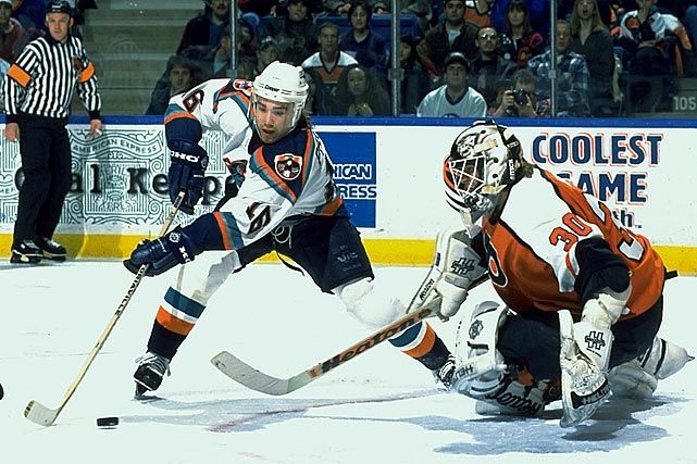
  • Speaking of uniforms that are hated by mostly everyone, there's nothing better than seeing a Fisherman in action. Here's Zigmund Palffy from his New York Islanders days trying to slide a backhander in on the Philadelphia Flyers!
  • The Detroit Red Wings are known for the octopus during the playoffs, so I thought this picture of Detroit's Paul Coffey hoisting an octopus on his stick was interesting. Paul Coffey's time in Detroit is probably the last time he could be considered an all-star as well.
  • I like hockey history, and I love old color photos of NHL players. When this picture of Gary Simmons in a California Seals jersey was sent to me by a reader, I was blown away by how crystal-clear the colors and details are. I love this photo!
  • Speaking of historical photos, check out this photo of the St. Louis Flyers! Do you recognize who #3 is? He's not one of the Flyers as seen by his mismatched socks from the rest of the players. In fact, he's not even a hockey player, but he is fondly remembered as a sports icon and a legendary baseball player. That's Yogi Berra! From left to right in that picture are George Milligan, Donald MacDonald, Joe Lund, Yogi Berra, Don Grosso and Hec Pozzo. What a great photograph taken by Buzz Taylor!
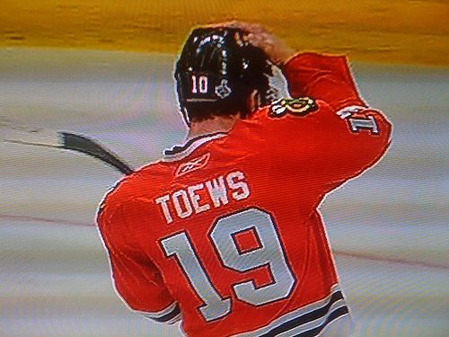
  • Remember in last year's playoffs when Jonathan Toews grabbed Patrick Sharp's helmet while repairs were being made to his helmet? Or when Alexander Ovechkin was wearing Matt Bradley's helmet last season? Earlier this season, the Penguins' captain pulled off the same trick when Sidney Crosby grabbed Chris Connor's helmet while his was being fixed! It seems this helmet-swapping phenomenon happens often in the NHL for the stars!
  • In sticking with the Penguins, how awkward does Mario Lemieux look in this picture with Eddie Johnston? Who knew the man who would be the most important figure in Pittsburgh's hockey history would look like an awkward teenager in his early days with the Penguins?
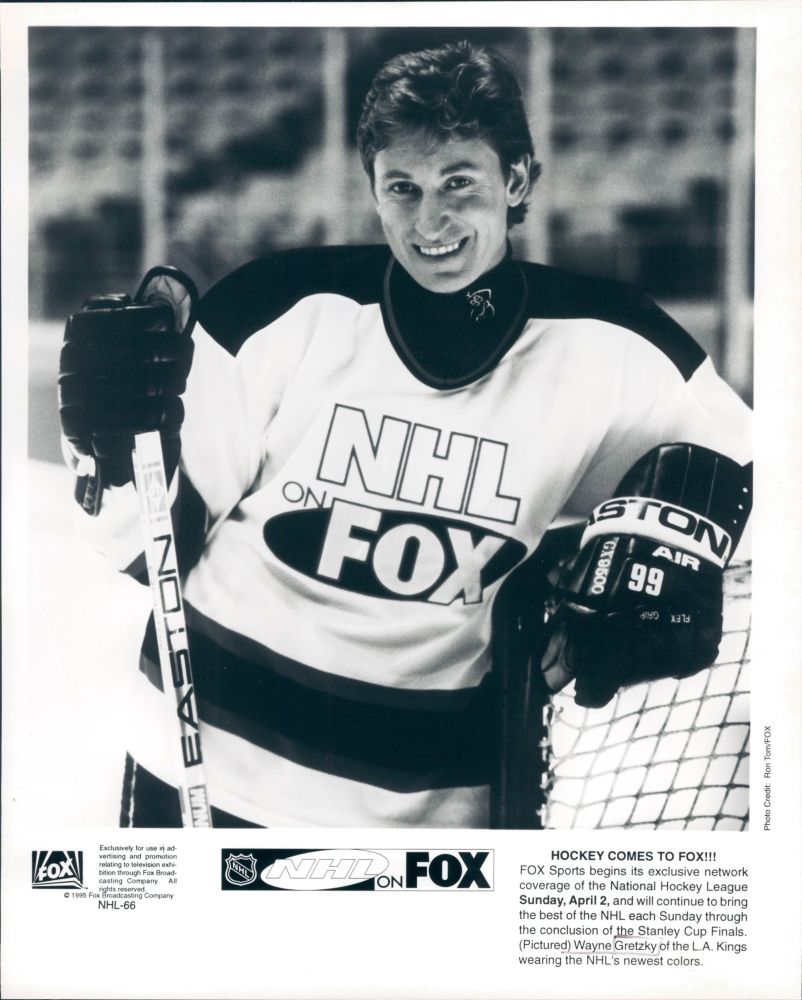
  • Another hockey legend is caught in an unfortunate jersey mishap. Wayne Gretzky, who spent time in the Burger King jersey and the St. Louis diagonal jersey, found himself promoting Fox's hockey broadcasts. Remember the FoxTrax puck? Yeah, me neither. It was definitely a low point for both Gretzky and the NHL.
That's all for a quiet Thursday. I have a pile of homework to get through, so I'm going to hammer away on that. More coming up tomorrow as we get ready for both the NHL and AHL All-Star weekends!

Until next time, keep your sticks on the ice!

Saturday, January 15, 2011

The AHL's Chicago Wolves have been one of the community's most active partners since they played their first game in 1994 as part of the International Hockey League. They were always a model franchise on the ice, and they prided themselves on the work they did in the community. In 2001, they were included in the merger between the IHL and the AHL, and they have yet to look back. In the 17 years they have been playing, they have won two IHL Turner Cups, two AHL Calder Cups, and the hearts of thousands of fans in the greater Chicago area. It is this last item - the winning the hearts of fans - that has made the Wolves a good corporate neighbour and a contributor to many charities. This weekend sees the Wolves contributing to another major charity, and this one should hit home for one player on the Wolves.

The Wolves will use a variety of means to raise money for cancer-related charities as they continue the "Fight Against Cancer". Proceeds from the three-game home-stand this weekend will benefit Little Heroes Pediatric Cancer Foundation, Bear Necessities Pediatric Cancer Foundation, Chicago Wolves Charities and other cancer-related causes.

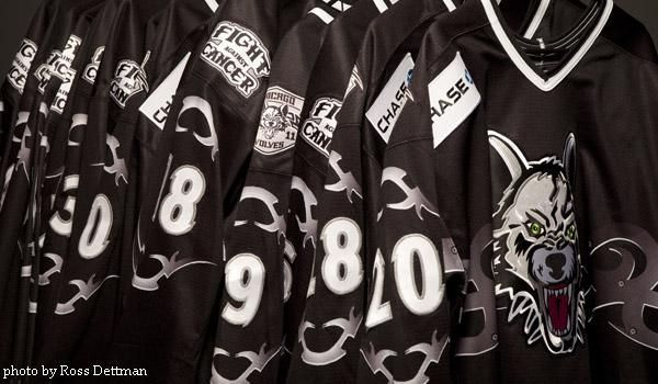
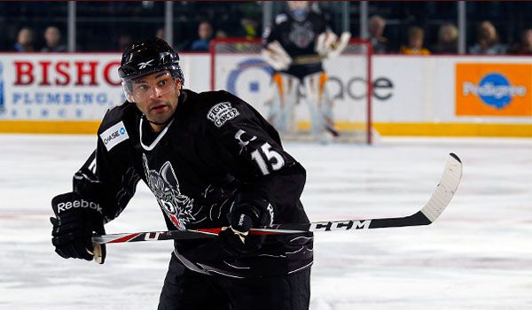
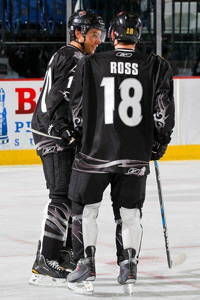
To celebrate the effort, the Wolves will be wearing these charity-related jerseys over the weekend. While I'm not really a fan of the black jerseys, they are for a good cause as the Wolves will be giving them to fans throughout the weekend via raffles and silent auction. For one player, though, this weekend has a much deeper meaning. Darren Haydar will be wearing three different jerseys: one for the silent auction, one for an auction at chicagowolves.com, and one for a raffle at the games. The reason this matters so much to Haydar is that his finacée, Sara Schuster, has recently recovered from a battle with throat cancer.

Sara was diagnosed with squamous cell carcinoma of the larynx at the Mayo Clinic in April 2008, and had to undergo twenty surgeries and twelve rounds of radiation to finally beat the disease. Unfortunately, her voice box and vocal chords had to be removed as part of the battle to defeat the cancer, but the beautiful 27 year-old is now doing well, having been cancer-free since April 2009. While she will have to speak through an electronic voice box implanted at the front base of her throat for the rest of her life and undergo surgery every twelve weeks to have scar tissue removed so she can breathe, the fact is that she beat Stage-4 throat cancer. Not many people have been as lucky.

"I'm very proud to be a part of this Wolves charity event, being a cancer patient myself," Schuster told chicagowolves.com. "Every event that raises money for research towards a cure means so much to the people affected by this terrible disease, and this is a wonderful way to donate to an important cause. When you buy these jerseys, you won’t only be wearing your favorite player's sweater, you’re wearing your support for a cure for cancer."

The jerseys themselves look pretty good despite being black. There's nothing gaudy or tacky on them, and there are no major distractions or flair that ruin the aesthetics. That being said, I would have liked to see something more in relation to the cause the Wolves are supporting in these jerseys, but they're a good charity jersey as they are. Well done, Wolves! I'm not going to be critical of a jersey that's going to help thousands of cancer patients in Illinois, that's for sure.

As for Haydar, he's been an active part of Sara's battle since she was diagnosed.

"I’m going to continue to stick by her side and do whatever I can to help her beat this terrible disease," he told Lacy J. Banks of the Chicago Sun-Times. To be as strong as she is and to fight as hard as she has is something I really admire about her."

After defeating the Wilkes-Barre/Scranton Penguins four-games-to-two in the AHL Calder Cup Final in 2008, the Wolves presented Sara with the game puck from the sixth game of the Calder Cup Finals to show their support in her fight. After their hard fight through four rounds of intense playoff hockey, the presentation of the puck to Miss Schuster moved several players and Sara to tears.

"I’m happy to be alive and I refuse to give up," Schuster said to the Chicago Sun-Times. "I am blessed to have the support of Darren, relatives, friends and the support of the Wolves’ organization has been super."

Count me in as a supporter of this excellent weekend in the fight against cancer. I think that what the Wolves are doing is top-notch in terms of being a good corporate citizen, and the impact will be felt by many people and fans in Illinois. As for Sara, I wish her nothing but the best as she continues to get treatment after her battle with this disease, and I'm very happy she was victorious!

If you'd like to support the Wolves in their battle against cancer, the charity auction for Darren Haydar's jersey has been posted and is running! Click here to go to the auction page! The current bid is $275, and all the money is going back to cancer-related charities for research into defeating this disease!

Until next time, keep your sticks on the ice!