Showing posts with label logo. Show all posts

Saturday, March 12, 2011

There is no quantitative limit with regards to the respect and admiration I have for hockey history. There are so many great stories and so much fascinating imagery from the game that it should be celebrated as often as possible. Thankfully, Classic Auctions is holding another one of its fabulous sports memorabilia auctions, so I think it's time we revisit some of the great history seen in the game of hockey and some of the associated stories that have come along with these small glimpses into the annals of the game. Let's take a look at some of the more interesting pieces up for auction this time.
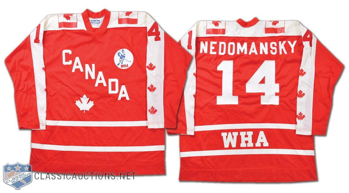
  • We'll start this look into hockey history with a glimpse back at a jersey from an all-star. Vaclav Nedomansky was chosen as a WHA All-Star in 1976, and he played on Team Canada for the game in Cleveland, Ohio despite being from Czechoslovakia! The reason for this is that the WHA chose players for their all-star teams based upon where they played rather than where they were born! The Canadian-based WHA teams sent players as part of the Canada All-Stars and the American-based WHA teams sent players as the United States All-Stars. In 1976, Toronto Toros' star Nedomansky and the Canadian WHA All-Stars beat the US WHA All-Stars by a 6-1 score on January 13 at Richfield Coliseum!
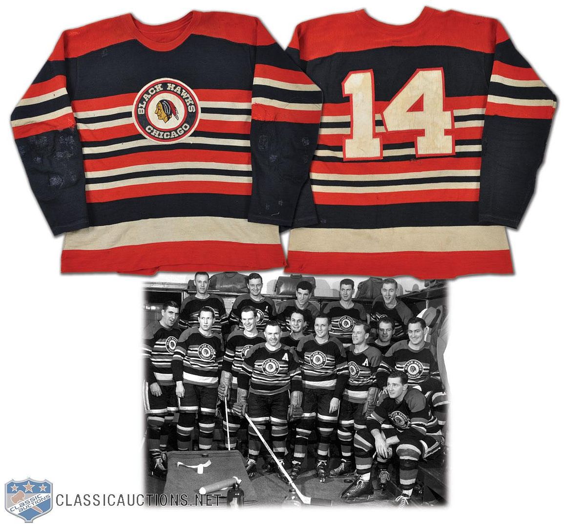
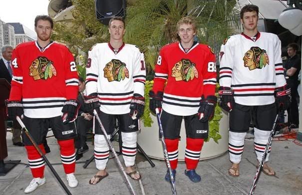
  • We move on to an Original Six team. I have to say that I am a huge fan of this Blackhawks sweater from the 1950s. The colours, the stripes, the logo, the font... it truly is a thing of beauty! If there was ever an opportunity to bring back a different alternate jersey for the Blackhawks, this one gets my vote.
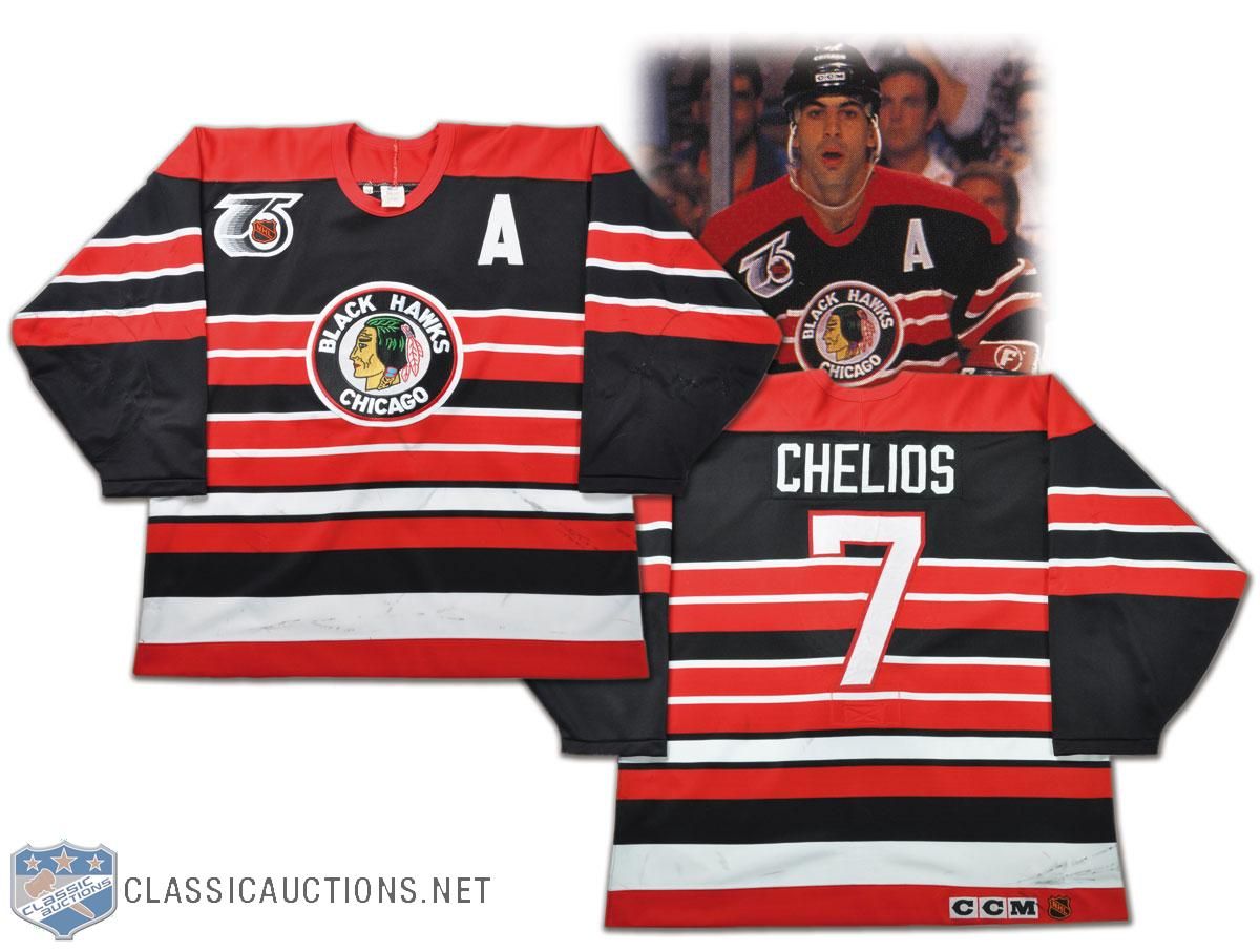
  • Strangely enough, the Blackhawks have worn this look closer to the future. In 1991-92, the NHL had the Original Six teams wear a throwback jersey, and the Blackhawks decided on a jersey that looked remarkably like their sweaters from the 1950s. Two things I don't like: the rear font they decided on, and the name on the back. The font is just too skinny, and if you're going to throwback to a previous incarnation, go all the way or don't go at all.
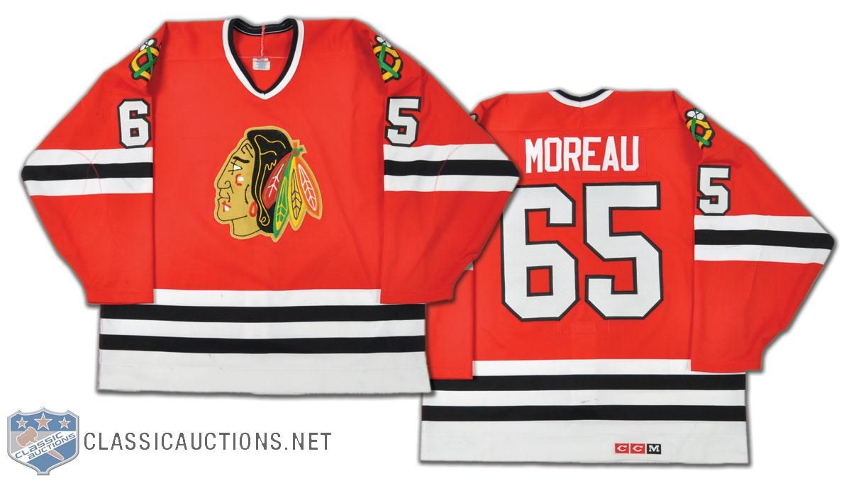
  • This is a rare find, but I'm always intrigued when I come upon a number that I've never seen a player wear. Ethan Moreau apparently wore #65 during the 1994 preseason! If you're a Moreau fan, this number is one of those rare finds - much like Joe Sakic's #88 jersey when he played with the Nordiques!
  • When you think of the Vancouver Canucks, does anyone else miss this look? I'm sorry, but as good as the current look is, there is still something about the skate logo that I truly miss about the Canucks. Maybe we'll see these beauties come back as an alternate one day? No one did yellow-orange-black like the Canucks did.
  • As much as I hated them as a Penguins fan, there is something magical about the red-white-and blue of the Capitals. But I do have one question about this Doug Jarvis jersey from the early-1980s: why are the hem stripes so huge? They literally go right to the logo which is mid-torso! That's a little crazy.
  • Just because there aren't enough Sutters in Calgary, here is more proof that the Sutter bloodline runs through the Flames. That's Shaun Sutter's jersey from the 1999-2000 season. Shaun is the son of Brian Sutter, and was drafted by the Flames when his dad coached there. Currently, Shaun serves as an assistant coach with the WHL's Regina Pats.
  • I've looked at this before, but there was something going on with the Philadelphia Flyers in the late-1970s and early-1980s. Check out the location of the captain's "C" on Bob Clarke's jersey from 1976-77. It's nearly in the middle of his chest! And it's still pretty close to his mid-line in 1980-81! What gives? Why is it so close to the middle of his chest?
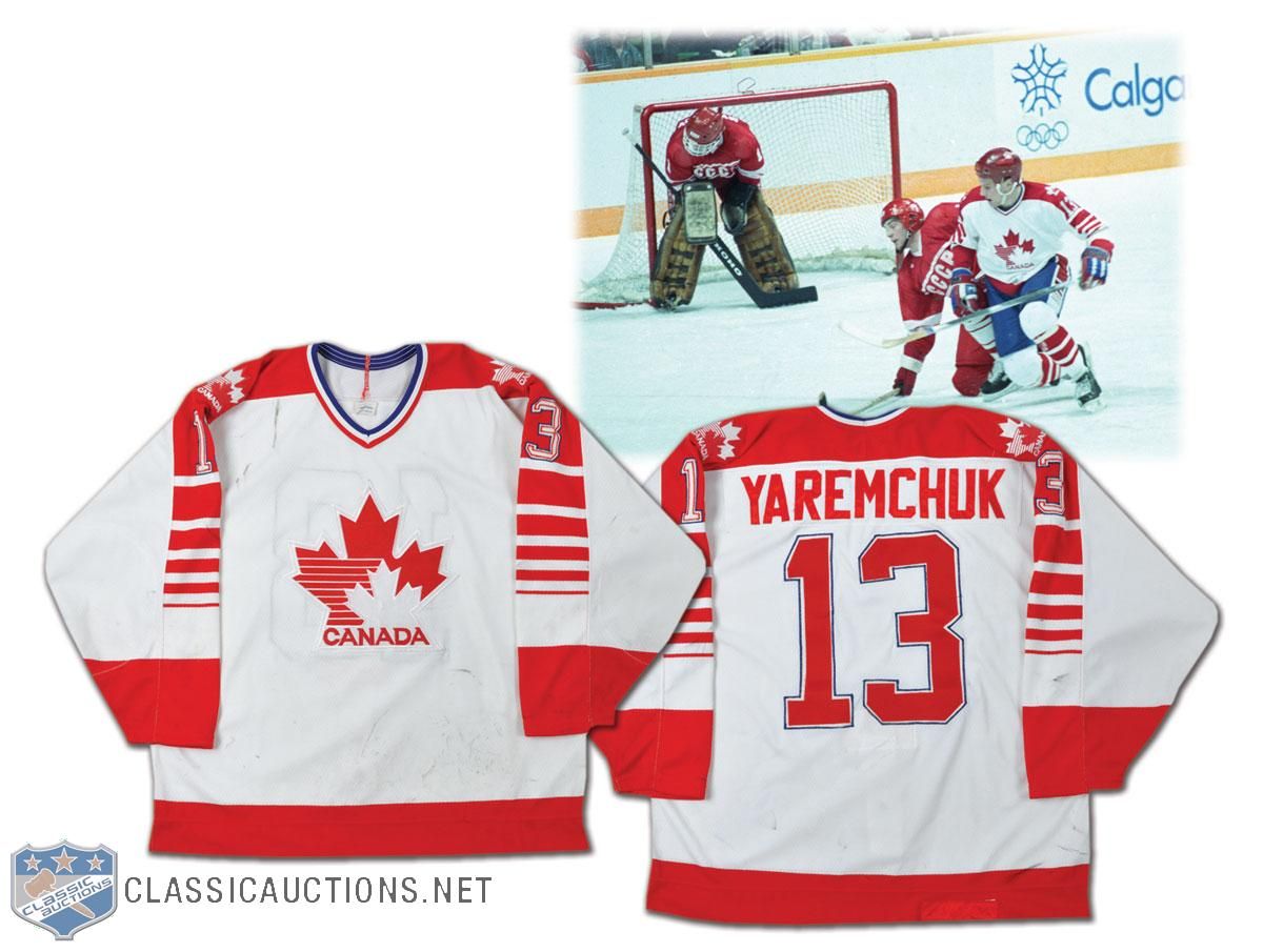
  • We move to the international scene. There's a big story surrounding the 1988 Canada Olympic jerseys that I wasn't aware of before reading the story on the Classic Auctions site. This is Ken Yaremchuk's jersey, and he played alongside NHL players like Sean Burke and Andy Moog as they prepared to represent Canada at the 1988 Winter Games in Calgary. Here's the kicker: "An embroidered CCM crest on the rear hem has been covered with a patch of red tackle twill, obviously to comply with advertising guidelines. Canada received a fine of $100,000 for refusing to wear uniforms made by Tackla at the Games". I never knew that! Corporate America already had a hold on the Olympic Games back then! How cool is that little gem of hockey history? I'm hoping your answer was "very".
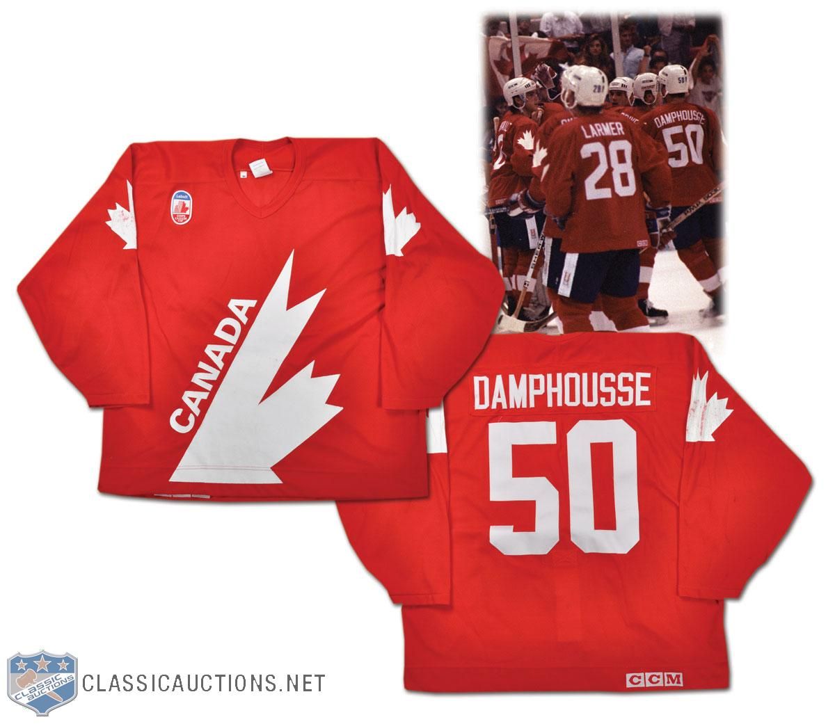
  • Here's a number that wasn't seen on the ice at the 1991 Canada Cup, but Vincent Damphousse played during the selection camp. He wore #50 through the camp as he worked to play his way onto the team, but he was cut days before the Canada Cup started. It's another one of those number cameos by a player who never wore #50 again. We'll see more of Damphousse later in this article as he has another jersey in this exposé.
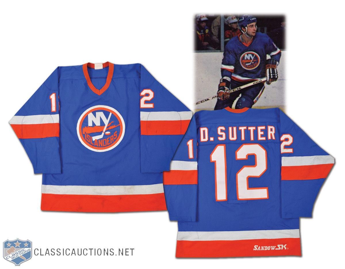
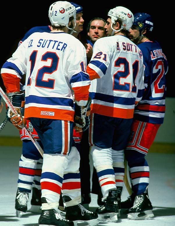
  • We mentioned a couple of Sutters already, so let's bring a couple more onboard in this article. We get a good look at Duane Sutter's jersey with the Islanders from '81-82, and I'm always a fan of the first initial on a jersey. However, as we look at this photo with both Duane and Brent Sutter in it, does anyone see a major difference in the lettering? Duane's appears as single-colour font while Brent's font is double-coloured. It appears this was corrected as of 1981-82.
  • With the Lightning changing their jerseys next season, it's always interesting to look back at some of their previous jerseys. Their inaugural jersey was interesting. Steve Kasper's jersey has that ridiculous font on it. I'm quite happy that it went the way of the dodo and was never seen again.
  • I have to say that I always loved the colours of the Minnesota North Stars. We get to see that gorgeous green colour of the North Stars jersey here on Basil McRae's uniform from the 1987-88 season. This is what Minnesota hockey looks like. Bring back the green!
  • Bob Rouse's jersey from his stint with the North Stars shows the addition of black to the colour scheme. This is how I think most people remember the North Stars. There were so many great memories of that Stanley Cup run in 1991 that ended at the hands of Mario Lemieux and the Pittsburgh Penguins in the final, but these great uniforms will stand out vividly in my mind.
  • The jerseys that the North Stars wore in 1991-92 really took leaps and bounds in the wrong directions with their "re-design". Nothing about that design even comes close to giving off that great North Star vibe, and it feels pretty bland as a hockey jersey. Little did the hockey world know that the "north" part would soon be a thing of the past.
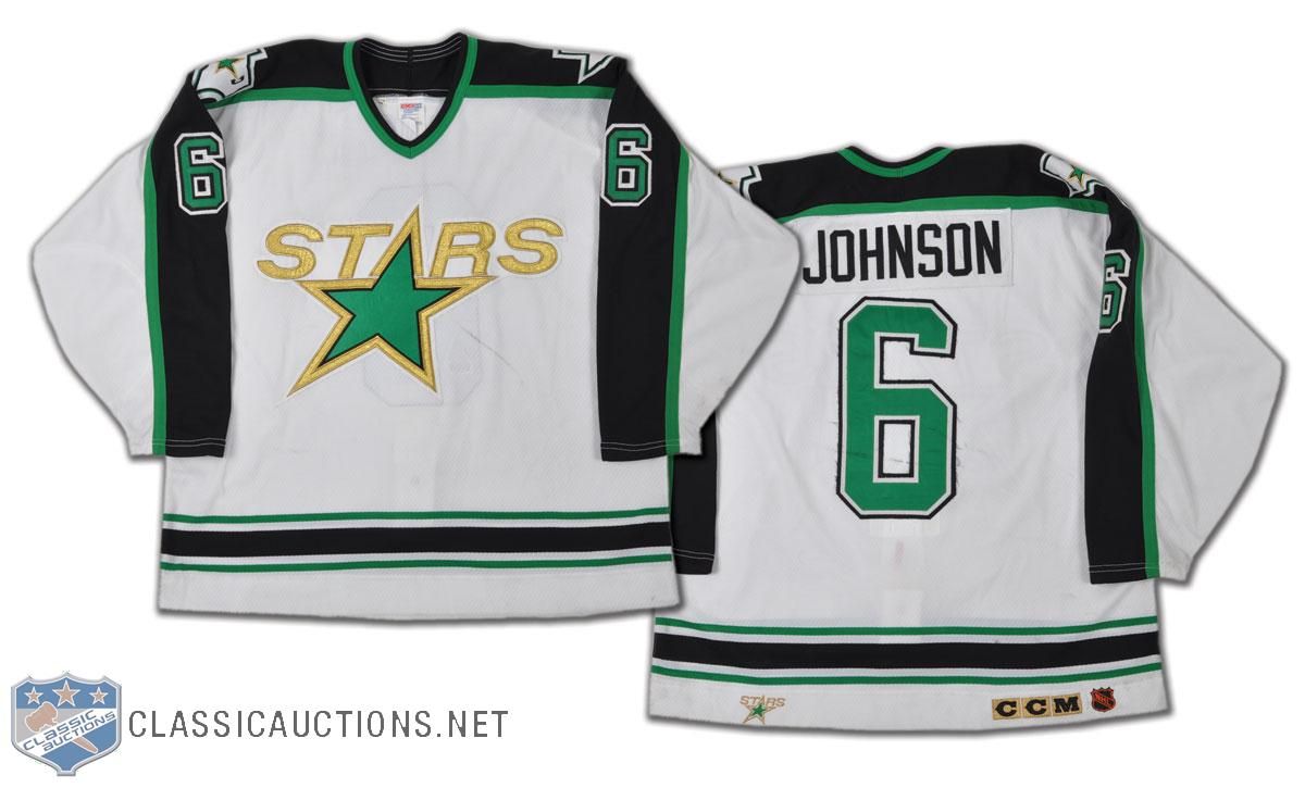
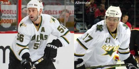
  • By 1993-94, the Stars would be playing in Dallas, and they would be wearing uniforms that seemed to have a lot in common with the earlier re-design. Note to self, fans: if your team suddenly begins to remove the parts of the uniform that make you distinctly unique like, say, part of the team name, I'd be suspicious.
  • Even the officials got in the act with some distinct designs. We've seen this image of Ron Ego calling a penalty in the WHA and discussed his red-striped officials jersey. I never scoured the internet for a picture with much intent because the referees seem to get lost in the shuffle of history. However, Wayne Mundey's referee sweater is a joy to behold!
  • The NHL officials showed that they wore the NHL colours for a long time as this official's sweater from the 1970s has orange numbering to match the NHL shield on the front! Wasn't it nice when NHL All-Star teams and NHL employees all represented the league by wearing the league's colours? The "good ol' days", I suppose.
  • The California Golden Seals seemed to miss the boat in the 1970s when they went pastel instead of staying true to their gorgeous green looks as the Oakland Seals. Bob Girard's uniform looks great, but it just doesn't have the same "pop" as the Oakland jersey does.
  • The 1975-76 Kansas City Scouts jersey is a nice blend of colours, but that logo really draws the eyes to it. That logo features chain-stitching, a favorite of Mr. Paul Lukas over on Uni Watch Blog. I'm not saying the colours should return in the same fashion, but I really think someone needs to come up with a new "Scouts" ensemble. Any takers?
  • Check out the logo on Nelson Pyatt's Colorado Rockies jersey from 1976-77. It looks a little off, doesn't it? That's because the Rockies didn't have their jerseys ready when the season started in 1976. The Kansas City Scouts had moved in the off-season before the 1976 season started to Denver, but they didn't have their jerseys ready in time for the start of the season. Thus the Rockies began the 1976-77 season with an odd-looking Rockies logo instead of their normal logos.
  • Speaking of another jersey that just doesn't seem right, here is a Penguins jersey from the late-1960s. The stripes being light blue just don't seem right after having seen them in yellow-and-black for so many years. Another of the jerseys lost in the annals of history, I suppose.
  • Don Maloney had an interesting career with the New York Rangers. While he wasn't officially the captain, he worked as acting captain whenever the Rangers saw their captain injured. Thus, he routinely is seen with the "C" on his sweater. However, Maloney is probably more well-known for his full name on the back of his sweater. I always thought that was pretty cool.
  • How many people remember Guy Lafleur's tenure with the Broadway Blueshirts? The original "Flower" laced up the skates with the Rangers for 67 games in 1988-89, netting 18 goals and adding 27 assists. I don't remember this, but Lafleur wore #44 while with the Rangers.
  • I found that the Detroit Red Wings did something as they evolved through the 1980s. In the late 1970s (and probably further back), the Red Wings used to use the wheel as the center point for their logo on their chests. The result? Greg Carroll's jersey looks seriously skewed because of the logo.
  • Another gorgeous throwback jersey from the 1991-92 season was worn by the Detroit Red Wings. Doug Crossman played with them that season, and the stripes make this jersey look amazing. This is still one of my favorite hockey jerseys of all-time.
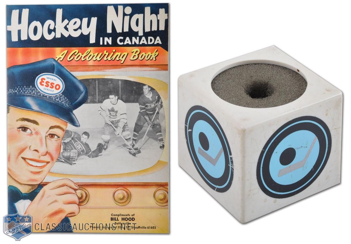
  • How cool is this Hockey Night In Canada microphone cover and book? Ok, the book isn't all that important, but how awesome would it be to have that microphone caddy? I might want one of those more than I want a fabled HNIC towel!
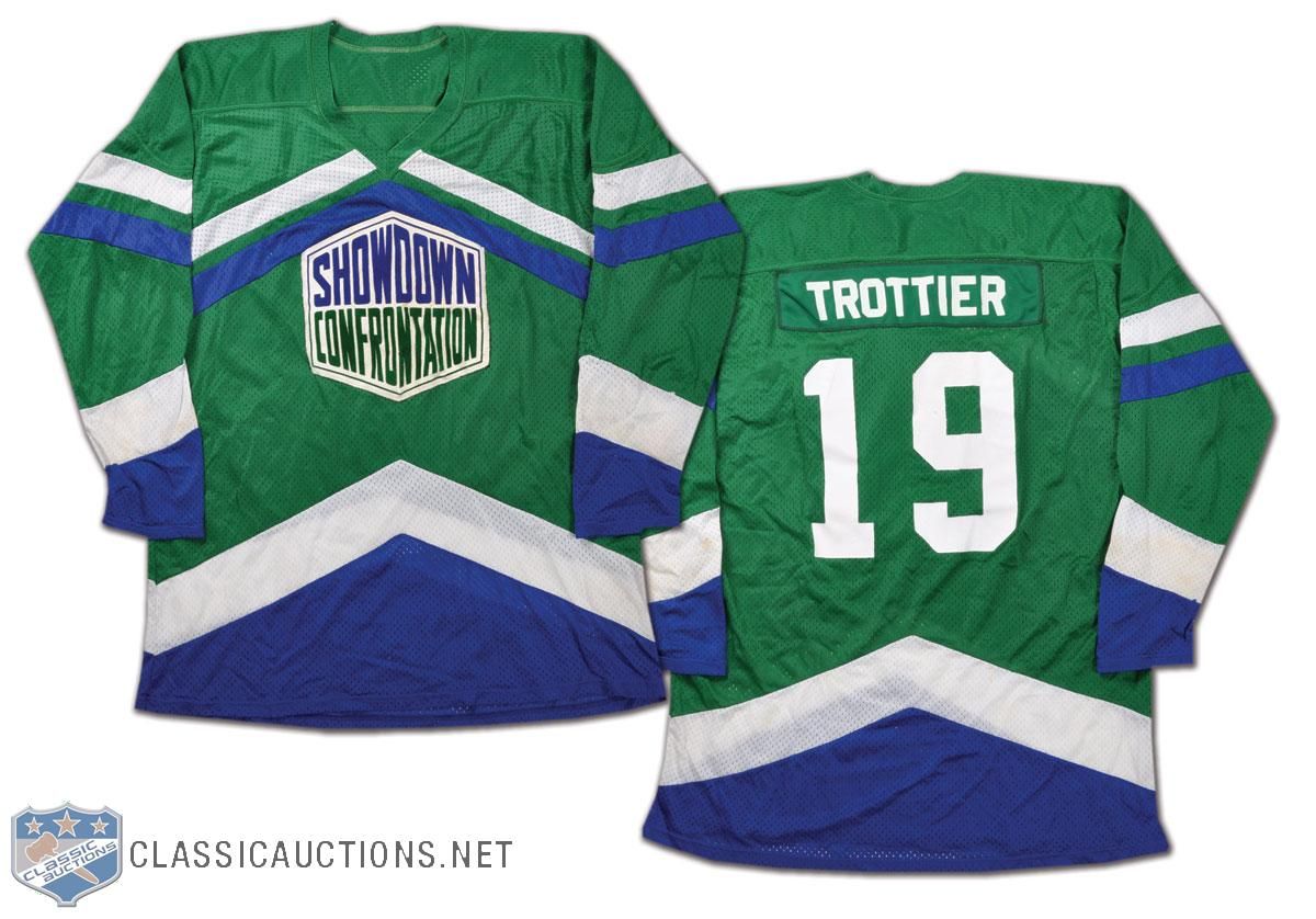
  • We've seen a number of the NHL Showcase Confrontation jerseys in the past, but there's another one in the auction this time around. Bryan Trottier's jersey is up for grabs this time, and I must admit that I really like the colours on this jersey. I may have to research these Showcase Confrontation games a little more!
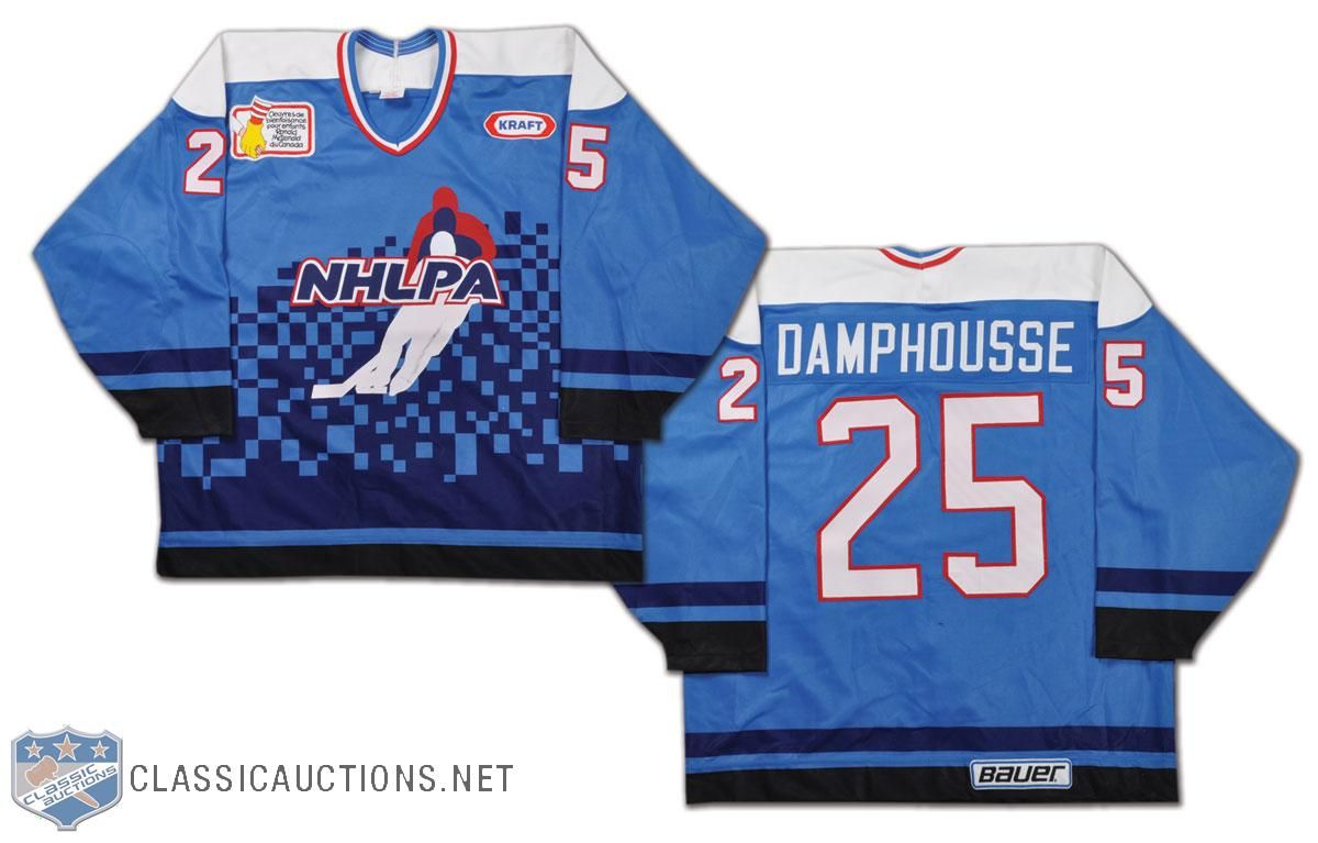
  • There are lots of people who saw the NHLPA 4-on-4 Challenge from Hamilton, Ontario in 1995, but there seems to be zero tape of these games online anywhere. During the strike, the players got together at Copps Coliseum in Hamilton to play some four-on-four hockey while representing their respective regions: Western Canada, Ontario, Quebec, and the USA. Vincent Damphousse was invited, and he played for Team Quebec at the event in this gorgeous NHLPA jersey. I want it!
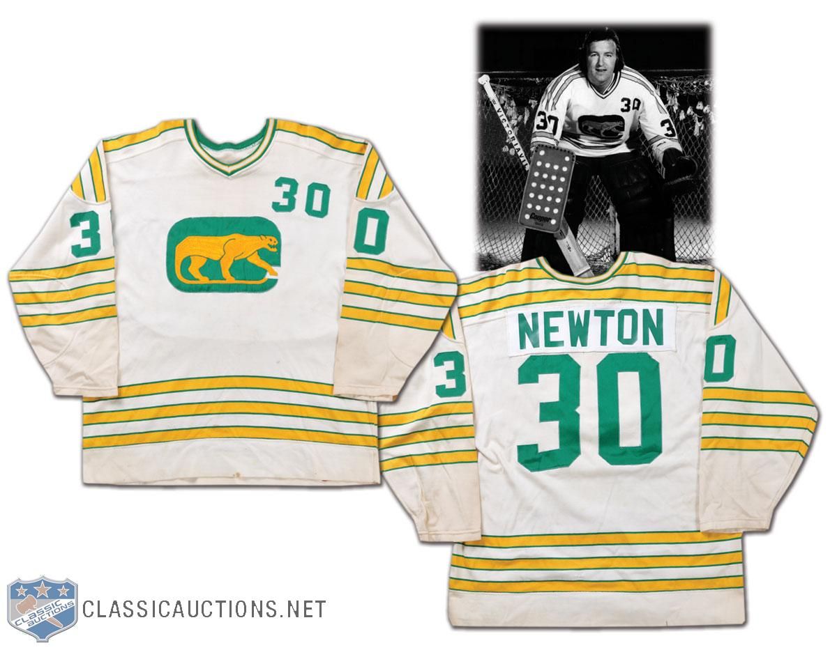
  • We started with the WHA, so let's end it with a few WHA sweaters as well. The original team with the number on the shoulder was the Chicago Cougars, and Cam Newton's jersey from 1973-74 shows the number clearly. I'm still not a very big fan of having the number on the front of the jersey in hockey, but it seems to have made a comeback with some of the NHL teams today.
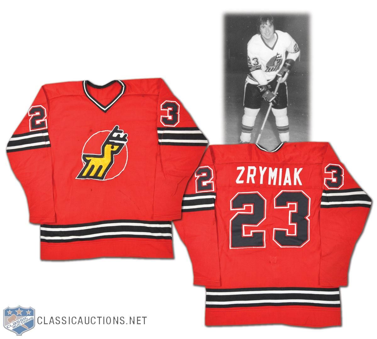
  • Journeyman defenceman Jerry Zrymiak bounced around the WHA for a while, but he played with the Michigan Stags for a while during the '74-75 season. I'm not sure about you, but the name "Michigan Stags" just sounds like a manly name. The colour is a little less manly, though. I love the Stags' logo, though.
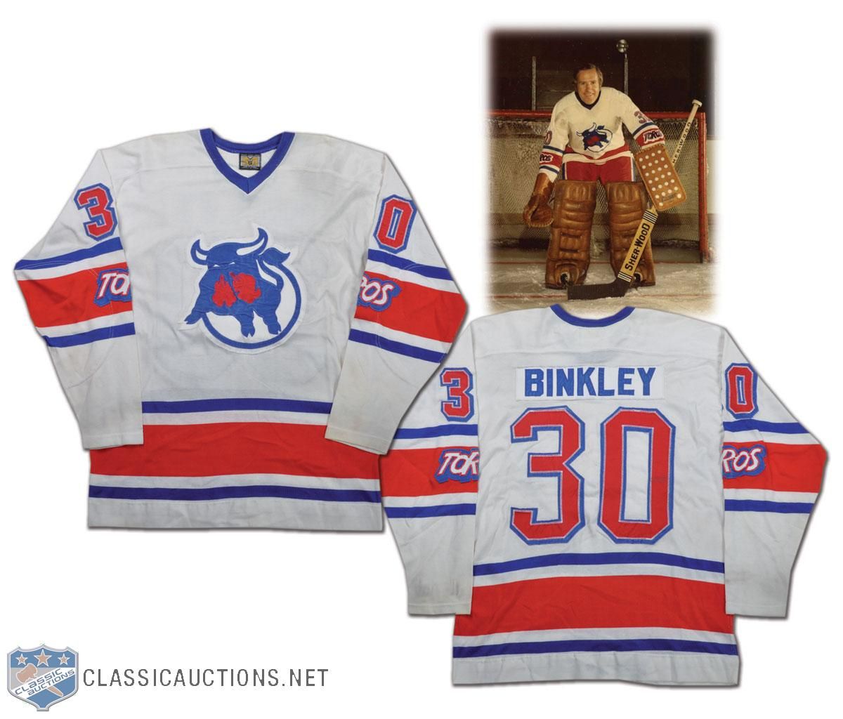
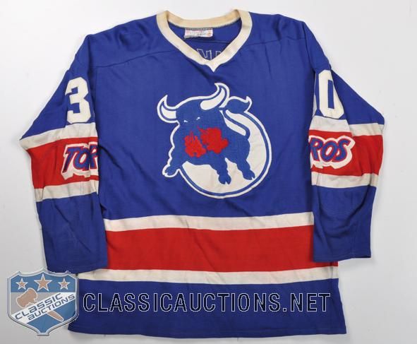
  • Les Binkley starred in net for the Toronto Toros in 1975-76. I like the colours of the Toros' jerseys, but the important part is the "Toros" mark on the sleeve stripe. That's a huge detail on these jerseys, especially when you consider that the team moved after the '75-76 season and became the Birmingham Bulls. Why is this important? Check out the similarities in the Bulls' jersey to the Toros' jersey. The only thing missing is the "Toros" wordmark from the sleeve!
There are a pile of incredible auction items available through the Classic Auctions website. I really would kill for that HNIC microphone cover or that Detroit TBTC jersey, but, being that I'm a poor college student, these luxuries will have to wait. If you're interested, get over to the Classic Auctions website ASAP!

Until next time, keep your sticks on the ice!

Sunday, February 13, 2011

I was at school the other day, and someone asked me if I had ever heard of the Canadian Women's Hockey League. I have, in fact, heard of the league as I had done a story on the draft that took place to get the inaugural five teams up and running. It was then that I realized that I have seriously neglected the highest professional hockey league that women can compete in against other women. Because of this oversight, today is all about the Canadian Women's Hockey League, how each team is doing, what they are wearing, and where you can catch a game or two if you're interested.

I want to preface this article with this statement: if you spend the time telling me that no one cares about women's hockey through comments or email, your comments will not only be denied entry on to this article, but I'll categorically go back and delete any and all comments you have ever made. And any future comments will be denied entry as well. I'm tired of hearing "hockey fans" crap all over women's hockey like it means nothing. If that's the case, your kid's Timbits hockey or any minor hockey in general is just as meaningless. As a true hockey fan, this won't fly with me. Capisce?

First off, there are a lot of recognizable names playing on the five teams in the CWHL. The five teams are based out of Brampton, Burlington, Toronto, Montreal, and the lone American-based team in Boston. These teams were assembled through a draft that happened in early August of 2010, and the teams have been battling since the season started.

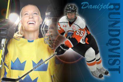
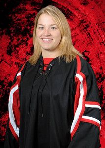
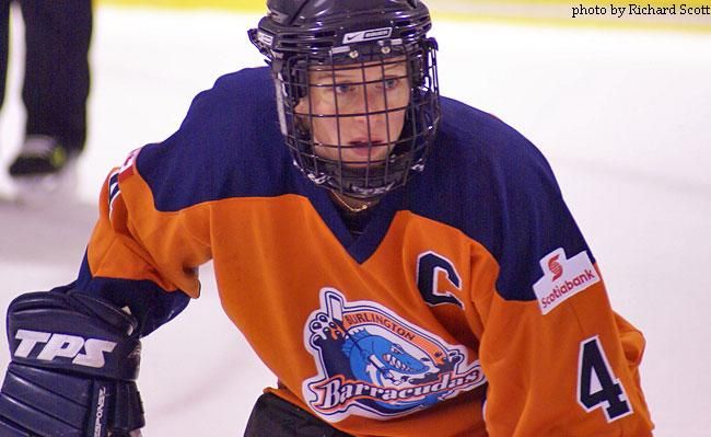
If you're a fan of Burlington Barracudas, you want to keep your eyes on Danijela Rundqvist, Becky Kellar, Ashley Riggs, and Shannon Moulson. Burlington has had a rough start in the inaugural CWHL season. They currently sit fifth out of five teams with a 4-17-1 record, including being 1-11-1 away from the friendly confines of the Appleby Ice Centre.

If you cheer for the Brampton Canadettes-Thunder, Jayna Hefford, Gillian Apps, Cherie Piper, and Lori Dupuis are probably household names. Brampton has been on a major tear recently having won eleven straight games, and this streak has propelled them into second-place in the CWHL with a 17-6-0 record! Brampton is pretty consistent when it comes to their play as they are 9-3-0 at the Cassie Campbell Comnmunity Centre and 8-3-0 away from home. Hefford is the CWHL's all-time leading scorer in the previous incarnation of the CWHL, so there's some history there too!

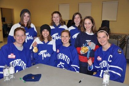
The Toronto Aeros are sitting in fourth-place in the five team CWHL, but trail third-place by only two points at the time of writing. Their 8-12-3 record sees them playing well at home where they are 5-3-0, but Toronto needs to be better on the road with their brutal 3-9-3 record. Jennifer Botterill leads the team in scoring, and she's joined by familiar faces Tessa Bonhomme and Sami Jo Small. The Toronto club is stocked with former NCAA players, so this young squad is coming along nicely as they mature through this season.

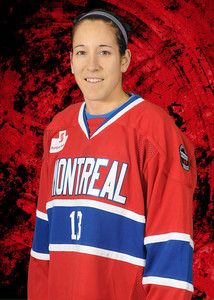
The Montreal Stars are the class of the league at this point, leading in wins and points in posting a record of 18-2-2. Caroline Ouellette is dominating the league with 58 points in just 22 games. Joining her on the Montreal squad are Emmanuelle Blais, Julie Chu, Sarah Vaillancourt, and Kim St-Pierre. Montreal is 11-2-1 on home ice at Aréna Étienne-Desarteau, but has yet to lose in regulation on the road with a 7-0-1 record.

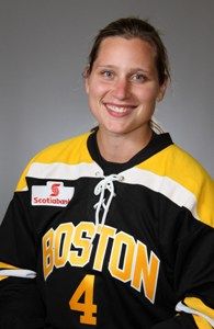
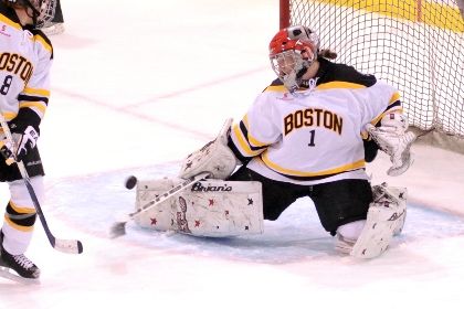
The lone American-based team is the Boston Blades, and they currently sit in third-place in the CWHL. Boston is 10-13-1 through 24 games thus far, but are significantly better on American soil. The Blades have a 7-6-1 record at the University of New Hampshire's Whittemore Center Arena, but have struggled to a 3-7-0 record while traveling through Canada. Led by Angela Ruggiero, Caitlyn Cahow, Erika Lawler, and Kacey Bellamy, the American-based team recently put an end to Montreal's undefeated season thanks in large part to a 74-save effort by by goaltender Mandy Cronin!

Just so you're aware, the Blades will play 16 of their 26 games at “home” – six apiece at Harvard and UNH, and single games at Providence College, Kennedy Memorial Rink in Hyannis and Wesleyan University in Middletown, Connecticut. Essentially, the "New England" Blades are making the tour through the NCAA circuit!

As you can see, some of the best women to ever lace up the skates are playing regularly in the CWHL. This will, of course, make the women's game much better as the women will regularly get to play at a high-level, and I commend the CWHL for its commitment to the teams, cities, and women who are putting their best game forward day in and day out.

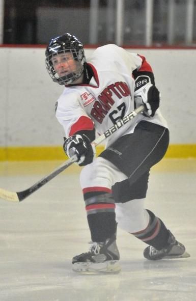
In terms of recognizing the teams, there are some clear similarities between the CWHL and a few NHL teams. The first jerseys put forth were clearly designed from NHL templates. As you can see, the Aeros look like the Maple Leafs, the Stars look like the Canadiens, the Thunder are wearing the colours of the Ottawa Senators, and the Barracudas are shown in the colours of the Buffalo Sabres. All of them have the Dallas Stars' treatment on the front in this image.

Well, there were a few teams that stuck with those similarities, but one team decided to stick with their original colours and their original logo that they wore in a previous league. I have to say that there are very few images of CWHL players in comparison to other leagues. In saying that, here are how the teams look today.

Toronto is definitely blue at home and white on the road. The roster photos shown on their roster page have the players in this mock-up, but I have not seen this uniform used in any picture where the players are playing. I also have yet to see the alternate uniform proposed above, so I'm on the hunt for some of those images still.

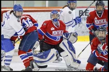
Montreal proudly wears red at home and white on the road. Again, no sign of the alternate uniform, and I'm thinking this may be a cost-saving measure. Why create a third uniform in your first year of existence? Or when your uniforms look extremely sharp already?

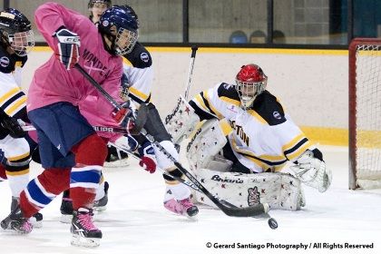
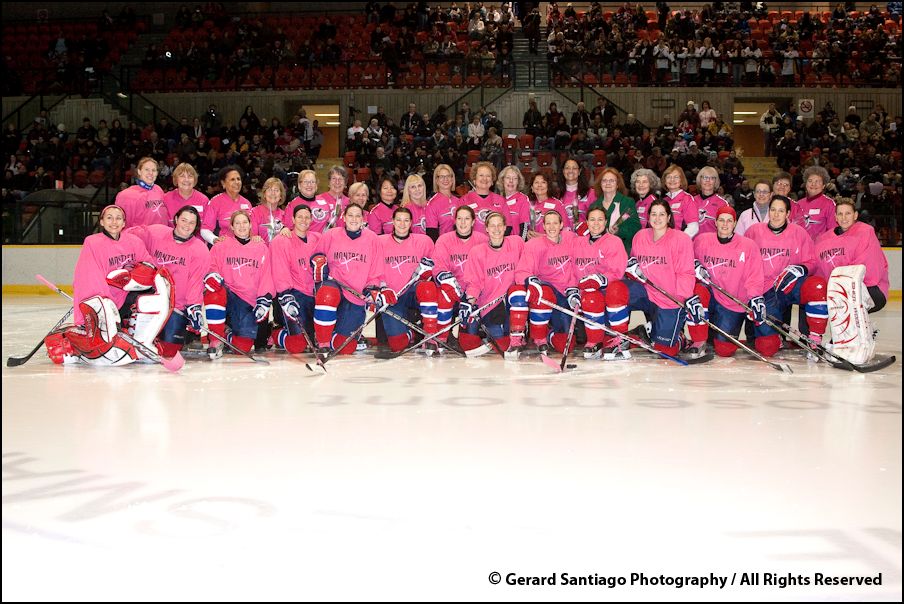
Montreal should go down in the CWHL as the first team to wear a promotional jersey as well as the team wore pink jerseys on February 1 to help promote breast cancer awareness and to raise funds for the Fondation du cancer du sein du Québec to battle the disease. After the game, the Stars and their moms took to the ice for a photo! The Stars raised over $5000 for the charity on the night! Good on the Stars for helping this charity, especially since it hits close to home for a number of women playing in the game!

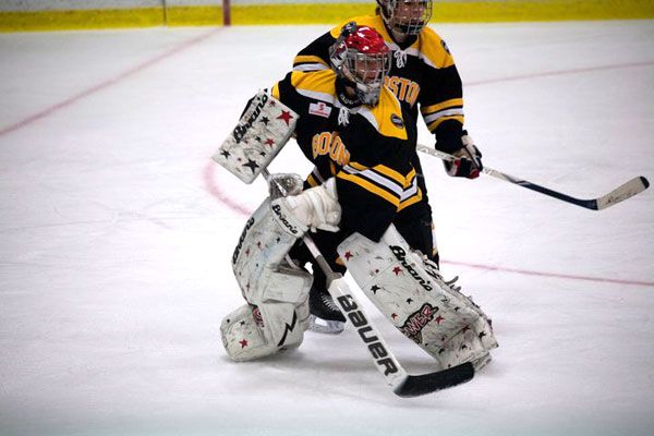
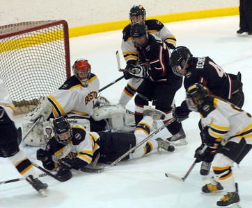
The Boston Blades look very familiar as they wear black with yellow at home and white on the road. Much like the Stars and Aeros, I have yet to see a third yellow jersey being worn by Boston, but I am still looking.

The Brampton Canadettes-Thunder have gone opposite to the norm, adopting the black third jersey as their home jersey while wearing white on the road. Instead of going red like the Senators do, the Canadettes-Thunder are wearing black. For a five-team league, you would think that Brampton could choose a different colour, but I'm not going to rain on their parade.

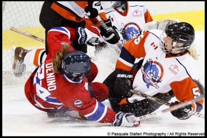
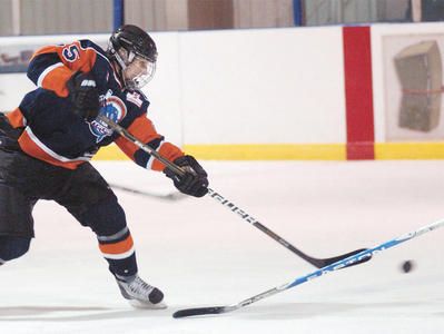
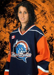
Burlington is the wild card in this five-team league as they decided to go with the template of the New York Islanders instead of the Buffalo Sabres. This may have been due to the fact that they wore orange and navy blue in their previous seasons, so this keeps their colour scheme intact. As you can see, the Barracudas wear white on the road while going navy at home. As you can see, Burlington has opted to keep their logo as they display it proudly across the front of their jerseys.

So there's your introduction to the Canadian Women's Hockey League. I'll be following these teams and players as the season progresses, and we'll have a full run-down of how well each team did at the end of the regular season along with a synopsis of how the players did in the race to win the scoring title!

I'd just like to point out that some of these amazing photographs were taken by Pasquale Stalteri and used with his permission. Please respect the copyright this amazing photographer has done, and I encourage you to check out his website or his blog where all of his amazing photography can be seen. I am truly thankful for the work Monsieur Stalteri has done with the CWHL, and for his generosity in allowing me to use some of his fantastic photography! A link to his site can be found on the menu to the right!

Until next time, keep your sticks on the ice!

Monday, January 31, 2011

Rarely are NHL fans treated to a new look midway through the NHL season. Rarely are we treated to a shift in the values, vision, and direction of a franchise so thoroughly with half the season still to be played. And it is the rarest of cases that a franchise will debut new uniforms midway through a season while still wearing their old uniforms. However, the Tampa Bay Lightning have decided to break the trend of waiting until the off-season to debut their new uniforms by unveiling them today. Of course, I have my take on these new threads, so we'll take a look at the good, bad, and indifferent about these new uniforms, and we'll have an overall grade of the new look debuted by the Tampa Bay Lightning.

We've seen a monumental shift in how the Lightning does business since Steve Yzerman took the reins as general manager of the Floridian franchise. The Lightning have definitely changed from an outside point-of-view, extolling the virtues of honour, tradition, respect, and doing things the "right way" as values of their franchise. So it comes as no surprise that the Tampa Bay Lightning published a new set of core values on which the team will build.

If you read that vision statement correctly, the Lightning represent three major keys: the Tampa Bay community, a championship team, and hallmark events. These are the cornerstones of the Lightning franchise in that they will represent and be part of the Tampa Bay community as both corporate citizens and icons within the community; they will be a championship-calibre team so that the metropolitan area of Tampa and St. Petersburg can be proud of their hockey franchise, and proudly stand behind and support their NHL club; and, the Lightning will host hallmark events in which the people of the Tampa Bay area can take part and of which they can be proud. Essentially, the Tampa Bay Lightning are redefining themselves in the market they play in, and I think this is an excellent idea.

Not only are the Lightning pledging to be more visual and more active in the community, but they are committing themselves to the community of Tampa Bay as partners and citizens. But it's not like this vision just suddenly appeared as some apparition to the men who run the Lightning. Instead, this is the basis that the vast majority of northern NHL markets run their businesses. Franchises like Toronto, Montreal, Boston, Minnesota, and Detroit send their players out into the community to interact with fans all the time at various community events. It's no secret that Steve Yzerman, a long-time Detroit Red Wing, is putting this vision forward as a way for the Lightning to become more visible in their own yard. This, readers, is how you generate buzz about your team. For a team that's deep in the sunbelt, this is nothing but a good idea. GOOD.

While the vision statement is something brand-new for this franchise that now puts an onus on the club in being a good corporate citizen, I have to admit that I'm shocked that the Lightning took a step back in their branding of themselves. The new logos, while fairly clear, are also still regressing backwards from their previous iterations. While we saw this work in the case of the Vancouver Canucks as they moved to new uniforms, the Lightning, to me, should be a little more bold. After all, lightning is a pretty awesome force in nature. So while the overall aesthetic of the Lightning hasn't been lost, it does seem a little underwhelming just being one colour. PUSH.

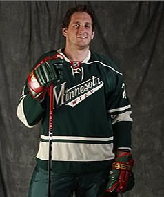
The new uniforms are different, and normally I believe that different is good if it leads to something better. The Lightning have essentially turned a once-bold look into a very subdued look. While I'm not totally against the idea of simplifying anyone's look, we go back to the Lightning being a name that exudes energy and boldness. Had the Minnesota Wild come up with a logo like this, the brand simply doesn't fit the identity. I feel that the home jersey's brand doesn't have the same effect without the black and silver that it once does, and the Lightning are worse off for it. STUPID.

However, I do like the blue colour that the Lightning have decided on for the home jerseys. I was always a fan of the alternate jersey that the Lightning wore in the late-1990s, and the "electric blue" that they wear on their current alternate jerseys stands out. While the Lightning certainly could use some black and silver highlights, the home jersey would essentially look a lot like their current alternate jerseys... making them Dallas East. Kudos for the Lightning in opting for the blue background for their home jerseys, and for not selecting navy blue as their primary colour. GOOD.

The new white road jersey is even more sterile than their current road jersey. Again, the jersey could certainly use some black and/or silver highlights to make the jersey "pop" a little more. After all, we're talking about "the Lightning". And I'm not a fan of the "Tampa Bay" written across this jersey. As you know, I seriously think that NHL teams need to live and die by their logos and branding and not the city name. While the city name is vitally important to the identity of the team, when you read "Chicago hockey", the Blackhawks logo probably comes to mind. Lose the name, grab some jersey accents for this road jersey. STUPID.

The new shoulder patch being sported by the Lightning is magnificent. Honestly, I love the retro look of this new patch, and I think that this design has a lot of opportunity to be a very good logo for branding. First, circular logos are automatically pleasing to the eye in their nature. Don't believe me? Think about these logos - Target, Apple, Disney, Mercedes-Benz, the Olympic Rings, AT&T, Shell Petroleum. What do they all have in common? They are round or have large portions of their logos in a round shape. And I guarantee that most of you can picture each of those logos in your head.

Secondly, the patch is very simplistic in its design. Less is definitely more in this case, and I think the Lightning should be very happy with this design. I, for one, think it could almost be their primary logo. GOOD.

I apologize for the size of the picture, but the Lightning have gone to single-colour names and numbers on the back of the jerseys. I'm certainly not complaining because you can read the names and numbers quite easily in that small picture, and it is much better than some of their previous font choices. The font is clean and simple, and that's perfect. GOOD.

Overall, the look of these new jerseys leaves me wanting more from the Lightning. It's not to say that they're bad or that I won't get used to them, but in comparison to today's look and yesterday's look, the Lightning just seem less aggressive in their new duds. Having the legends show up and wear the new uniforms, including Phil Esposito who never played for the Lightning, was a little much in terms of presentation.

The Lightning also announced that their recently-introduced alternate jerseys would move forward with the new uniforms to remain as the alternate jersey. So while the "Victory Stripes" may be gone from the home and road jerseys, fans of the Lightning will still get to see them when the Lightning play games in their alternate uniforms. As much as I like to make fun of the armpit stripes, they are unique to the Lightning, so I'm glad to see the stripes remain. However, I'm still not sold on "Bolts". PUSH.

So there are the new-look Tampa Bay Lightning in all of their uniform glory. Personally, I think the look will grow on me, so I'm going to give these jerseys a thumbs-up as they went 4-2-2 in the GOOD-STUPID-PUSH record. Time will tell how the Lightning fare in their traditional design, but at least Steve Yzerman didn't resort to bringing Manon Rhéaume in to back up Dwayne Roloson.

Until next time, keep your sticks on the ice!

Sunday, January 23, 2011

We're back again on a chilly Sunday with more comic book unveilings. The NHL Guardian Project rolls on with seven more Guardians unveiled this past week, so we'll continue to run down the similarities between these Guardians and some of the more recognizable superheroes that have a hold on pop culture. Again, this is just some fun with the NHL Guardian Project before the big unveiling at the NHL All-Star Game on January 30, so don't take this article too seriously.

If you want to see any of the previous Guardians that have been unveiled, feel free to check out this article for the first eight Guardians or this article for the next eight Guardians. Seven more NHL-themed superheroes are on-deck, so let's get to them!

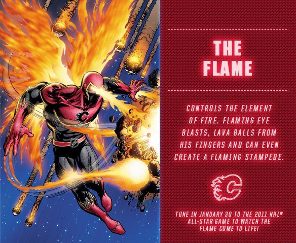
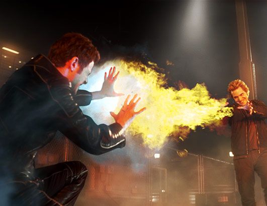
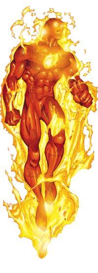
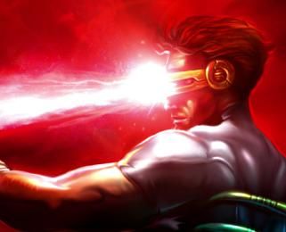
We'll start in Calgary where the Flame holds the fort. The Flame seemingly would be the equivalent of Pyro from the X-Men series or Johnny Storm aka The Human Torch from the Fantastic Four, but having the ability to shoot fire from his eyepiece reminds me of the X-Men's Cyclops as well. "Lava balls from his fingers" just sounds uncomfortable, so does that mean he has lava flowing through his veins? And apparently he can create "flaming stampedes" which means that the near-dead fire-horse is being revived by Stan Lee.

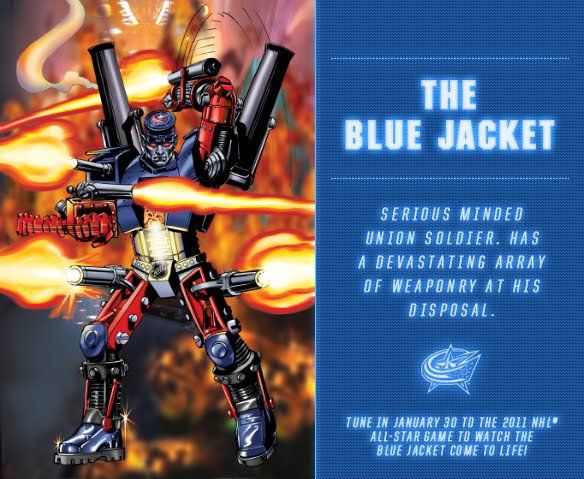
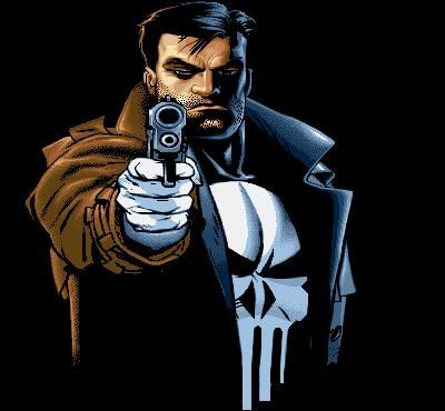
We move on to Columbus where the Blue Jacket has an arsenal of weaponry at his fingertips. As a "serious minded union soldier", I assume he'll protect the interests of the players with all his might as the NHLPA could use a good warrior. He does have "a devastating array of weaponry" attached to him, so I'm thinking that this Blue Jacket soldier is more machine than he is man. Thanks to the revamp of the Captain America, I'd say the Blue Jacket is a close copy of the stars-and-stripes superhero. That, or an Americana-themed Punisher. He was a fan of guns as well. Then again, maybe he's just a primitive Sentinel?

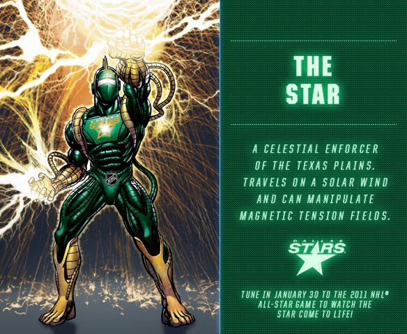
We head south to the state of Texas where the Star defends the city of Dallas. I have to admit that this Guardian's name is a little narcissistic, but who am I to judge? I find him to be very much like Electro in his electrical abilities. He's a "celestial enforcer", but I'm not quite sure what that means entirely. He "travels on solar wind", but I'm not sure why he would choose to travel this way when all it does is land him on the North or South Pole and/or send him clear past the Earth altogether. And this "magnetic tension field" stuff? Well, it is important in the field of magnetohydrodynamics, but let's just say that ten year-olds probably won't get the theory behind it. My guess is that the Star is probably from some far-off galaxy where this stuff is as common as 2+2, and is not of this planet whatsoever.

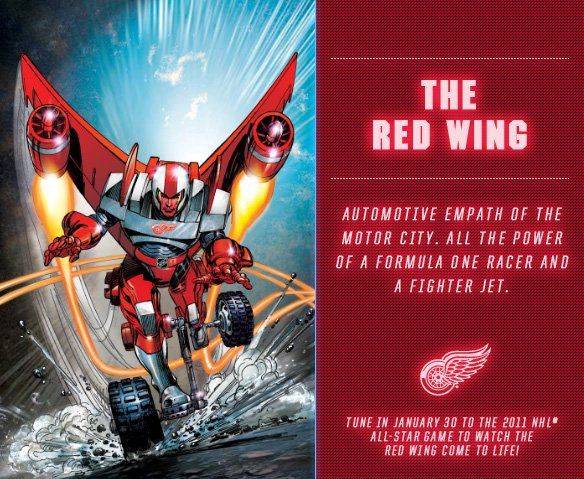
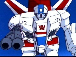
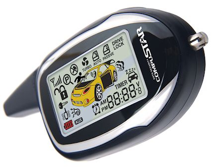
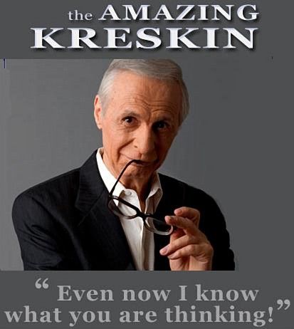
The fourth Original Six Guardian we see is the Red Wing. Only the Red Wing isn't wearing the Original Six logo, so I'm thinking we might need an update to this Guardian. The Red Wing seems like a poor man's Transformer, resembling something like Jetfire with wheels. He reportedly has "all the power of a Formula One racer and a fighter jet", so I assume he moves fast with great bursts of acceleration. Being that he's an "automotive empath", he comes equipped with Command Start, and can control any vehicle with his mind. He's like the Kreskin of Transformers!

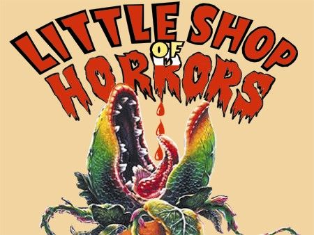
We jump north of the border to encounter the Maple Leaf. Who actually isn't a leaf at all. However, being a walking and talking maple tree means that he actually is an ent, and he is only slightly more intimidating than Dr. Reggie Bushroot of Darkwing Duck fame. He is literally an "immovable object", so we just need to find the unstoppable force for the paradox. I like the Original Six logo once again, but if he can grow exponentially larger at will, can he become bigger than the planet? At what point does this power reach its limit? Will we see a Little Shop of Horrors reference at some point?

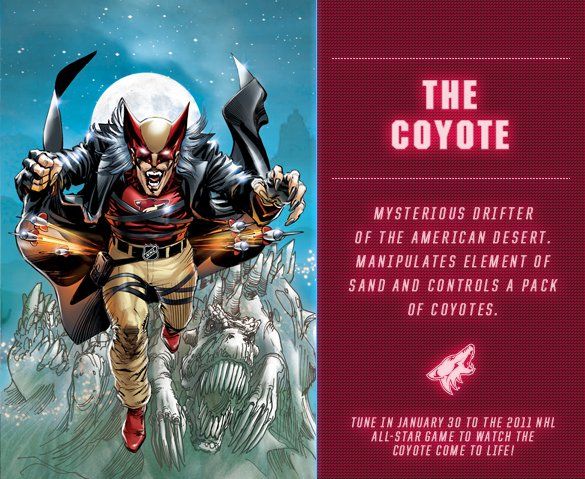
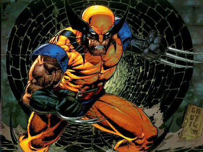
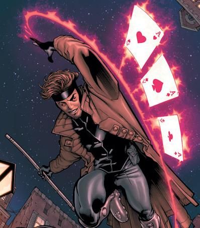
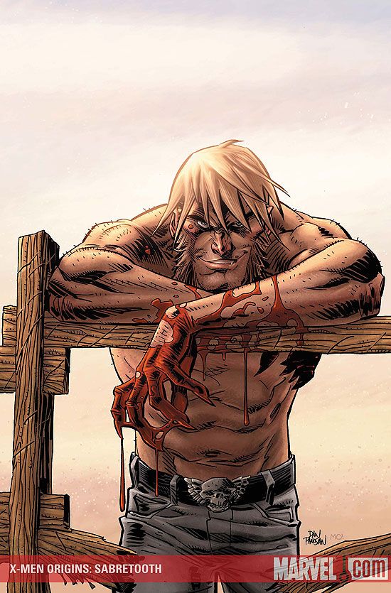
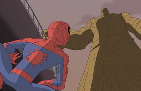
Next, we head to the desert to meet the Coyote. The Coyote is the NHL's version of Wolverine in Gambit's clothes with Sabertooth's claws. Strangely, he's also a drifter like Wolverine was in his past. He also has the same ability as that of the Sandman to control any amount of shifting sand. Oh, he also has a pack of Coyotes that roam the country side as his own personal K-9 unit. Much like the Phoenix Coyotes, I'm guessing this guy will be a major "underdog" in most battles until he "unleashes" his true powers. Puns are free of charge in this article.

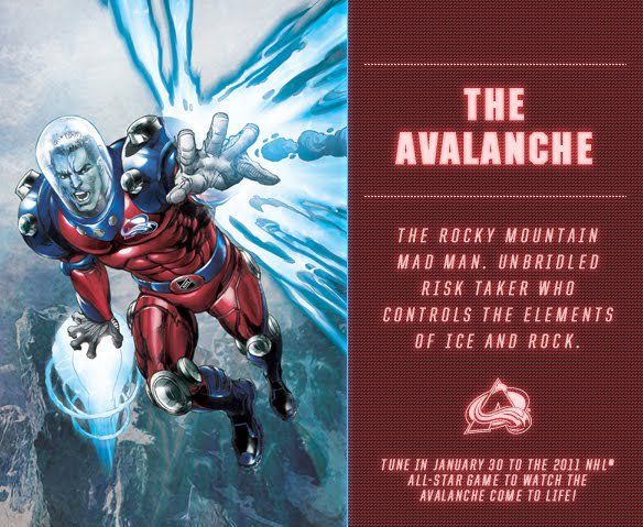
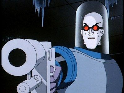
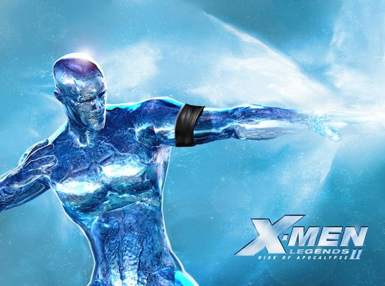
The last Guardian we encounter today is the Avalanche. The Avalanche has some very distinct similarities to that of Mr. Freeze from the Batman franchise as well as the abilities of Iceman from the X-Men franchise. The fact that he's the "Rocky Mountain mad man" worries me a little, and I'd be very concerned about his reputation as an "unbridled risk taker". I understand the ability to control ice, but how does he control rock? Can he cause earthquakes? Is he able to make mountains out of molehills? What are the limits of this power?

There are your seven newest Guardians to arrive on the scene. Again, you can see all of the Guardians on January 30 at the NHL All-Star Game from Raleigh, North Carolina when they are are officially unveiled as part of the NHL Guardian Project!

Until then, keep your sticks on the ice!

Sunday, January 16, 2011

There were eight more NHL Guardians unveiled this week as we move closer to the January 30 date of the NHL All-Star Game where you can see all of the Guardians at once. Today's eight Guardians have a heavy animal theme to them, but I'll continue with my looks at each one individually in terms of their looks and who they seem to resemble from the pop culture world. The first seven Guardians were unveiled last week, so that means we'll have half of the NHL teams with respective Guardians at this point. In two more weeks, we'll see the entire roster of all 30 NHL Guardians put forth by Stan Lee and the NHL. Let's take a look at the these eight Guardians as we move forward with this update of the NHL Guardian Project!

We'll start with the Canadien in this update. The Canadien looks like a collage of G.I. Joe's Cobra Commander and Iron Man. I'm not sure how he's a "legendary protector of Quebec" when he's just been created, but we'll go with that explanation. He has the ability of power absorption, so he's Iron Man/Cobra Commander with the power of the X-Men's Rogue. As for the power of magnification, I'm sure the Canadien is used to this living under the microscope on Montreal's hockey world. Also, the Original Six logo used on the Canadien is different than the other Original Six Guardians. Not a fan of that change.

The next Guardian we'll examine is Lightning. The Lightning Guardian has a distinct resemblance with that of the Silver Surfer and has the ability to harness electricity like that of Storm. In fact, goaltender Mike Smith already used this imagery of Storm on a mask of his, so we'll just chalk this Guardian's design up as "continuing the theme". Being that he's Lightning, the control of electricity is pretty much a no-brainer, but that's all he has in terms of powers. That, and surfing on a bolt of electricity. He seems slightly incomplete in terms of powers.

We'll begin to move into the animal Guardians now, but we have a man-imal Guardian first as we take a look at the Canuck. The Canuck looks a lot like Batman in his get-up, but it appears he has multiple dorsal fins. His description of "resident Guardian sage" had me confused because the word "sage" is defined as "having wisdom that comes with age and experience". The NHL Vancouver Canucks began play in 1970, meaning he'd be approximately 40 years old - hardly what I consider a sage by any means. Controlling the element of rain gives him the ability to erode rock and cause mudslides, something of which the Guardians of California may want to be aware. I'm not sure where these sonar blasts are going to come from, but I'm hoping he has a better "weapon" than SOund Navigation And Ranging. All the Canuck can do with those blasts is locate something in the water, and cause pods of whales beach themselves... which probably isn't a good thing for the Orca-Guardian to do.

We begin looking at the real animals of the NHL Guardians at this point, and we'll start with the Capital. The eagle is very close to the airspace of several other Guardians, including the Flyer, so there could be a few conflicts over the cities of the east coast. The telescopic sight is probably important while in the air, but I fail to what good it will do at close range. Like the Canadian, apparently the Capital will need some sort of bi-focals. Being a shape-shifter like the X-Men's Mystique would mean the Capital wouldn't have to be an eagle, but I suppose that's his preferred shape. The sonic scream can probably shatter glass, but I'm not sure the Capital is able to break the rules of physics and direct sound waves at a target with full force.

The next animal-based Guardian is the Bruin. I fully expected this Guardian to be a comic book-style character of the Boston Bruin from the semi-famous commercials, but this Bruin seems a lot meaner. Seeing as how his "intelligence borders on precognition", he should be able to see a future of early tee times in the spring with his Spiderman-like "Bruin-sense". I have yet to see any bear's roar cause actual petrification, although I can understand being petrified if this beast was roaring next to you.

The sixth Guardian seen today is the Wild. He's a "whirling dervish of destruction", not unlike this guy from Saturday morning cartoons. He possesses "celestial incinerators" on his Iron Man-esque hands. That, to me, means that he's a walking, talking fusion reactor because the only celestial incinerator I know of is the sun. And the sun is one giant fusion reactor. Maybe that's why the Wild wears sunglasses?

Following suit in the mean, angry predators is the aptly-named Predator. Is he actually made from titanium as his "Titanium Music City Super Cat" moniker indicates, or is he built like he's made of some sort of strong material like titanium? He has some titanium in him as his claws are titanium, leading me to believe that he's made mostly out of metal, not unlike Wolverine's adamantium skeleton or Colossus' ability to turn to metal. I've never seen a cat or any sort of furry, mammal-like predator spit anything let alone radioactive spit, but being that this Predator is metal, I guess he can do what he likes. I'm not sure what advantage one would have with radioactive spit, but just be sure to decline French kissing this Guardian.

Last in this week's Guardian set is one of the alpha-predators of the world in the Shark. The Shark is a "technological genius" which seems highly unlikely considering his watery lifestyle and how humidity and electronics don't mix. His ability as a "software empath" means that he can basically control any software with his mind whether it be traffic signals, rocket ships, computers, or ATMs. In essence, the Shark can control the world with just his mind. Add in his army of sharks with frickin' laser beams, and this Guardian is virtually invincible. Attack him from the air? He can set off any number of missles to take you down. Attack him from the land? He has a full military arsenal at his disposal. Attack him at sea? Submarines and destroyers may not get you, but the army of sharks will. The Shark might be the Guardian with the most potential, but I'm sure he'll fall short similar to the team that he represents.

There are the next eight Guardians. Again, a bit of a tongue-in-cheek look at them from me, but we need to have a little fun with these characters while we can. I am looking forward to reading the graphic novel that features all 30 NHL Guardians, but at least we can see what each of them looks like before the NHL All-Star Game on January 30.

Until next time, keep your sticks on the ice!

Thursday, January 13, 2011

This is not my desk, but I pity whoever has that to deal with in the future. No, today I want to clean off my desktop that has been littered with images and emails and stories that I think need to be told. I collect these little snippets of information as I wander my way through the dark halls of the Interwebs, and they seemingly pile up until I can find a good day to end the insanity and clear off all the icons. There are a number of things to look at, read, and hear about, so let's get started on what should turn out to be a pretty good collection of hockey-centric information.
  • CONTEST NOTICE: I received an email from Lynsey. Lynsey works for a company that has been hired by LG, the electronics company, to promote a contest in association with the Toronto Maple Leafs! Ten finalists have been selected to compete for the right to be the LG Leafs Ambassador, and you can vote on the finalists! There's even a pretty good prize for voting: one voter will win a 55" HDTV from LG! To register and get in on this chance to win a TV, click on the link above, choose your favorite video, and register your info for your chance to win. It's free, and who doesn't like free, especially when it's a free 55" HDTV? The videos - they're pretty good too! Get voting!
  • I received an email from Arvay Adams who wants to bring to light something I have never heard of, so let's explore it now. Long ago before the heady days of the NHL and WHA, there existed a league that went by the letters "CHL". We've heard of the Canadian Hockey League, the Central Hockey League, and the Continental Hockey League, but this one was very different. Enter Mr. Adams with his proposal to shed some light on the "Colored Hockey League". This is the first I've heard of this league, but I am highly intrigued by the history, and I'm glad Mr. Adams contacted me with his idea for CHL apparel. I'll be buying in to some of his designs this week, and look for an upcoming article on this fascinating league on this site!
  • I'm sitting at home right now in my Toronto St.Pats t-shirt, so I thought I should post this picture of the 1921-22 Toronto St.Pats. My shirt doesn't look like the sweaters worn by the team in the picture, but I love these old photos. If you look closely, the player standing third in from the left, the player directly to the left of the goaltender, and the goaltender himself have the "N" in Toronto reversed on their sweaters! Those players with the "N" problems are George Smith, Bill "Red" Stewart, and John Roach. A little sweater "oops" there for three of the St. Pats!
  • When the Mighty Ducks of Anaheim were first being unveiled, there was a contest to pick a logo for the team. While Michael Eisner, then-CEO of Disney, may have wanted his team to wear the jerseys from the Mighty Ducks movies, there were some other images being floated about as potential logos for the expansion team. The logos on the bottom row and at the very right of the top row are very Disney-esque in their design, but that first logo on the left could have been a very interesting secondary logo. Of course, we all know what logo they chose and eventually what that logo spawned.
  • Speaking what the Ducks' logo spawned, here's Jason York in all of that jersey's glory. Wow. York doesn't look happy about it at all.
  • In other horrific jersey news, we have Wayne Gretzky appearing in Los Angeles' alternate jersey, also known as the "Burger King" jersey. Wayne's legacy in LA was great, but seeing him in this uniform makes him seem less great for some reason.
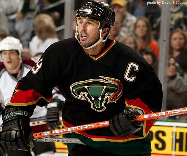
  • Mike Modano always looked good in North Star green, so when the Dallas Stars put him in this tragic alternate jersey, it certainly didn't seem right. Ironically, I picked up one of these Stars alternate jerseys the other day for a mere $90. While some may question my sanity for this, I'm trying to decide whether Modano should appear on the back or go with Brendan Morrow. Thoughts on this one, readers? Maybe Lehtinen?
  • Sports Illustrated posted a fabulous collection of photos today of all the current NHL goaltenders' masks. There are some absolutely fabulous designs on a few masks, and some really personal marks that make them entirely unique. Some of my favorites? Kari Lehtonen's Chuck Norris mask makes me laugh. I love the old masks displayed on Joey MacDonald's mask. The right side of Jonathan Bernier's mask brings back memories of Kelly Hrudey and Erik Ersberg. Pekka Rinne's predator-in-a-goalie-mask design is pretty neat. Jason LaBarbera shows off his love for pro wrestling. Ty Conklin brings back the Blues Brothers. James Reimer is all about Hockey Night In Canada.
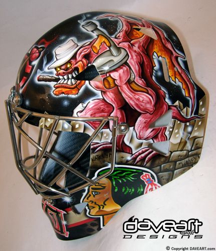
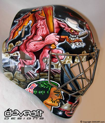
  • The one mask that SI forgot to include is the alternate mask worn by Marty Turco when the Blackhawks wear their alternate jerseys. Being that the jerseys resemble that of what the Hawks wore in the 1930s when gangsters played a large role in Chicago, Turco's "Gangsta Gargoyle" mask is highly appropriate in terms of it being paired with the alternate uniform.
  • OPPORTUNITY: Since school is eating up a ton of my time that I normally spend blogging, if anyone is interested in submitting articles for HBIC like you did in September, please contact me via email. This is a blog "of the people, by the people, for the people", so if you have something hockey-related you want to get off your chest, send me an email today! Or in the near future! Or whenever you like!
That's a quick Thursday update as I clear a bunch of stuff off my desktop and email. I encourage anyone who wants to guest post to contact me. You'll get full credit as the writer of the article, and I definitely enjoy reading other people's ideas and opinions. The best part is that you contribute only as much as you like and only as often as you like. I'm still writing, but I occasionally need some time to deal with homework. That's where you come in.

Give it a thought, HBIC readers, and contact me if you're interested. I was very impressed with the last round of HBIC guest posts, and I think this feature will continue as we move forward with this blog.

Until next time, keep your sticks on the ice!

Sunday, January 9, 2011

The NHL Guardian Project continues to run over on their Facebook page, but we're here tonight to bring to you the first few NHL Guardians that have been revealed. I don't know how many of you have been following the project's progress thus far, but there have been eight Guardians that have been revealed. The very first Guardian was revealed on January 1, and we're making our way towards the final Guardian who will be seen at the NHL All-Star Game in Raleigh, North Carolina. We'll run through these quickly, and I'll give my thoughts on each Guardian as well.

The very first NHL Guardian that was revealed was the Penguin, which may cause some confusion with this Penguin in the world of comic books. However, the Penguin resembles that of Frozone from Disney/Pixar's The Incredibles with his ability to shoot icicles from his hands and travel on a frozen sheet of ice. In fact, the Penguin is dressed almost exactly the same as Frozone! I'm not suggesting that the NHL Guardian Project is infringing on anyone's design, but one looks an awful lot like the other when side-by-side and has the exact same powers. Hmmm....

The second Guardian seen was the King, not to be confused with "The King" or "the King". Or Elvis Presley or anyone else nicknamed "the king". The King wears a ton of armor, has a shield that can create a force field, and a sword that causes earthquakes. Depending on how they play this, the King could be invincible to any physical attack with his force fields and ability to open Grand Canyon-sized chasms, or he could simply be an overly-protected, sword-wielding knight that causes the ground to shake a little. I'm hoping it's somewhere in the middle for this Guardian.

The third Guardian released to the public was the Hurricane. No, not this guy. Or this guy. Instead, we get a male version of the X-Men's Storm, only with less lightning and fog. His description makes him sound like he's a schizophrenic meteorologic nightmare. A personality as wild as the weather patterns? Hurricanes are, from what I've seen and read, not very nice to be around, so maybe we're looking at our first villain in the NHL Guardian Project? Anyone have a windbreaker and/or a white coat?

The fourth Guardian to be revealed was the Blackhawk. There are a couple of items I like on this Guardian. I like the Original Six marking on the upper left of his chest. I like how the suit looks and acts like Iron Man's suit, right down to the palms of his hands. I'm hoping the Guardian itself is a Native American so that the Native American peoples are properly represented. However, if he controls the element of wind, does that mean the Blackhawk can neutralize the Hurricane with his power? I'm interested in seeing how that one will play out.

The fifth reveal of the NHL Guardian Project saw the Sabre come to life. While Sabre can control the element of water in all its forms, I have to wonder what happened to his left arm. Does his shoulder just end like a fire hydrant spewing water everywhere? While, exactly, does Buffalo's Guardian get the power of water? Is Buffalo known for its rivers, lakes, and hydro power? Is he made of water? That would be kind of cool. He'd be similar to the Liquidator from Disney's Darkwing Duck! That would make for some interesting scenarios.

The sixth Guardian unveiled by the NHL Guardian Project was the Flyer. As per his name, the Flyer comes blessed with a pair of bird's wings, similar to those of Hawkman or the X-Men's Angel. However, being a master of telekinesis and mind-control makes him a little more interesting. Essentially, he can move objects with his mind, or make you move them for him. Add to the fact that he's a "punishing warrior" and suddenly you have a dangerous flying control freak. The Flyer could be the most interesting of the Guardians yet.

The seventh Guardian presented was the Oiler. The Oiler looks like a cross between Juggernaut and Magneto in appearance. I like how he's the protector of the Great White North. I guess the other five Canadian Guardians will serve a different country. He controls winter and wintery patterns, meaning we have another Storm wannabe, and oil manipulation. What, pray tell, is "oil manipulation"? If there's a spill, he can clean it up? The Gulf of Mexico could use this Guardian.

The last of the unveiled Guardians is the Devil. Not Satan himself of course, but a demonic image to be sure. Being the "underworld maverick", I assume he patrols the river Styx and lives in the inner circle of Hades, but I'm sure more will be revealed about this hot-headed bachelor. If he has infrared vision, he's more like the Terminator or Predator. He may need a Tic Tac for that flaming breath, but I want to know what he can do with this "master matter manipulator" skill. Is the world a bucket of Legos to the Devil whereby he can change the world around as he sees fit? That would be a cool skill.

There are the first eight Guardians unveiled by the NHL and the NHL Guardian Project thus far. While I took a bit of a tongue-in-cheek look at them, I am very interested in the graphic novel that is being produced featuring the NHL Guardians. I think it might turn out to be a cool idea if the project is marketed right and not too "ComiCon" for the average hockey fan. Only time will tell, but we'll see the final results on January 30 at the 2011 NHL All-Star Game in Raleigh, North Carolina!

Until next time, keep your sticks on the ice!

Saturday, January 8, 2011

Hockey is an interesting game whereby one has to earn respect. Respect isn't just given based upon name recognition or legacy. Otherwise, we'd be sitting here debating the merits of Brent Gretzky's game or how Brett Lindros changed the way the game is played. Teams normally show one another respect after a long playoff series by shaking hands as a way to end the battle with honour and respect. It's an age-old tradition in hockey, and one that the players take very seriously. However, the AHL's Hershey Bears played two games in the month of October while showing some serious disrespect to two other AHL teams.

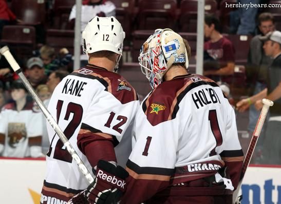
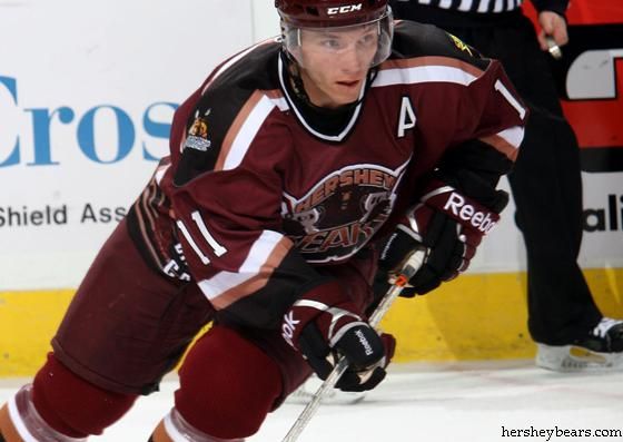
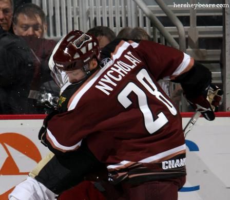
I had heard rumblings about this before the Manitoba Moose's recent series against the Hershey Bears, but it was laid out across the Sports page of the Winnipeg Free Press for all to see on Friday. It seems as though the Hershey Bears added a couple of logos to their "Championship" jersey that they wore in October to commemorate their 11th Calder Cap they had won in the previous season.

While I have no issue with teams who want to display their achievements on their jerseys, it seems a little bush league for a professional hockey team, especially one as storied as the Hershey Bears, to be creating new jerseys with their resumés on them. If you're an AHL fan or a Bears fan, you know that the Hershey Bears have won the Calder Cup eleven times, including the last two consecutively. Having the bear in the logo holding two Calder Cups is not what you'd expect from a professional hockey team.

With that, enter Gary Lawless, reporter for the Winnipeg Free Press, who discovered more about these championship jerseys. Lawless writes,
"Wilt the Stilt was as famous for announcing to the world he'd been 'friendly' with more than 20,000 women in his life as he was for his hall of fame basketball career.

"The Bears can now be known for similar 'notch on the bedpost' bragging.

"Back-to-back Calder Cup champions, Hershey put together a jersey with a Moose logo on one shoulder and a Texas Stars patch on the other.

"The Stars and Moose are the teams the Bears defeated in the last two Calder Cup finals.

"'We're the champs and here are the chumps we left in our wake,' is the message the Bears want to convey."
Again, I had heard about this earlier in the season, but I never really followed up on it simply because I thought it was a one-off game where the champs wore their jerseys and then auctioned them off to fans. However, upon reading Mr. Lawless' article, I decided to dig a little deeper.

It appears as though the Bears used their championship jerseys for two games during the month of October as they worked their way through the schedule - once in Hershey, and the other in Wilkes-Barre/Scranton. Of course, that means both a home and road version of the uniform, and that's exactly what the Bears had done: created a home and road set of championship uniforms.

Going back to what Mr. Lawless wrote, the home white set did indeed have both the Manitoba Moose logo and the Texas Stars logo on the shoulder! Normally, the Bears have the Washington Capitals logo - their NHL affiliate - and their secondary logo on the shoulders, but this is a first that I've seen in any professional hockey. And it's not like they just did this at home for their fans. No, they took their act on the road where the Moose logo was displayed on the right shoulder and the Stars logo was displayed on the left shoulder.

I'm shocked. In fact, I agree 100% with Gary Lawless when he writes,
"Designing, manufacturing and wearing these jerseys is a mistake, an error in judgement and ego run amok. It's not what the Bears have stood for in a glorious history dating back to 1938 with over 5,000 games played in the AHL and a record 11 Calder Cups. There's absolutely no question the Hershey Bears are the flagship franchise of the AHL and such a display is beneath their standard."
Wearing it once for your own fans? I can stomach that. Wearing these jerseys on the road for other teams' fans to see? Wow. It's a little sickening to see the Bears, so steeped in nostalgia and memories, stooping to this kind of bravado and self-indulgence at the expense of other AHL teams.

There's a friendly handshake between teams in the two conferences where they pledge to visit one another's rinks to help sell tickets. The Bears are always a good selling ticket in Winnipeg when they visit, and I hope that this little indiscretion towards the Moose by the Bears won't hurt their chances of visiting next season as the Moose and Bears continue this friendly setup. I like the Bears as a franchise, and I really hope this won't keep them from visiting MTS Centre in the future.

But if they don't face Manitoba next season, the Bears have no one to blame but themselves. And that's too bad because these teams are beginning to develop quite the rivalry.

I respect and support the Bears for raising money for charity, but not at the expense of other teams in the AHL. Continue to do good for the community, Bears, but please leave the minor-league shenanigans to non-cornerstone franchises.

Until next time, keep your sticks on the ice!

Thursday, December 2, 2010

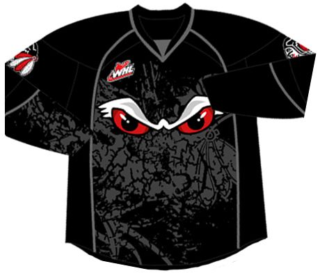
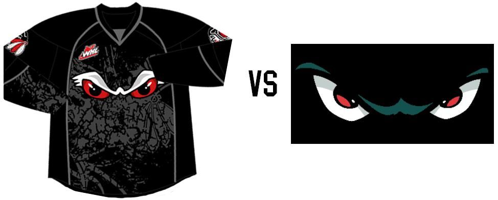
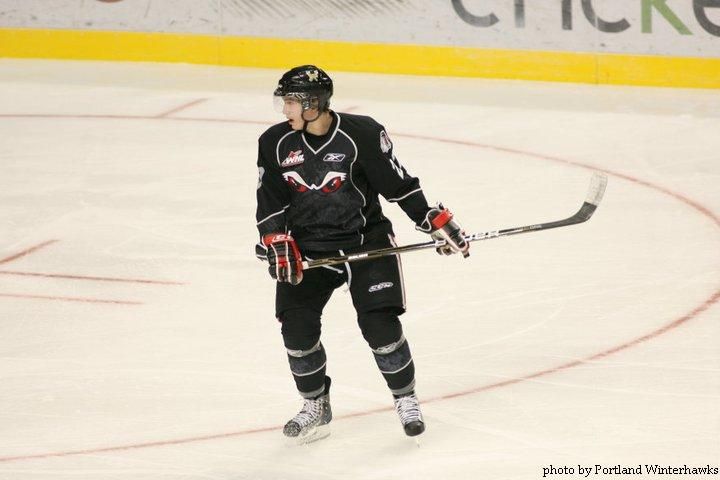
I don't know about you, readers, but over the last few weeks we have seen some fairly uninspired, unoriginal alternate jersey designs. From Columbus' cookie-cutter colour scheme and design elements to Anaheim's rather ugly alternate uniform, there seems to be a distinct lack of creativity happening in the world of hockey. You already know that I am sick of seeing black uniforms, so don't even think about trying to pull out the black fabric when designing an alternate jersey. Yet, this last week, we saw another completely unoriginal and uninspired effort put forth by the WHL's Portland Winterhawks as they unveiled their new alternate jerseys on November 24.

There's no doubt that junior hockey teams have to keep their fans engaged in order to make a profit. That's true for 99.9% of businesses, but hockey teams require fans to buy-in with their hearts and wallets in order for them to remain highly competitive in an ever-expanding entertainment world. Hockey teams seem to fall back to alternate jerseys as a way to capture the fans' imaginations, but there's something far too familiar about the new Portland Winterhawks alternate jersey.

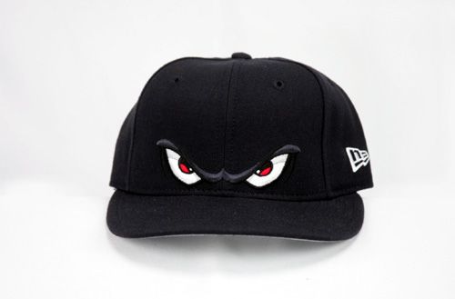
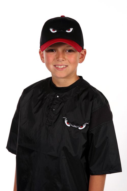
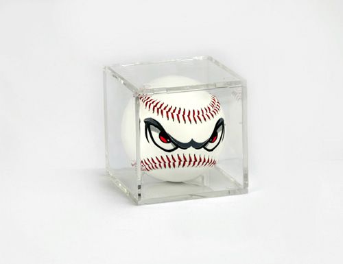
I mean, I've seen hats with that logo of angry eyes. I've seen it on shirts and on baseballs, too. So why would the Winterhawks have all of these things, especially baseballs?

Because the logo is nearly identical to that of the Lake Elsinore Storm, a Class A - Advanced minor-league baseball team in the California League. Don't believe me? Look at the comparison of the two logos. Yes, there are some minor differences, but the idea of the logo itself is definitely similar. After all, all three of the merchandise items - the hat, shirt, and baseball - come from the Lake Elsinore Storm merchandise page.

I don't know what the Winterhawks were thinking when they designed this logo and jersey, but all I think of when I see it is a minor-league baseball team. And while I'm aware that this look brings a new and "dangerous" identity to the team, it has already been done by another team in another sport.

I find this effort by the Winterhawks to be an epic fail for their lack of creativity, lack of research, and lack of colours. And I'm embarrassed as a hockey fan to find out that the Winterhawks are stealing ideas from other sports.

Until next time, keep your sticks on the ice!

Friday, November 26, 2010

Black Friday was appropriately celebrated by the Anaheim Ducks as they unveiled their newest look with their new alternate uniform. I say it's appropriate for Black Friday because Anaheim just can't seem to stay away from a black alternate uniform. In 2003, the then-Mighty Ducks introduced a brand-new alternate uniform that went away from their eggplant colour. They, of course, chose black. These Mighty Ducks alternate uniforms weren't the best sellers, but they weren't the best looking uniforms either. Today, though, the Ducks went a little more radical, although we're not seeing anything like this once-worn alternate jersey.

Here is your 2010-11 Anaheim Ducks alternate uniform. Much like the Blue Jackets yesterday, there are points about this uniform that I like, and some that I would rather see gone like the Wild Wing jerseys. We'll go through these individually as we always do, and I'll give the old thumbs-up or thumbs-down.

First off, I like the new logo. It's not necessarily "new" in the full sense of the word as the Ducks wear it on their normal home and road jerseys, but removing the word mark now makes this a true logo. All NHL teams need a logo to give them a recognizable image, so keeping the webbed "D" foot makes complete sense as a logo since most people already know that it's part of the Ducks' image. Thumbs-up for this idea.

The rear font on the new alternate jersey is the same as their normal font they use on their other jerseys. Again, continuity is important for a franchise with a unique font as it really does become a selling point for retailers. There are no added costs for a different font or different number of layers, so fans know exactly how much the name and number on the back will cost. Thumbs-up for keeping the unique font and making it easy on fans.

The Ducks have also brought back a little history as the shoulder patch shows the old Mighty Ducks mask logo. There's nothing wrong with a little nostalgia on a patch as I'm sure that a lot of Ducks fans have those old uniforms, so this brings the new jerseys and old jerseys together. I like the patch, and it gets a thumbs-up from me as well.

The image of Selanne showing the patch is also fraught with problems. What is going on down the side panel of that jersey? Stripes that go nowhere and do nothing are, in a word, useless. You can see that they don't continue down the pants, so why add them? While I appreciate Anaheim's black, orange, and champagne colour scheme, there are so many reasons why the orange and champagne should only be used as accent colours. They just don't blend well together when used in large blocks against a black background, and stick out vividly like a sore thumb. Speaking of thumbs, thumbs-down for the side panels.

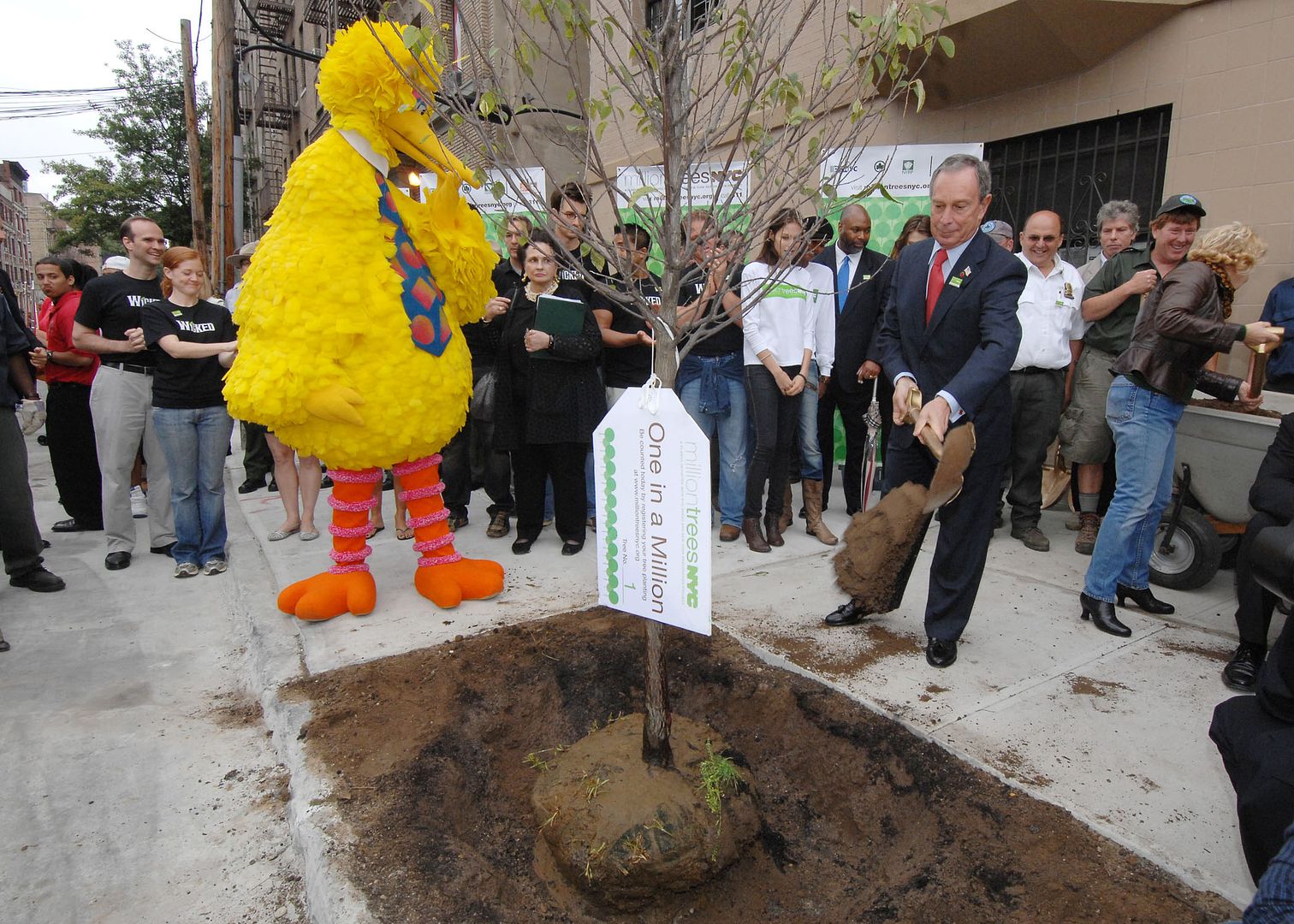
We just went over why the accent colours don't work well, yet there are the Ducks wearing those two colours as the main colours on their new socks. Those socks look horrid, especially when the pants slide up a bit. I don't know if the designers watched a lot of children's shows before getting into the design process, but the Anaheim Ducks' socks look fairly similar to Big Bird's legs - mostly orange with a contrasting colour for definition. In fact, if you strapped a pair of skates onto Big Bird's feet, his legs would look a lot like the Ducks' socks. Big thumbs-down for the socks.

I get that the Ducks use black as their main home jersey, so I'm not sure why they couldn't add some colour to their scheme. They re-introduced the Mighty Ducks logo on the shoulder patch, so why couldn't they wear the Mighty Ducks uniform like they once did? Does anyone think this is a step back if they swapped out the "Duck mask" logo for the webbed "D" logo? It honestly doesn't look that bad at all, and I clearly have little to no graphic designer ability. Thumbs-down for another black uniform in the Ducks' closet.

Overall, it's a 3-3 tie, but the aesthetic of the jerseys just bring it down another notch. I've gone on record a few times that hockey is a sport where colours are important, and black is simply choking the life out of a once-vibrantly colourful sport. Anaheim could have done a lot with these alternate jerseys, but they chose to remain inside the box that is their uniform scheme. And that's unfortunate.

I don't think I'll ever have one of these uniforms in my closet unless I can get one on the thrift. Orange and champagne aren't really my colours, and I don't need or want any black clothing. Sorry, Anaheim, but these just aren't your best effort, similar to what we saw in the game against the Chicago Blackhawks today.

Until next time, keep your sticks on the ice!

Thursday, November 25, 2010

The image to the left is that of the brand-new Columbus Blue Jackets' alternate uniform to be worn during the 2010-11 season and beyond. Columbus has worn an alternate jersey in the past that had the black shoulder-to-wrist yoke, and that look eventually became their everyday uniforms in 2007 with a few minor changes. In continuing with Columbus' "new uniform" trend, a brand new logo can be seen on their new alternate jersey, and they have introduced a new colour not seen as an accent colour on their uniforms before. But the big question always remains: how does this uniform rate? There are a few things that I like on this uniform, but we'll see if they make the grade below.

The new alternate uniforms are very clean, very simple, and very easy on the eyes in terms of their look. There are no flashy designs or crazy graphics or sensational striping, and the jerseys have a very "retro" feel to them despite the team being just ten years old. I'm not against this retro feel that the NHL seems to have reverted to, but maybe this should send designers a clear message that new is not always better. The overall exterior look of the new Blue Jackets' uniform gets a thumbs-up.

The rear font used on the alternate jerseys for the players' names is still the same as before. Keeping the font the same makes it easy for fans who have grown accustomed to the Blue Jackets' font over the last few years, so that's good. Thumbs-up for that decision.

The number font, however, has taken a turn for the "blockish". The Blue Jackets wore a very unique font on their regular uniforms compared to most of the other block-lettered teams of the NHL. That, however, has fallen to the wayside with the new alternate uniforms, and I, for one, don't think this was a necessary move. Block letters are nice for companies that cut and stitch numbers onto uniforms, but the NHL is a multi-billion dollar retail business based on the each team's unique features. It's the uniqueness of each team that separates them from all the rest. This move to block letters makes the Blue Jackets' alternate uniform less unique compared to the rest of the NHL, and that's a thumbs-down from me.

Speaking of a lack of uniqueness, what's with this colour scheme? Light blue, white/cream, and navy blue? That would be a unique colour scheme if it weren't for Nashville, St. Louis, Florida, and Pittsburgh. In fact, when looking at the last few alternate jerseys, all of Nashville, St. Louis, Florida, and, to some extent, Minnesota have been designed in the same fashion: hem stripes, sleeve stripes at the elbow, lace-up collars, and a shoulder yoke. Granted, not every one of these teams has all of these features, but the majority of them are present on each team's alternate uniform. Is Reebok simply not trying, or do the teams just not have any creativity? Thumbs-down to the overall design for the Blue Jackets because they look like everyone else.

I do like the new logo on the alternate jersey, but, like the rest of the jersey, it seems to be copying something else from someone else. The Blues, Panthers, Penguins (twice), Sabres, and Wild all opted for a change back to a circular, retro-style logo in the last few years. The cannon? A great addition and could be a great logo on its own. The circular logo like everyone else? I can do without. I'll give this a push because the cannon logo is a great idea, but the circular logo has been done.

You may have noticed that the collar of the new Blue Jackets' alternate jersey has a special insignia on it. Blown up, you can clearly read the letters of JHM on the collar as the insignia. Why is that there? Let's go to the press release.
"To honor Blue Jackets founder John H. McConnell during the team’s 10th season, the initials JHM adorn the back of the neckline.The JHM edition of the jersey will only be worn by the team during the 2010-11 season. For jerseys sold at retail, the JHM will appear only on the initial production run, making it a true collectors’ edition."
Ok, so there's something to commemorate the team's founder, but I'm thinking this really isn't necessary. Yes, it will make game-worn jerseys fairly unique and recognizable through this special mark, but fans aren't really interested in a collectors' edition unless they are interested in buying every single uniform the team has worn. Making that person a "collector"! Thumbs-down.

The writing on the outside of the collar isn't the only place to find something as the Blue Jackets added stuff to the inside of the collar too! Let's go back to the press release for the reasons this was done.
"The phrase 'We Fight. We March!,' which appears on the interior of the jersey’s collar, was first introduced during the 2008-09 season to describe the Blue Jackets’ first-ever march to the Stanley Cup Playoffs. The expression continues to represent the team’s intention each year to fight and march throughout the regular season and into the playoffs. Below 'We Fight. We March!,' 10 stars commemorate the introduction of the jersey in the club’s 10th season."
Here's a news flash to all designers: if you can't see it, it doesn't exist. If this stuff was really that important, why not add ten stars to the bottom hem to commemorate this jersey's addition to the Blue Jackets' wardrobe where it can actually, y'know, be seen? Adding the motto on the inside is simply adding for adding's sake. These two "features" serve zero purpose overall, and have already been done by two teams: the Pittsburgh Penguins and New York Rangers. Pittburgh gets a pass simply because it will be worn on the Winter Classic uniforms, and it commemorates that event. The Rangers, however, fail miserably because no one cares about the year the franchise was established. If you're a fan, you already know that! Therefore, the Blue Jackets fall into the latter category of "fail miserably", leaving them with a thumbs-down for this idea which seems dumber and dumber every time a team does it.

Ok, so where do we stand? Well, I count 2-4-1. These jerseys just seem too cookie-cutter to me in terms of how they look. I expected more, and some of the kids in Columbus did as well. That first image by Brittany Curry? Not bad at all! I think that, for all the hype and secrecy on this unveiling, the results leave me feeling a little underwhelmed. That's never a good thing for your fanbase, especially those who don't live in the metro area of Columbus, Ohio, because they probably won't want to be part of the "We Fight, We March!" squad. I expected some creativity after they came up with a gorgeous home and road set, but all I see are ideas stolen from other teams. And that's not very professional.

Sorry, but I expected more, Jackets. You gave us a fairly standard uniform in terms of how it looks with very little original design. What's that? You did provide something more? I'm sorry, but a new cannon mascot named "Boomer" who will only appear when the new uniforms are worn is far too kitschy, and seems very much like a marketing ploy. He's not Batman who appears when the Bat Signal comes out. And you certainly don't need a second mascot when Stinger is already wearing the new threads! What's the point of that?

Because of this, I now fear the unveiling of the new Anaheim Ducks' alternate jersey coming up.

Until next time, keep your sticks on the ice!